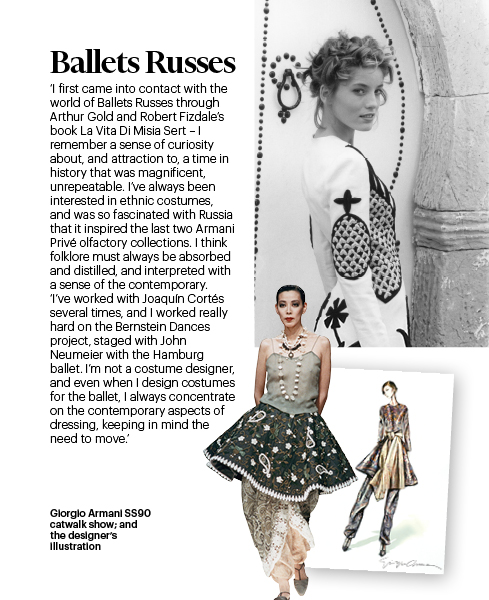
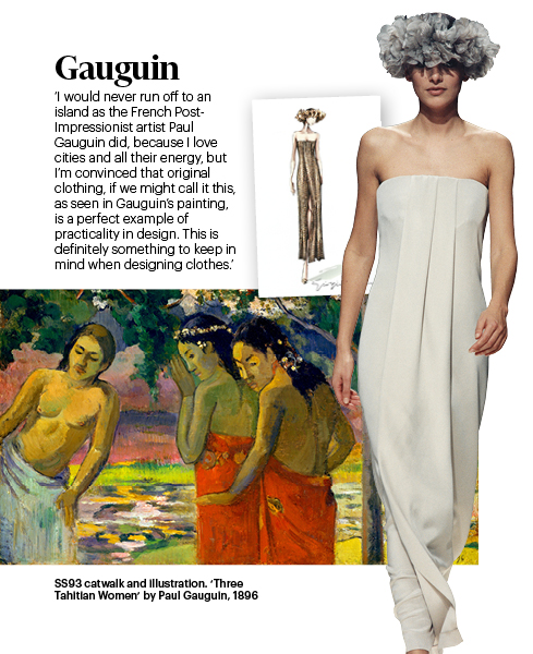
Art and fashion have forever been entwined. In the 1920s, Coco Chanel collaborated with Pablo Picasso when together they worked on costumes and backdrops for the Ballet Russes; Sonia Delaunay designed clothes and textiles in tandem with her vivid artworks; Yves Saint Laurent returned to art again and again throughout this career: in 1965, he drew on the bold abstractions of the Modernist painter Piet Mondrian to create a collection of six A-line dresses; he was forever fixated by Yves Klein’s blue; and, in 1980, created a couture collection after Henri Matisse’s cut outs.
The AW16 collections took their inspiration from a diverse range of art. The catwalks recalled everything from the surreal works of Salvador Dalí, to the great sculptures of Richard Serra and the playful Pop Art of Andy Warhol. When looking for the cultural threads that drew the looks together, one found both bold and deeply romantic influences. Feather-light tulles and laces conjured the spirit of the Impressionists, while mind-bending patterns and dazzling monochromatics evoked Op Art.
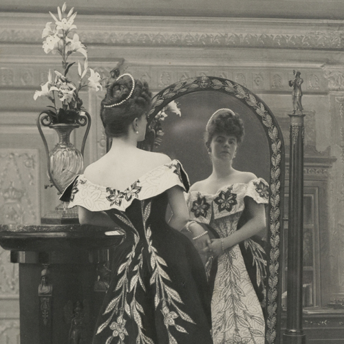
 and Carmen Dell’Orefice model Ceil Chapman eveningwear in front of a back-drop inspired by Matisse’s ‘Jazz’, photographed for Vogue by Cecil Beaton, 1949Cecil Beaton\/Condé Nast via Getty Images")
Jean Patchett (left) and Carmen Dell’Orefice model Ceil Chapman eveningwear in front of a back-drop inspired by Matisse’s ‘Jazz’, photographed for Vogue by Cecil Beaton, 1949
Cecil Beaton/Condé Nast via Getty Images
This Art of Fashion supplement revisits the influence of the visual arts within the dynamic realm of ready-to-wear. How does art translate into our wardrobes? It’s also been an opportunity to talk to designers about more private passions. Jonathan Anderson, the creative director of Loewe and his own label, JW Anderson, discusses the value of craft and why the art of the hand is having such a renaissance. Nicolas Ghesquière talks about the architects who inform his designs, his catwalk presentations – and his Instagram feed in “The Lines of Beauty”. And Giorgio Armani reflects on the key works that have inspired his 41-year career at his eponymous label.
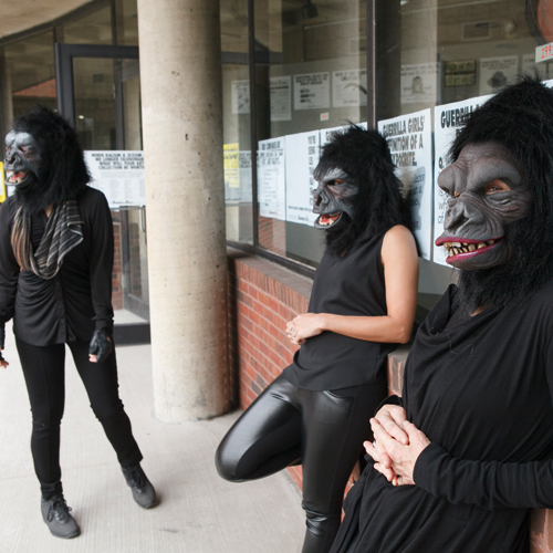
We also spoke to the artists, like Trouble Andrew (aka GucciGhost) and Maggie Cardelús about their experiences of collaborating on the autumn collections. Cardelús produced a vivid print for Sonia Rykiel, while Andrew’s spray-painted bags have become a cult accessory. Lastly, we’ve found the creative highlights of the season, from the international fashion shows to major exhibitions. I hope it leaves you inspired.
Jo Ellison, Fashion Editor, FT
Expressionism
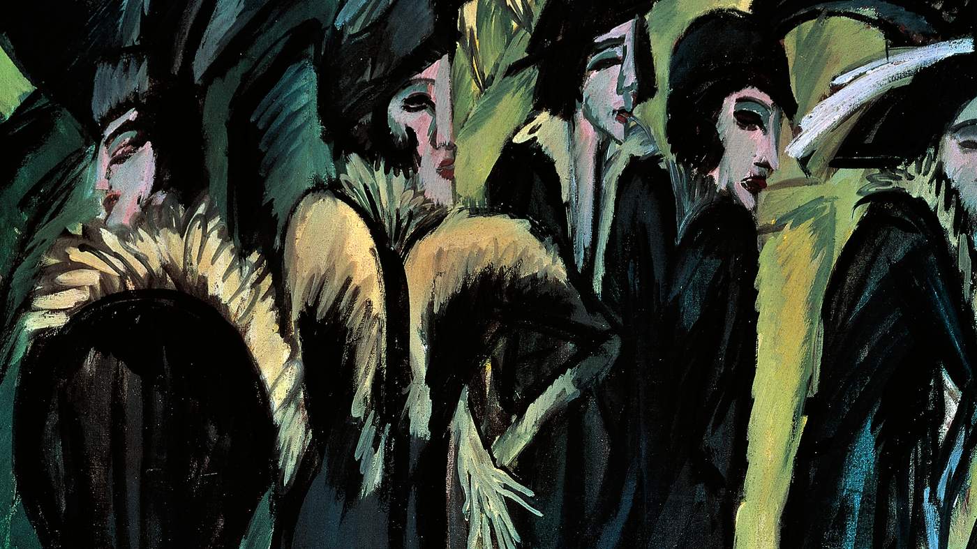
Collections with a noirish sensibility and febrile femininity show big character – and no small amount of menace
From left: Marc Jacobs, Louis Vuitton, Roksanda Ilincic, Dries Van Noten, Balenciaga, Roberto Cavalli, Max Mara, Christopher Kane, Bottega Veneta, Altuzarra, Christian Dior, Kenzo. Catwalking.com
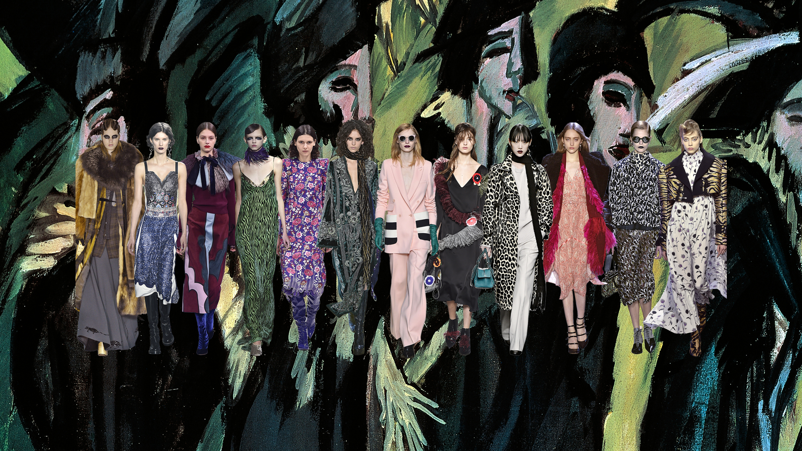
The vivid colours and dramatic silhouettes of the Expressionist artists provided fertile ground for the AW16 shows. Several designers drew on the movement’s noirish sensibility and febrile femininity to create collections with big character – and no small amount of menace. Belgian designer Dries Van Noten had taken the Italian heiress and eccentric marchesa, Luisa Casati, as his muse; the models were swathed in leopard print and smeared about the eyes with kohl in the spirit of the art patroness’s wild-eyed beauty. The clothes, meanwhile, borrowed from the Expressionist palette; the chartreuse yellow blazers, violet striped pyjama suits, a long slip gown in absinthe green could have stepped straight from an Ernst Ludwig Kirchner canvas.
Other designers were also inspired by that movement’s dangerous degenerative appeal. At Marc Jacobs, models wore black lips, towering heels and layered furs to recall the vast exaggerated characters of filmmaker Fritz Lang. At Christopher Kane, the models were in rain bonnets, strings of trinkets and shoes strewn with “rubbish” to capture a mood of “beauty expired”. While Kane’s damaged muse evoked the fragile figures that populate the works of Egon Schiele, others drew on the painter’s more defiant female forms; a wicked stepmother in a tinselised overcoat at Dolce and Gabbana; Dior’s slick-haired emissaries in their pointy boots and spooky black glasses; a silvery femme fatale at Roberto Cavalli; a Kenzo diva dressed in a zebra brocade jacket and matching boots, glowering from under a blonde pompadour. Quietly terrifying. Quite terrific.
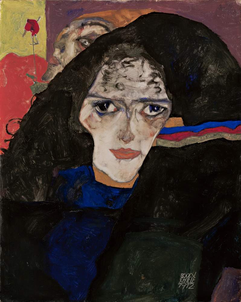
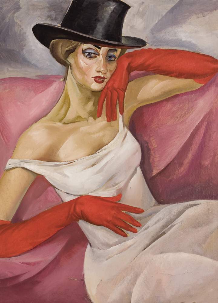
Five Women on the Street, Ernst Ludwig Kirchner’s 1913 oil painting of prostitutes is part of his ‘Street Scenes’ series; Lady in Top Hat, Boris Grigoriev, c1919; Mourning Woman, Egon Schiele, 1912 (early Schiele work is on show at Austria’s Egon Schiele Museum, Tulln, until October 2)
DEA Picture Library; Michael Ochs Archives; Hulton
The lines of beauty
Ghesquière at the Niteroi Museum. Patrick Demarchelier/Courtesy LV
Nicolas Ghesquière’s passion is for concrete as well as clothes. He tells Jo Ellison why every building tells a story
“It’s about the sense of proportion. It’s about the interaction between the landscape and the building. And it’s about what kind of girl will emerge from this landscape.”
Watch any fashion show under the creative direction of Louis Vuitton’s womenswear designer Nicolas Ghesquière, and one is struck as acutely by the drama of the show space as by the collections within it. For Ghesquière, architecture provides the stage on which his women come to life. For Resort 2015 his desert sirens emerged from the sandy plains of Palm Springs, California, to stalk the space-age Bob Hope Residence built by the American architect John Lautner in 1973. For AW16, his muse walked amid a set of fractured, mirrored colonnades. Made in conjunction with the artist Justin Morin, the set recalled a lost Atlantis designed to capture “a sense of architectural discovery”.
“I’m fascinated by how we integrate with the landscape,” explains Ghesquière over tea in Rio de Janeiro, Brazil, where he has just staged his Resort 2017 show. The collection was shown at the Oscar Niemeyer-designed saucer-shaped Niteroi museum which saw the models descending down a giant crimson ramp to stride its watery perimeters all framed against the city’s Sugarloaf mountain. “The resort show was all about tropicality and urbanity, and how nature explodes into this urban space,” continues the French designer. “Rio is built into this unique landscape, and I loved looking at that interaction in my design. The show was about colour and the freedom of the city’s character.”

Louis Vuitton Resort 2017 show at the Niteroi Museum
Ghesquière’s passion for architecture is well documented on his Instagram feed where he posts as many images of the buildings that excite him as he does new bag designs. “I like Brutalism, usually,” he says. “Minimalism and Brutalism.” As with his own designs, he is drawn to modern and otherworldly structures, as well as the more nostalgic elements of futurist design: now 45, he has never let go of his childhood obsession with Star Wars and is a devotee of science fiction. Recent posts have included the white wobbly structure of the Sarpi Border Checkpoint, in Georgia, by the German architecture practice J Mayer H; the concrete hive that forms Egon Eiermann’s addition to the Kaiser Wilhelm Memorial Church in Berlin; and the Belgian Polar station Princesse-Elisabeth in Antarctica, a silver capsule built in 2009. Neither is he immune to the charms of the more classic schools of architecture: he often photographs the neat Hausmann boulevards over which he has an enviable vantage from his studio headquarters in Paris.
“I love Carlo Scarpa, Herzog & de Meuron, Ricardo Bofill, Fujimoto,” says Ghesquière of the architects who inspire him. But his collections rarely include literal references. “What I see is a context. I am inspired by the way a building receives people,” he explains of how architecture informs the character of his collections. “Like a child, I imagine who I will project onto that stage. I am interested in how the architect has imagined how someone will walk into the building. How people live in a building.”
Providing the context for these fashionable characters helps fill in the creative process for Ghesquière who has been artistic director of womenswear at Louis Vuitton since 2013. “For example, in Palm Springs we were in a residential space, so the show had a type of languor to it. While Niteroi has always been a museum so, from my perspective, I imagined the girl as visitor. Someone who was curious about a space rather than owning it. I use the architecture to create my own little story, my version of what is going on,” he continues of the way he works.
‘I use architecture to create my own little story, my version of what’s going on’
Before joining Louis Vuitton he brought a similarly architectural rigour to his designs at Balenciaga, where he was creative director for 15 years. “I look at the space to play with the cineography of the show. It informs the movement of where the girl will walk and what the space is calling you to do. Architects know exactly how you will use a building, and where you will go in it, and why you are attracted to certain parts of it. I use the same principles when thinking about how I will present a show. The way you present the first dress will influence how people see the rest of the collection so I look to architecture to find the same balance in my edit of the looks. So sometimes you look to find a very specific coherency, and other times it can be more chaotic. By refining the structure of the presentation, and looking at the way we will use the building, I’m trying to get into the brains of the spectators.”
He applies the same logic to the shows he presents at the Louis Vuitton Fondation. The vast glass-sheathed museum designed by Frank Gehry was opened last year and Ghesquière has shown his past three collections within its grounds. Some designers would find the giant space intimidating, but Ghesquière’s approach has been to build bespoke spaces within its walls to house his collections. Unlike resort, these have been smaller, more intimate in scale, and quite surreal. For his second outing, he built a black box in the building’s foundations; for the AW16 show his stage incorporated 57 columns (and 200,000 mirror fragments) under three black geometric structures. Rather than work within the environment around him, he chose to transplant the audience to another planet altogether. “We had an idea of this trip,” he says, “of a digital heroine, like Tomb Raider, discovering an archaeological site.”
That Ghesquière’s collections aim to transport the spectator is no accident. Louis Vuitton built its fortunes by catering to the needs of the travelling classes, and Ghesquière’s shows are born of the same escapist instinct. But while the house’s founding father might have had his feet on terra firma, Ghesquière’s adventures are typically fantastical, housed in spaces designed to skew the senses. The Niteroi show was staged in Rio, but its location felt completely alien. So, too, Palm Springs.
“With Vuitton, we are always travelling,” says Ghesquière. “But for me it’s still quite new.” Dynamic architecture allows ideas take flight. “It’s a way to travel and keep it related to fashion, related to the brand,” says Ghesquière. “It helps me find an interaction with the exotic.”
Impressionism
Sherbet-shaded tulles and butterfly-strewn peignoirs recall the breezy romance of Manet, with modish extras
From left: Marchesa, Erdem, Gucci, Chloé, Alexander McQueen, Simone Rocha, Carolina Herrera, Oscar de la Renta, Valentino, Chanel. Catwalking.com
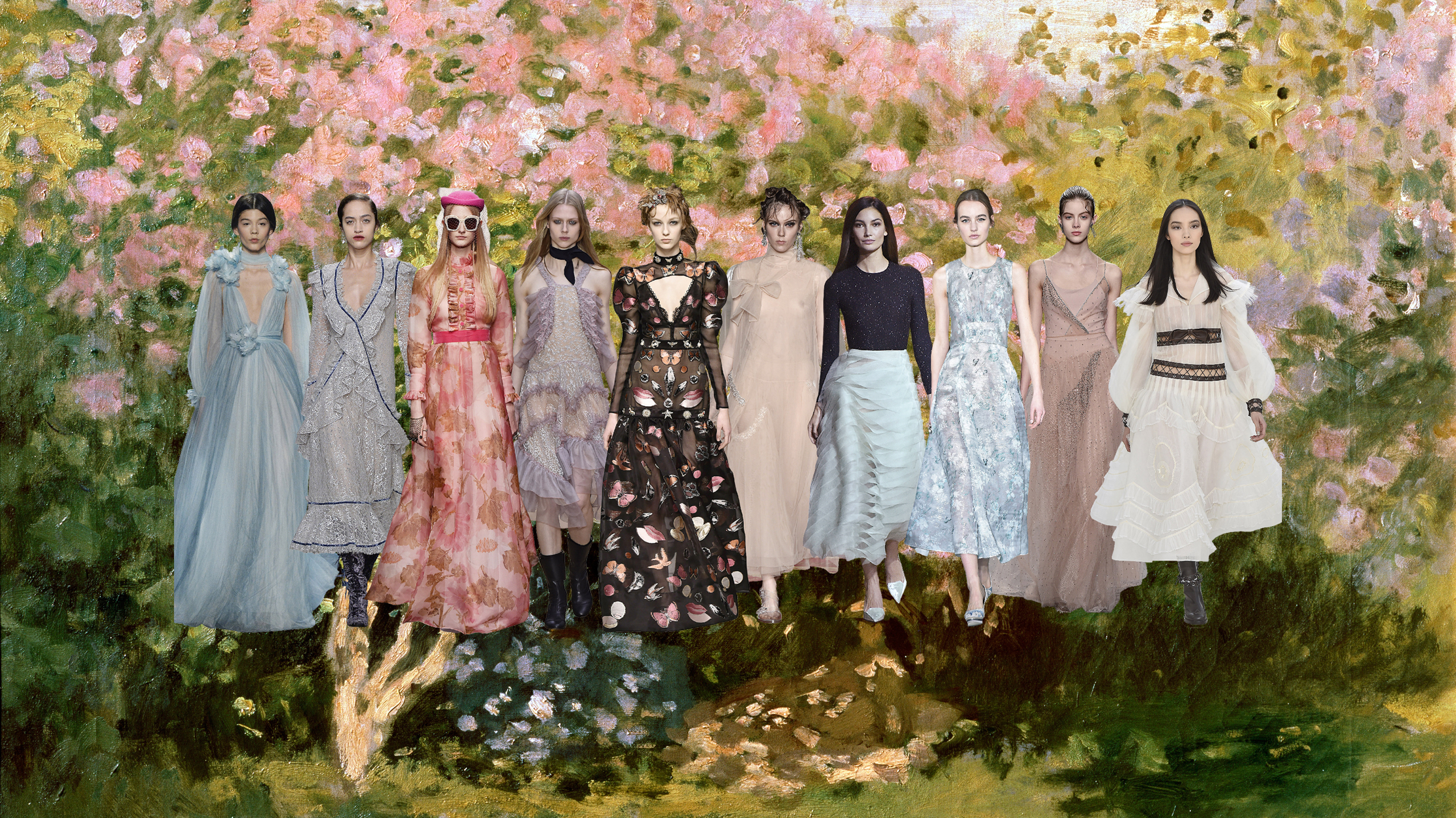
With its featherlight frilly dresses, dusty pastel shades and unfettered femininity, the breezy romance of the Impressionists continues to captivate, especially on the catwalk. At Chanel, the tiered white tulle gowns offered by Karl Lagerfeld recalled the quiet gentility of Edouard Manet’s figures at the Folies Bergère, designer Sarah Burton’s dreamy sleepwalkers were pretty as a picture in their butterfly-strewn peignoirs at Alexander McQueen, while the sherbet-shaded tulles at Chloé, Gucci and Marchesa were perfectly apt for an afternoon in the Tuileries with Pierre-Auguste Renoir.
But Impressionism at the AW16 collections still arrived with modish extras. Just at Edgar Degas once looked to the barre for inspiration, this season Valentino designers Maria Grazia Chiuri and Pierpaolo Piccioli had also taken their lead from the ballerina. Dressed in flesh tones, with tutu skirts and ruffles, their dancer was as demure and delicate a creature as in any Degas painting, but here she sometimes swapped her ballet slippers for hefty biker boots or swaddled her frame in military style outerwear. The designers had been inspired by the choreography of Merce Cunningham and Martha Graham to find their “floral graciousness” and bring their dancer into the modern age. Degas would surely have approved.
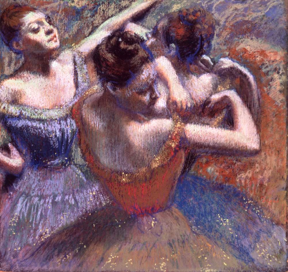

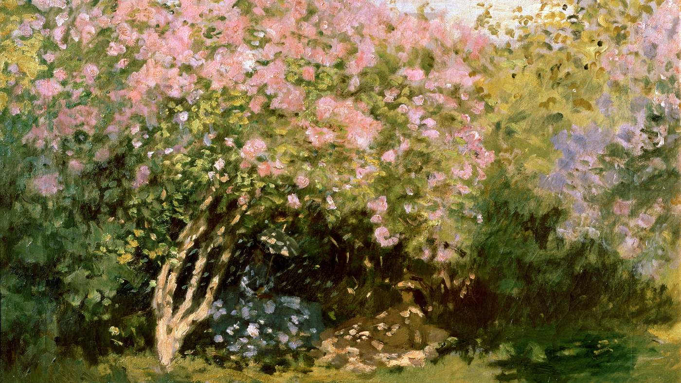
Above: Lilac in the Sun by Claude Monet, 1872-73. In the Garden by Pierre Auguste-Renoir, 1876. The Dancers by Edgar Degas, 1899
From October 22, 130 major Impressionist works will be on display at the Fondation Louis Vuitton in Paris in a collaboration with Russia’s Hermitage Museum and Pushkin State Museum
Fine Art Images/Heritage Images/Getty
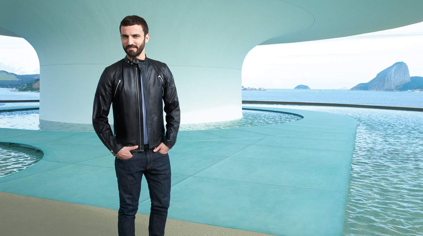
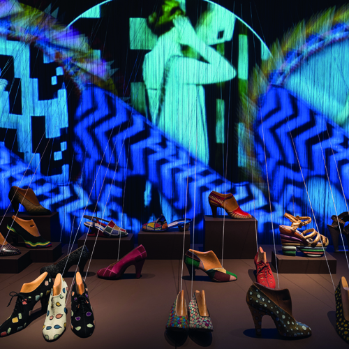
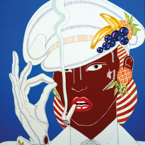
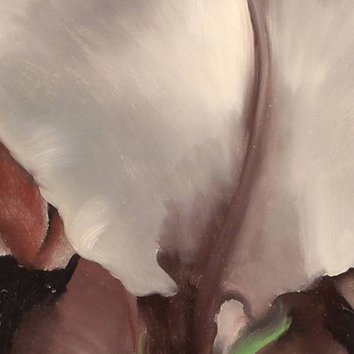
Passion project
Photographs by Benjamin McMahon
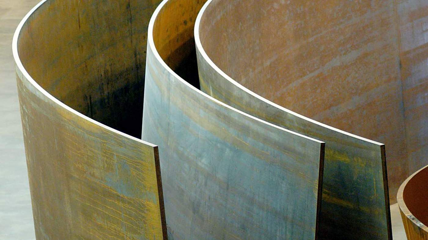
Minimalism
As appealing to the modern woman as to the modern artist, this season, less is very much more
From left: Balenciaga, Acne, Sportmax, Hermès, Joseph, Loewe , DKNY, Proenza Schouler, Rick Owens, Jil Sander, Céline. Catwalking.com
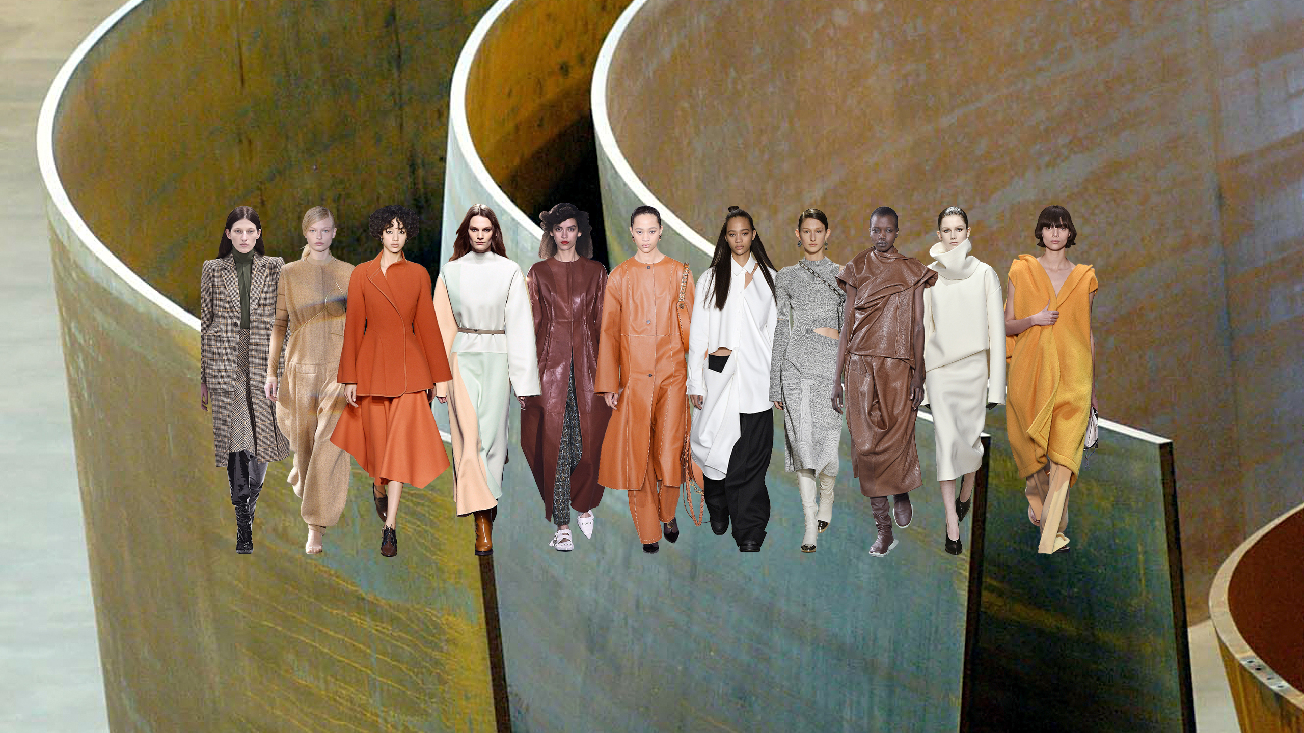
Minimalist design in fashion has become so commonplace it’s almost taken for granted at the shows. For AW16, the aesthetic discipline informed everything from the collections themselves to the spaces in which they were shown. In New York, the Proenza Schouler designers, who have previously cited the felt sculptures of American minimalist Robert Morris and the spare abstractions of Clyfford Still as influences, showed their collection at the Whitney Museum of American Art, the great spare Renzo Piano designed space that opened last year.
As a sign of gratitude perhaps, their AW16 collection was inspired by three American artists – Frank Stella, Richard Serra and Robert Ryman – whose work informed the duo’s study on “control and release”, a finely calibrated exercise in banded cotton viscose, ribbon and volume. The Loewe show was staged within the trefoil architecture of the Unesco headquarters in Paris, a World Heritage Site, and the collection echoed the building’s sinuous design and rich textural details.
Phoebe Philo, the designer who has made minimalism a mantra throughout her eight-year tenure at Céline, offered an AW16 collection in which she had stripped her colours right back to earthy neutral, and played with proportion: creating huge silhouettes in gentle fabrics. Sounds simple, but like the best practitioners of minimalism, the clothes are more sophisticated than at first they look. And it wasn’t all sober. A giant robe coat in canary yellow was a jolt to the senses.

It’s no doubt symptomatic of the era – minimalist looks emerge in periods of austerity – and the new season is dense with design, from the undulating chestnut leathers at Rick Owens to the neat checks that underpinned the new graphic silhouette at Balenciaga.
At Hermès, sublimely simple dresses and sport-inspired daywear underscored the provenance of their craftmanship, each piece a showcase of artisanal skill and material superiority. Designer Nadège Vanhee-Cybulski had developed a palette that brought to mind the soft fluorescents of the American sculptor Dan Flavin, and the graphic lines of her “new pastels” were just as calming on the eye.
Above: The Matter of Time, steel sculptures by American artist Richard Serra, 1994-2005. Untitled cubes by Donald Judd, 1980-84. These box-like, minimal structures, sometimes called Judd Cubes, are in the grounds of the Chinati Foundation, a contemporary art museum in Marfa, Texas. Untitled work by Robert Morris, at a preview of Art Basel in 2012
Walks of art
Aimee Farrell meets three contemporary artists who worked on the AW16 collections
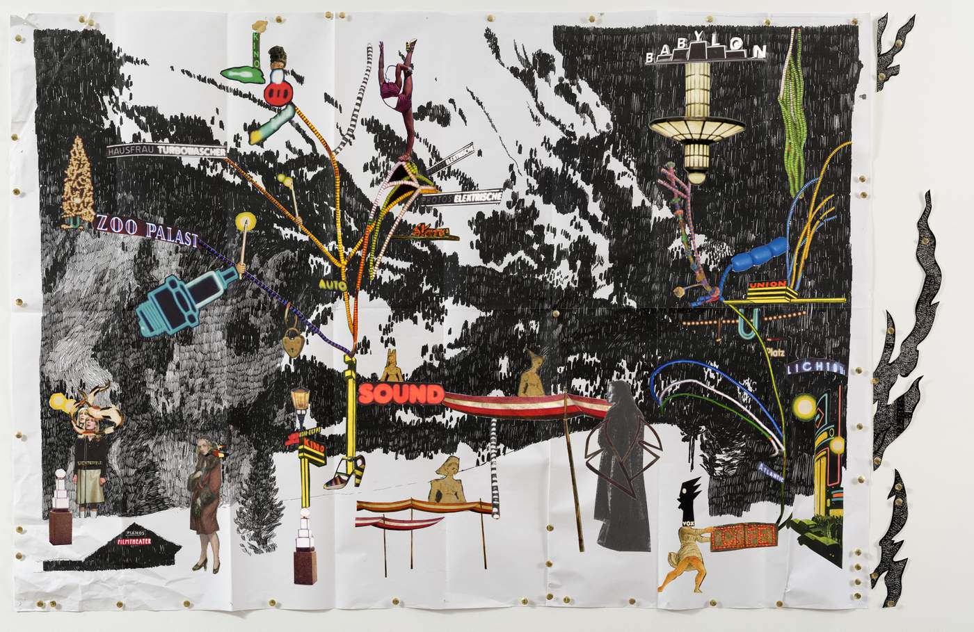
Christophe Chemin’s Nivôse (black ink on paper, collage and metal pins, 2016) courtesy of Christophe Chemin
ONE: PRADA+CHRISTOPHE CHEMIN
“They’re walking works of art that are grounded in the idea that they’re being made for a brand to be worn on the street. They’re not just existing artworks that have been put onto clothes.” Christophe Chemin, the 39-year-old Berlin-based French artist propelled, somewhat reluctantly, into fashion’s spotlight, is describing the imagery he conceived for Prada AW16.
The self-taught collagist collaborated with the brand on the men’s and women’s collections to create a capsule of six composite prints: each “sews” together an eclectic stream of references, from Hitchcock’s Vertigo and Weimar Berlin’s cabaret, to the romance of the Italian Renaissance and the Japanese art of Wabi-sabi.
In the women’s collection, Chemin’s artworks were inspired by the French Revolutionary calendar, that secular, romantic system which swapped saints’ names and religious dates for flower, seed and tree terminology. Adopted in 1793, it was scrapped by Napoleon in 1806.
“The names are really beautiful,” says Chemin. “They relate to the nature of women and nature itself.” He describes the prints themselves as “subtle, refined, and with lots of flowers”: in Vendémiaire (“vintage”) the female form transmutes into the landscape, blush bodies become mountains and purple figures sprout from the scorched earth, cactus-like; in Germinal (“seedtime”), a tranquil room scene draws on Le Corbusier’s scale of architectural proportion, Modular, and is layered with botanical imagery.
 courtesy of Christophe Chemin")
Christophe Chemin’s Vendémiaire (colour ink, colour pencil on paper and collage, 2016) courtesy of Christophe Chemin
Chemin says the collaborative process with Prada “was free and instinctive”. It began, unusually, not with pictures but with the written word. “Once I knew we working with the idea of history I started to write a list of concepts, ideas and tableaux that I had in my mind,” says Chemin, who maps out every artwork in detailed, cinematic scripts. Mrs Prada was first introduced to Chemin’s work by her design director Fabio Zambernardi, who has known the artist for many years.
“I created six artworks and told Fabio he could do whatever he wanted with them. I remember saying: ‘Feel free to cut, zoom in, do whatever seems good to you, I trust you – be creative.’ In that sense it was a real collaboration as, while I was pretty free to do whatever I wanted, there was still a lot of interaction.”
Chemin spoke daily with the studio, ping-ponging ideas back and forth and thinking of ways in which his art would work as garments. For the Nivôse (“snow”) collage, says Chemin, “I pleated the paper as a poster, pinned it on a wall with a metal stud and rephotographed the results. I knew that would work in an interesting way as a skirt.”
‘It’s an insanely fast way of creating. But interesting. It pushed me to urgency’
A chameleon figure, who has authored four novels and directed and acted in numerous films, Chemin’s studied style was an easy fit for Prada. Layering together photographs, ink and pencil drawings to create a 3-D effect, the compositions readily acknowledge “the language of Prada” via trompe-l’oeil details, pins (“Prada loves a pin”) and even the occasional banana (an allusion to the earrings Mrs Prada wore as part of her ode to Josephine Baker for spring 2011).
Things moved rapidly, even by fashion’s standards: Chemin delivered his women’s designs in under three weeks, starting work on the imagery immediately after the men’s show. “The UPS man was literally standing at the door of my studio waiting to take the artworks directly to the factory,” explains the artist. “It’s such a fast way of creating. It’s insane, but it’s also interesting – it pushed me to urgency.”
Chemin is clearly enamoured with the results: “It’s something quite beautiful and different from other brands,” he says. He’s intrigued too by what he calls the “next chapter” – how women will wear and live in his work. Chemin certainly softened some of the more violent imagery that often features in his art, and he’s clear that these Prada prints should be seen as being utterly distinct from his personal work. And for now he’s happy return to creating under the radar.
“It’s been an experience,” he says. “This was a good way for me to put my work out there in a very mainstream way. But I did this out of respect for the brand because I love Prada. It’s a one shot thing.”
Gucci AW16 collection featuring GucciGhost. Catwalking.com
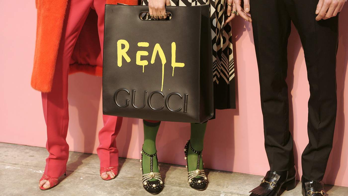
TWO: GUCCI + GUCCI GHOST
There’s something unlikely, but brilliant, about Gucci creative director Alessandro Michele’s collaboration with Trouble Andrew (real name Trevor Andrew), the New York street-artist and musician behind @GucciGhost. It’s a spooky moniker for a personal project that Andrew began some four years ago, scrawling the Italian house’s iconic logo onto anything from dustbins to brick walls to vintage leather jackets.
“I was creating this fantasy world for Gucci. But, from the beginning, part of the plan was to make this happen for real,” explains Andrew. Aptly, the word “real” is now tagged larger-than-life onto Gucci AW16 bags, baseball shirts and jackets, many of which are painted, patched, deconstructed and rebuilt from Andrew’s own artworks in a deliberately raw, skate-punk style.
“They were either going to hire me or sue me,” jokes Andrew. “But my timing was perfect. Alessandro is fearless when it comes to mashing contrasting elements together and making things new.”
“Gucci was either going to hire me or sue me,” jokes the street-artist’
It was the photographer Ari Marcopoulos, a friend of Andrew from his pro-snowboarding days, who initially put the artist and designer in touch. Marcopoulus was shooting the Gucci look-book when he suggested Andrew send along some of his work. Michele, who was looking to add a street-style element to his collection, promptly signed him up and within days Andrew was flown to the Gucci headquarters in Rome. “We hung out and just started working,” he says by phone from Milan. “They gave me a workspace and free range to create and I replicated my studio with music and incense.”
 with Trevor Andrew Kevin Tachman\/Courtesy of Gucci")
Gucci creative director Alessandro Michele (left) with
Trevor Andrew
Kevin Tachman/Courtesy of Gucci
The pair’s creative process took on the same ad-hoc spirit as street-art: “I would be painting downstairs, then take things up to show Alessandro in the fitting-room. He would add to them – and we kept building and playing around like that until we were finished.”
The whole collection was completed in 10 days, with some pieces still being worked on just hours before the show. And the results are so true to his graffiti, that Andrew can barely tell the difference between the hand spray-painted and the printed samples.
“It’s so good I want it all,” he says, reeling off a wish list that includes GucciGhost rings, duffel bags and a painted leather jacket that replicates a love-worn original.
Does he view the artist and fashion designer as natural creative collaborators? “Art, fashion, music – it’s all aligned,” he says. “Everyone shares and borrows and influences. I don’t think fashion can survive without art, or vice versa. They need one another.”
Follow Trevor Andrew and Alessandro Michele on Instagram: @troubleandrew, @lallo25
Gucci AW16 collection featuring GucciGhost.Catwalking.com
THREE: SONIA RYKIEL+MAGGIE CARDELUS
Julie de Libran, the artistic director of French house Sonia Rykiel, first encountered the ethereal collages of Maggie Cardelús in the late 1990s. “I saw her in the gallery of my friend Kaufmann Repetto in Milan. I’ve loved her creative process from the start,” explains Libran. “Her work with memory and photography, and all her cut-out figures, are incredible. I was particularly attracted to a cut-out book she created as a single art piece.”
Hence, when Libran discovered that the 54-year-old American Cardelús had relocated to Paris, she quickly invited her to the Rykiel studio. What started out as a conversation between the two creatives about “women and their thoughts, dressing and thinking and working together” quickly evolved into a collaborative journey through the house’s archive.
For her collaboration with Libran for Sonia Rykiel AW16, Cardelús produced a series of spliced portraits of the brand’s founder Sonia Rykiel, who died on August 25, her daughter Nathalie and granddaughter, Lola, all cast into a pleasing, freehand print with an energetic tribal feel. Then, as the project progressed, and the artist returned to the studio, the “Le Visages” prints included portraits of the collaborators themselves too.
“I’ve loved seeing how Maggie develops her ideas as an artist,” says Libran. “To me the prints represent the notion of women dressing to think, have conversations and exchange ideas.” The cloth also serves as a neat visual reminder of the house’s familial, female roots.
Follow Julie de Libran on Instagram: @juliedelibran, #maggiecardelus
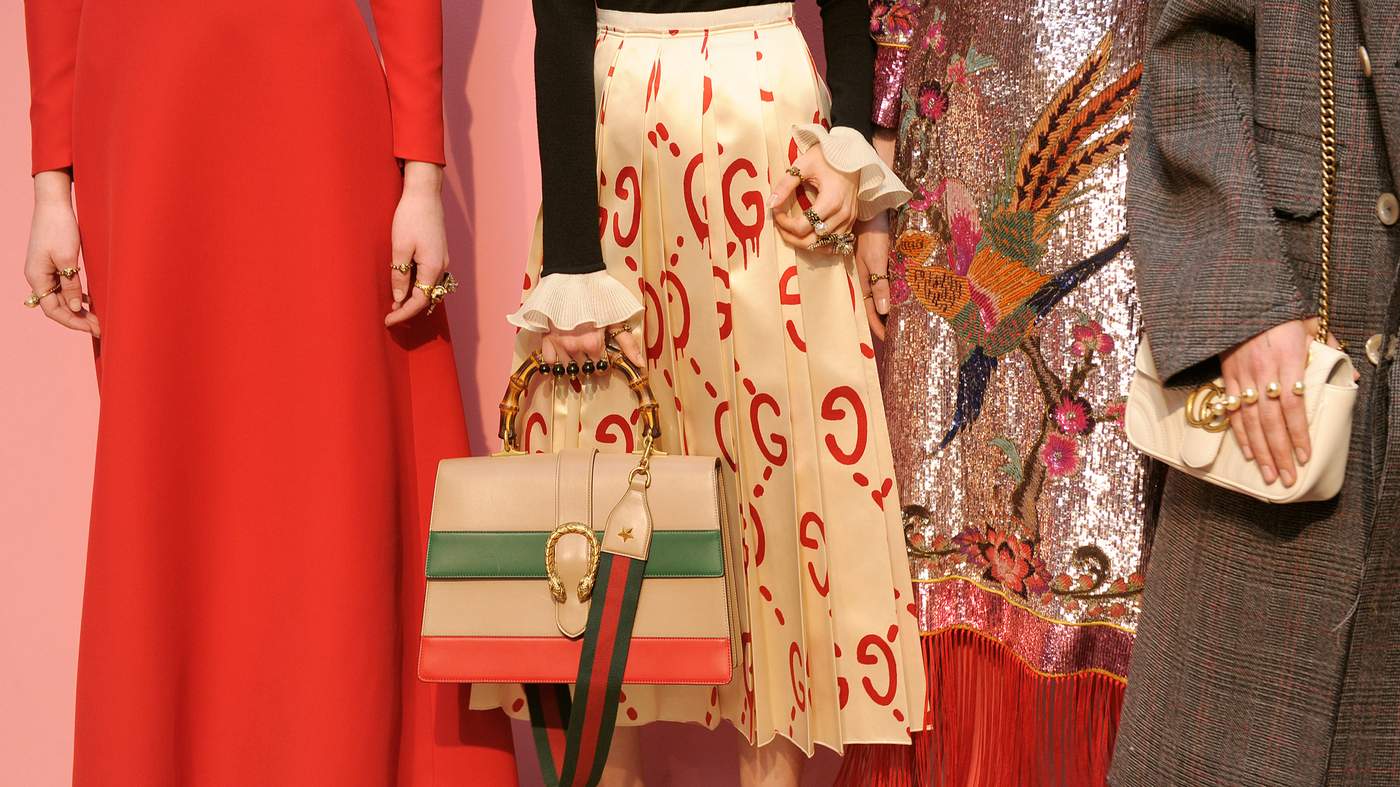
Japonisme
The rich cultural legacy of the East is refracted through the lens of European design
From left: Ralph Lauren, Gucci, Fendi, Alberta Ferretti, Anna Sui, Comme des Garçons, DSquared2. Catwalking.com
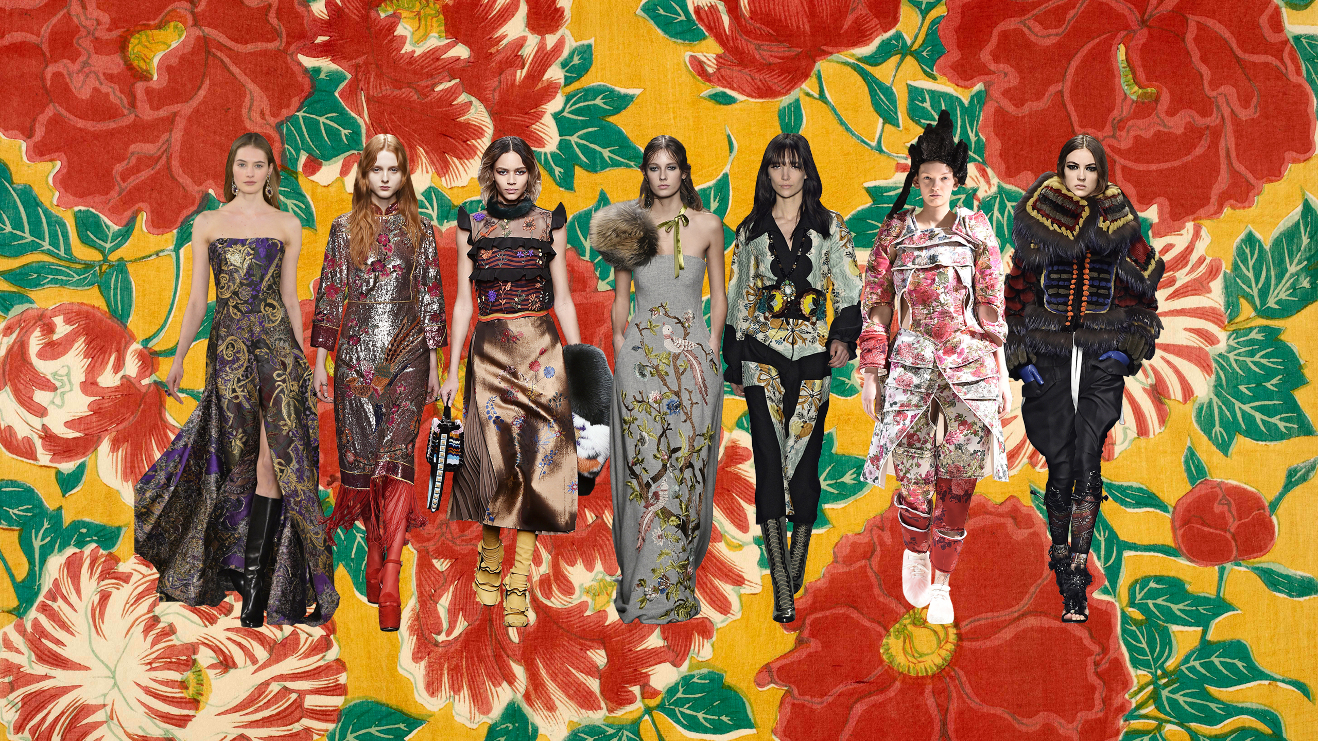
“Don’t ask me where I found it,” said Karl Lagerfeld of the 18th-century Japanese botanic print he had used to inspire the closing looks at Fendi AW16. “But I find everything.”
The resulting golden jacquard, woven with tiny vivid flowers, was exquisite and deeply sensual. “I prefer this to sexy,” observed the designer of the robe dresses and jackets he had created. “So much more refined, and chicer.”
Lagerfeld is not the first to have refracted the rich cultural legacy of Japan through the lens of European design. At the Paris world’s fair in 1867, a pavilion dedicated to the arts and crafts of Japan precipitated a fever for the textiles, porcelains and woodblock prints of the country which was closed to Western trade for 200 years until 1853. Along with its counterpart Chinoiserie, the fashion for Japonisme transformed the interiors, dress codes and boudoirs of the 19th century European haute bourgeoisie. Artists such as James Tissot, William Merritt Chase and Robert Lewis Reid captured society hostesses adorned in kimono-style robes, standing against printed silkscreens, or leaning artfully against lacquerware furniture while toying with an oriental fan.
The signatures of Japanese design are now so built into our sartorial culture we barely notice them, and there were many at the AW16 shows: it was there in the sumptuous purple brocades at Ralph Lauren, as heavy and comforting as kimono silks; and in the shimmering sequinned cherry-blossom embroideries at Gucci; and a grey gown at Alberta Ferretti illustrated with embroideries of birds and flora.
Many of these Japanese accents were the nostalgic blooms of old world exotica. At Comme des Garçons however, the 73-year-old designer Rei Kawakubo brought the spirit of Japonisme right up to date with a collection dedicated to the “18th Century Punk.” Her 17 looks combined panniers, stomachers and corsets all covered in gorgeous floral brocades in designs that at once recalled the extravagances and textural splendour of Versailles, and the articulated armour of the Samurai. The juxtaposition of cultural languages made for a powerful new look, as arresting in 2016 as it must have been for those visitors crowding into the pavilions all those decades ago.
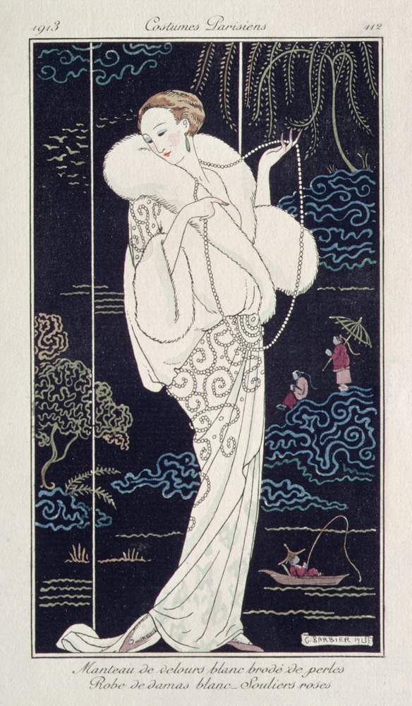
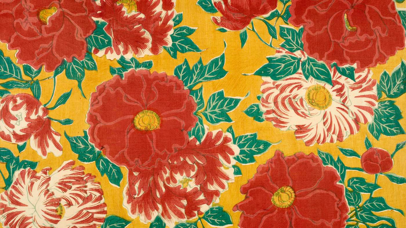
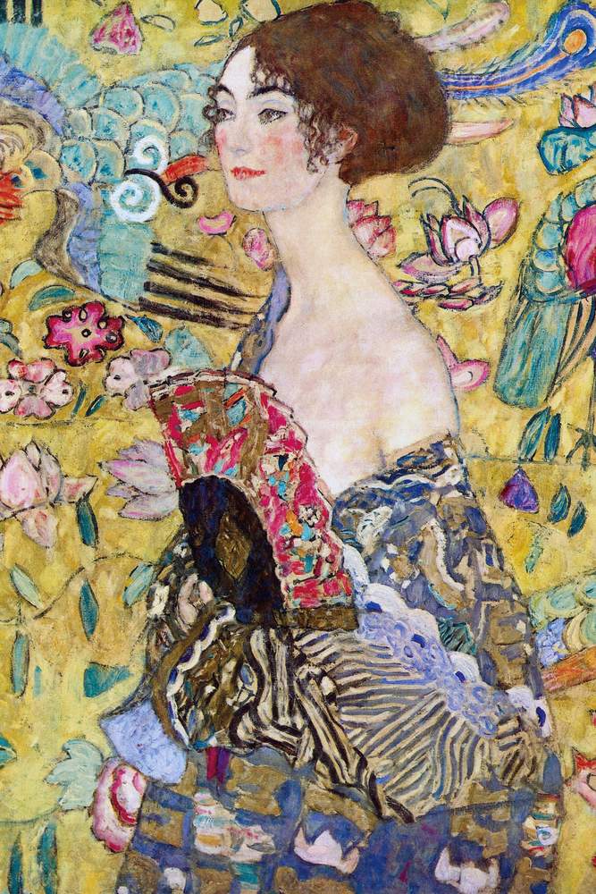
Japanese floral design, from the Olga Hirsh Collection of Illustrated Papers; Lady with a Fan, Gustav Klimt, 1917-18; White Velvet Mantle Embellished with Pearls, Georges Barbier, from ‘Journal des Dames et des Modes’, 1913
British Library/Bridgeman; Leopold Collection/Bridgeman; ©Trustees of the Chester Beatty Library
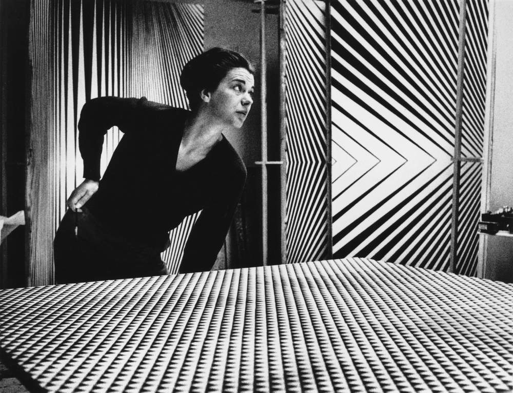
Op Art
The dynamic ideas first explored by 1960s artists offer a tantalising challenge for those designing for the body
From left: Emporio Armani, Courrèges, Marni, Issey Miyake, Victoria Beckham, Salvatore Ferragamo, Fendi, Haider Ackermann, Sportmax, Emilia Wickstead. Catwalking.com
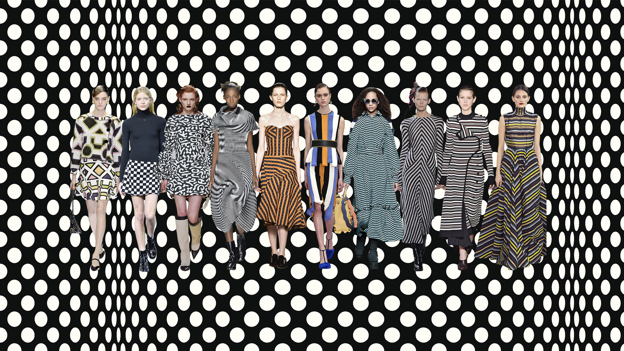
Bridget Riley, Victor Vasarely, Julian Stanczak – the spirit of Op Art was writ large at the AW16 shows where designers played with the same chromatic graphics that so fascinated the 1960s artists who came to define the youthful optimism of the age. The compliment hasn’t always been so gratefully received: Bridget Riley took legal action against the commercial exploitation of her work in the 1960s and has remained at a polite distance from fashion ever since.
As an exercise in monochromatic trompe l’oeil, the ideas first explored by the Op Art artists offer a tantalising challenge for those designing for the body. At Emilia Wickstead, Sportmax, Victoria Beckham and Salvatore Ferragamo, it was the graphic stripe that took centre stage, banded across the evening wear and dresses in bisecting panels which looked clean and modern without being overwhelming.
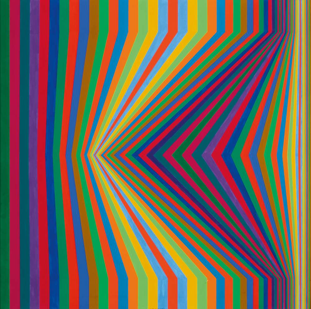
At Fendi, Marni and Delpozo the lines took on a woozy curvature; at Fendi, designer Karl Lagerfeld had used a wave (“not a ruffle”) to ripple across full-skirted shirt dresses. At Marni, the squiggly monochromatic prints and elliptical silhouettes were more organic in style. While at Issey Miyake, the designs were so convincing it leant the clothes a dynamism as dizzy-making as any kinetic sculpture: the patterns seemed to zoom in and out of focus as they spun around the body.
Bridget Riley with some of her works; Berc by Victor Vasarely, 1967. The Hungarian-Franco artist is being celebrated in France with a three-part exhibition of his work in Avignon, Aix and Gordes, until October 2
Atypeek; Romano Cagnoni/Hulton; Berc, 1968 (tempera on panel), Victor Vasarely (1908-97)/private collection/Bridgeman
Armani:
my life in art
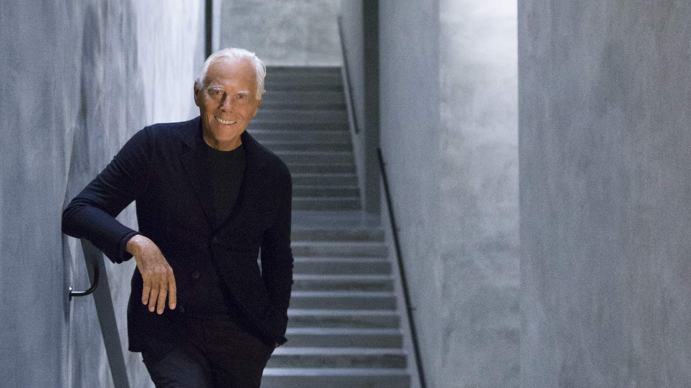
A master himself, who can inspire Giorgio Armani? The Italian designer talks about his life in art
GIORGIO ARMANI: Q&A
What is the relationship between art and fashion? They are both disciplines capable of expressing all the complexity of modernity and sharing its roots. We can see this in exhibitions of art and fashion, which are now organised and presented on the basis of the same criteria of taste and quality – with clothes chosen as if they were works of art and art chosen and exhibited with all the brilliance of fashion.
Were you exposed to art early in life? It was a series of personal discoveries, based on emotions. It started when I was at high school in Milan, where my family moved just after the war. As I explored the city, I came across its great works of art and magnificent churches. I learnt to like modern and contemporary art upon maturity, when I questioned art and its practices, just as fashion questions itself.
Do you collect art? I have a complicated relationship with collecting, which I always connect with a meeting, a relationship or a sentiment, so I have portraits, drawings and photographs that are often given to me by people I work with.
Is fashion an art or a business? It is both: a form of artistic expression when it is elevated and goes beyond the need to dress, and yet a business at the same time. This is just like the art world, where the success of certain names is constructed by the gallery owners, who invent a market for them.
Do you think consumers recognise the influence of art on your work? I don’t know. I certainly don’t insist on reminding them of it. It’s one of many notes in the margin. There’s no need to talk about it just to get a few more positive comments.
Do you see yourself as a postmodernist? I don’t think of myself as a surrealist or a postmodernist – I think there is a time for every form of art. I am a designer who designs clothes, accessories and furniture on the basis of a specific aesthetic vision.
Has showing your work in your Milan exhibition space, Silos, made you see it differently? It made me think about how my work has evolved, about my influences, which may be social, musical, visual or even personal, and how these have driven change in what I do. It was difficult to select the outfits to display, and to exclude others, because every one of them has a special history, and I love them all.


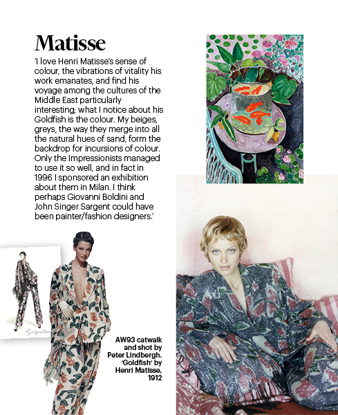
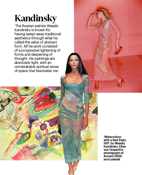
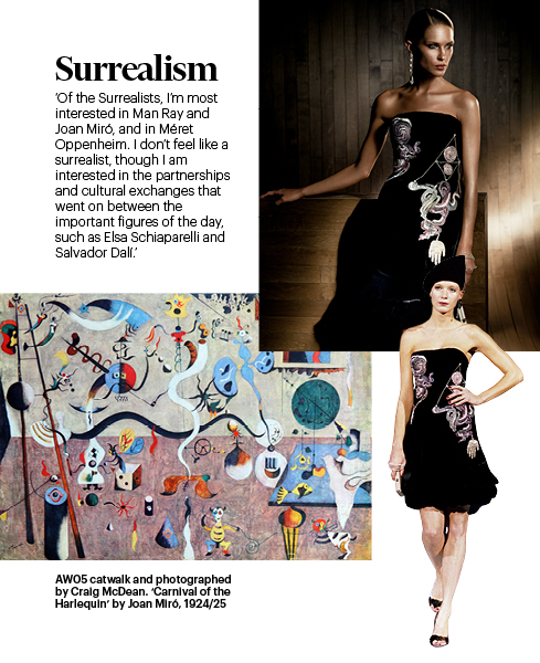
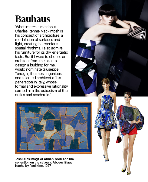
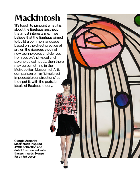
Gauguin: ©Fine Art/Alamy; Matisse: © Succession H. Matisse/ Dacs 2016; Kandinsky: Private Collection/Bridgeman; Miro: World History Archive/Alamy; Klee: Artsimages/Alamy; Mackintosh: Steve Vidler/Alamy. Fashion images courtesy of Giorgio Armani
Fashion Calendar


Editor Jo Ellison (jo.ellison@ft.com) Design Giulio Cipone, Gabriela Izquierdo, Alexander Kozlowski, Kati Lopez, Kostya Penkov, Harriet Thorne Contributors Grace Cook, Aimee Farrell, Hilary Kirby, Carola Long, Ruth Metzstein Commercial Chris Nardi, Jo Thompson, Alexis Williams
For all advertising enquiries please contact Alexis Williams: +44 (0)20 7873 4216, alexis.williams@ft.com