The muse can be a difficult word for modern readers. It sounds too passive for some. Too neutral. Some find it altogether sexist. And yet some partnerships do create artistic alchemy. There’s a special kind of magic in work that captures a “real-life” relationship, those intimacies we are invited to share. Fashion especially endows the muse with unusual powers: photographers can get forgotten and, today, it is often the model whose name lives on.
Kate Moss was only 17 when she went on holiday with the photographer Mario Sorrenti. The teenage Moss, yet to claim her place as the world’s most famous face, was in her career infancy. And yet the resulting images have become some of her best known – a woman on the verge of global stardom, but still quite oblivious to her strengths. The pictures, some of which are seen in this issue, find her swimming, eating, sleeping and mostly starkers. All are presented as evidence of Sorrenti’s then “obsession” – they later split up. And we all fell for her thereafter.
This seventh issue of the Art of Fashion traces many more obsessions. The artist Reilly takes a trip round the National Gallery to examine the pictures that have inspired the bold, vivid graphics in his work with different fashion brands. The British designer Margaret Howell looks at the Mid-Century movements that have been informing her plain-speaking style since 1970. And the US designer Thom Browne offers us a lesson in how a career-long obsession with grey flannel has fired his most fantastical creations.
Jo Ellison, Fashion Editor, FT
Cover stories


How did Richard Bernstein airbrush his way into history?
Before Instagram, there was Interview. The magazine founded by Andy Warhol in 1969 – and finally closed this May – helped fuel the rise of celebrity culture with its escapist mix of art, pop, fashion and society. And the ice in the cocktail was always the cover, with stars from Liza Minnelli to Michael Jackson airbrushed and enhanced into a unparalleled vision of glamour by the magazine’s cover artist Richard Bernstein.
Bernstein never achieved anywhere near Warhol’s level of fame. But, as Roger Padilha writes in a new book, his “images turned ingénues into stars, stars into superstars, and superstars into megastars”. In her foreword for Richard Bernstein Starmaker: Andy Warhol’s Cover Artist, his friend Grace Jones explains that, “Richard’s art made you look unbelievable. Everything he did was beautiful, the colours, the airbrushing – he could make something out of nothing… In a lot of these pictures I didn’t have much make-up on, actually. He did the make-up on you. And it was magic.”
Born in 1939, Bernstein moved from Long Island to New York City to study at the Pratt Institute. His early artworks incorporated tinted photographs and cut-out and collaged imagery, featuring everything from Jell-O to iconic figures such as the Kennedy brothers. He made his artistic debut in Amsterdam in 1968, with an exhibition which included a poster with the Beatles’ faces superimposed onto naked bodies.
The combination of nightclubbing and networking was central to Bernstein’s career, and it was at Max’s Kansas City in Park Avenue, amid a hip art and fashion crowd, that he first connected with Warhol. Later, through Elsa Schiaparelli’s granddaughter, the photographer Berry Berenson, he socialised with the designers Halston and Calvin Klein, Valentino and Elsa Peretti, and was introduced to US Vogue editor Diana Vreeland.
Bernstein’s first cover for Andy Warhol’s Interview – as it was initially known – was in 1972. It depicted the model and actress Donna Jordan colourised to resemble a disco update on Warhol’s famous silkscreens of Marilyn Monroe. By 1975 he had evolved a new style involving heavily airbrushing his subject’s portraits, and using coloured pencils, collage and pastels to create a fantasy version of them.
After Bernstein started to party at Studio 54 in the late 1970s, cover stars such as Madonna took on what Padilha describes as “an even bolder energy. They glistened like the throngs of sweaty Studio attendees dancing all night long, eyes shadowed in electric greens and yellows like the resident drag queens of the club.” This vivid aesthetic was also seen in his considerable work outside Interview, including a 1985 poster for fashion brand Fiorucci, depicting drag artist Divine, and album artwork for Grace Jones, who fused the worlds of art, music and fashion to create her diva-with-a-hint-of-danger image.
For Bernstein, the party started to come to an end after Warhol’s death in 1987, when a new editor phased him out and commissions became more sporadic. He died in 2002. Artist John Loring, with whom he had shared a studio, believes his legacy is “a terrific social document of… the celebrity worship of the times, of the look of the time, of what celebrity was and wasn’t… And it’s extraordinarily pleasing to look at.” He was the man who made stars shine. Carola Long
Richard Bernstein Starmaker: Andy Warhol’s Cover Artist by Roger Padilha and Mauricio Padilha is published by Rizzoli on 7 September, £79.95

How did Richard Bernstein airbrush his way into history?
Before Instagram, there was Interview. The magazine founded by Andy Warhol in 1969 – and finally closed this May – helped fuel the rise of celebrity culture with its escapist mix of art, pop, fashion and society. And the ice in the cocktail was always the cover, with stars from Liza Minnelli to Michael Jackson airbrushed and enhanced into a unparalleled vision of glamour by the magazine’s cover artist Richard Bernstein.
Bernstein never achieved anywhere near Warhol’s level of fame. But, as Roger Padilha writes in a new book, his “images turned ingénues into stars, stars into superstars, and superstars into megastars”. In her foreword for Richard Bernstein Starmaker: Andy Warhol’s Cover Artist, his friend Grace Jones explains that, “Richard’s art made you look unbelievable. Everything he did was beautiful, the colours, the airbrushing – he could make something out of nothing… In a lot of these pictures I didn’t have much make-up on, actually. He did the make-up on you. And it was magic.”
Born in 1939, Bernstein moved from Long Island to New York City to study at the Pratt Institute. His early artworks incorporated tinted photographs and cut-out and collaged imagery, featuring everything from Jell-O to iconic figures such as the Kennedy brothers. He made his artistic debut in Amsterdam in 1968, with an exhibition which included a poster with the Beatles’ faces superimposed onto naked bodies.
The combination of nightclubbing and networking was central to Bernstein’s career, and it was at Max’s Kansas City in Park Avenue, amid a hip art and fashion crowd, that he first connected with Warhol. Later, through Elsa Schiaparelli’s granddaughter, the photographer Berry Berenson, he socialised with the designers Halston and Calvin Klein, Valentino and Elsa Peretti, and was introduced to US Vogue editor Diana Vreeland.
Bernstein’s first cover for Andy Warhol’s Interview – as it was initially known – was in 1972. It depicted the model and actress Donna Jordan colourised to resemble a disco update on Warhol’s famous silkscreens of Marilyn Monroe. By 1975 he had evolved a new style involving heavily airbrushing his subject’s portraits, and using coloured pencils, collage and pastels to create a fantasy version of them.

After Bernstein started to party at Studio 54 in the late 1970s, cover stars such as Madonna took on what Padilha describes as “an even bolder energy. They glistened like the throngs of sweaty Studio attendees dancing all night long, eyes shadowed in electric greens and yellows like the resident drag queens of the club.” This vivid aesthetic was also seen in his considerable work outside Interview, including a 1985 poster for fashion brand Fiorucci, depicting drag artist Divine, and album artwork for Grace Jones, who fused the worlds of art, music and fashion to create her diva-with-a-hint-of-danger image.
For Bernstein, the party started to come to an end after Warhol’s death in 1987, when a new editor phased him out and commissions became more sporadic. He died in 2002. Artist John Loring, with whom he had shared a studio, believes his legacy is “a terrific social document of… the celebrity worship of the times, of the look of the time, of what celebrity was and wasn’t… And it’s extraordinarily pleasing to look at.” He was the man who made stars shine. Carola Long
Richard Bernstein Starmaker: Andy Warhol’s Cover Artist by Roger Padilha and Mauricio Padilha is published by Rizzoli on 7 September, £79.95


The secret to branding starts with the Renaissance, says fashion’s favourite graphic artist. Charlie Porter reports
‘I love this kind of stuff,’ says Reilly, an illustrator and graphic artist, standing in front of The Ambassadors by Hans Holbein the Younger. Reilly requests anonymity, even though he has 116,000 followers for his Instagram account @hey_reilly and has recently collaborated with the Italian luxury house Fendi. He is Scottish-born, slight and boyish, at a guess in his mid-forties.
We are at the National Gallery because Reilly, who recently moved to Hastings after a couple of decades living in London, wanted to meet somewhere near Charing Cross Station. Since we are here to talk for the Art of Fashion, a wander round a gallery seemed a nice idea. It works. Meeting Reilly backstage at the Fendi menswear show in January, he was so nervous that he could barely speak. But in front of art, Reilly is eager and affable, especially when talking about the fashion cut-up Instagram posts that have made his name.
“I love using this kind of stuff in my work as well,” he says. The Ambassadors, painted in 1533, shows two bearded gentlemen draped in extravagant robes – the volume of cloth then denoting power but nowadays seen as feminine. “They look so modern,” he says. “If you take them out of context and look at them, it’s phenomenal. They could have been in the Valentino show.”
Reilly often plays with branding in his work, always without consent. One such image, posted in February last year, reimagined the Fendi logo using the lettering of sportswear brand Fila. It made a succinct comment on the 21st-century clash between high and low in fashion. It also caught the eye of Silvia Venturini Fendi, the brand’s creative director of accessories and menswear. “Honestly, when I got that first message from Fendi I thought I was going to be sued,” says Reilly.
The opposite was true. Reilly was given free rein to create cut-up imagery for the men’s AW18 collection. Further collaborations were developed when Karl Lagerfeld chose to use the Fendi/Fila graphic on T-shirts in his Fendi’s womenswear AW18 collection.
Reilly’s work shows the massive importance of social media in the luxury goods industry. To produce the T-shirts, Fendi and Fila are not collaborating, nor has money changed hands between the brands. Both clearly understand the social media pull of such an improbable mash-up, and the benefit to their millennial credibility. “They have been so free with me,” says Reilly of Fendi. “Silvia said, go for it. I thought there was no way they would but she said, just do it.”
Holbein’s painting in front of us is full of visual codes and riddles, in particular a warped skull extending across the bottom of the work. “It’s so loaded,” says Reilly. His own prints for the Fendi men’s collection included seemingly random juxtapositions: a horse with a dice on its back, stood on a lump of cheese. “I was thinking, what does it actually mean to me? Why is that a strong image? It’s got to mean something.”
Reilly believes that the secrets of fashion branding and imagery connect with the coding found in Renaissance art. “It’s all myths and icons,” says Reilly. “People project onto them. We only know what history tells us,” he says of The Ambassadors. “Holbein knew what he was doing, but then it gets repackaged and it becomes a whole new myth. It can keep travelling and travelling. The further we go on, the more it changes and becomes a different story.” Likewise, brands and their logos have power and meaning without anyone really understanding why.
Reilly hasn’t been in a museum for a couple of months. “They only get glanced at on holidays and high days,” he says of the paintings which often inspire his work. “It’s great how the social network has got all these budding artists learning a new form of art just through looking at other people online. Digital collage, whatever you want to call it, I think it’s great.”
A school group arrives in front of the painting. “Run,” says Reilly. As we walk away, he gives some background: the first in his family to go to college, he studied textiles in Dundee, then printed textiles and menswear at the Royal College of Art in London. He spent a few years painting, then fell back into fashion, doing his own streetwear label for a while. Now he does freelance graphics and illustration, with Instagram art on the side.
Our next stop is The Arnolfini Portrait by Jan van Eyck. “Ri-donk-ulous,” says Reilly. He points to the male of the austere couple, dressed to the nines yet parsimonious of expression. “Look at him in his Stephen Jones hat,” he says, referring to the British milliner who makes headwear for everyone from Dior to Comme des Garçons. Reilly points to the ruching. His eye goes to all the other odd details in the painting.
“Is that a pair of really amazing sandals down there in the left-hand corner or am I seeing things?” It’s a pair of wooden platform sandals with extremely pointed toes, like a rejected design by Vivienne Westwood. The work was painted in 1434. “Look at them!” says Reilly. “I’m going to fashion a pair of them when I get home. Get me two leather belts and a tree and I’ll be out of the door.”
We head to Piero della Francesca 1470 work The Nativity. “It’s quite a mad painting when you look at it,” says Reilly. “It almost looks unfinished.” Has he seen the ghost of a donkey in the stable? “He’s got transparency of 30 per cent on. Like it’s been Photoshopped.”
Reilly taught himself digital design. “I just bought a computer and thought I should probably get to know these things,” he says. “Before I was doing everything by hand. That’s what I love doing. But after a while all these people were battering things out really quickly and I’m there spending three weeks mixing paint.”
Reilly was born in a village outside Glasgow. His family is working class, creative-minded and supportive. “I was about eight or nine when I started cutting up clothes,” he says. “I was unpicking them, and taking them in really badly. I taught myself how to sew. I felt compelled to do it.” He was also expressive. “I started painting on my clothes. My brothers are quite happy to remind me, ‘Remember when you painted that big parrot on the back of your Hawaiian shirt?’
“I’m not sure that anyone from my family would have been interested in luxury brands,” he says. “Brands like Fendi weren’t even on my radar. Kids today are so well-informed, so into them. The brands have 12-, 13-year-olds queuing down the block. I knew about my streetwear but I was going to a market stall and buying a knock-off of whatever was cool.”
Instagram began as a hobby. “I was treating it like a brain dump,” he says. “No one was paying a blind bit of notice and I was more than happy with that.” Then, people started to spot his work. The late stylist and jewellery designer Judy Blame asked Reilly to collaborate on a shoot. “He was really brilliant in throwing it open to me,” says Reilly. “He said, let’s go for it, do what the hell you want.”
The Fendi/Fila post was the result of playing around with cross-pollinating logos (Prada using the lettering of Crocs was another that he did) and posting them online. “They sat there for two months,” he says, “and nothing.” Then they went viral. “I think it was the stylist Alastair McKimm who saw them, tagged someone, who tagged someone else, and it blew up.”
Fendi came calling. Reilly is still in disbelief that the brand would want to work with him. “I thought they’d be running a mile,” he says, “but they seem to be really excited about it. I don’t know if it’s a shift in a market.”
It is. Right now, all that’s selling in fashion is anything loud, logo-ed and extreme. It’s about novelty. “That’s actually a brilliant word for it,” says Reilly. “That in itself is re-appropriating a word and giving it back its original meaning in the present day. It’s a novelty item. That’s great. That’s going on a T-shirt.”
Reilly has just started a small T-shirt range using his Instagram imagery but has no plans to formalise his output. “I post whenever I feel like it. If something happens and I have a knee-jerk reaction, I’ll do a post. I can sometimes sit for three or four days and not do it.”
Can he exploit his account, like the myriad influencers who get paid by brands to post? “I don’t want it to be a job,” he says. “This is just fun. That’s how I want it to stay. I don’t want to become this advertising thing. It’s not the place I’m coming from.”
He is enraptured by the National Gallery. “I would love to work with an institution like this,” says Reilly. “Working my way round the artworks and reimagining them in my style. It would be perfect.”

Reilly’s illustration for Fendi menswear. Courtesy of Fendi
Reilly’s illustration for Fendi menswear. Courtesy of Fendi

Reilly’s Fendi/Fila graphic on a Fendi womenswear T-shirt
Reilly’s Fendi/Fila graphic on a Fendi womenswear T-shirt

Reilly’s illustration for Fendi menswear. Courtesy of Fendi
Reilly’s illustration for Fendi menswear. Courtesy of Fendi

Fendi menswear show
Fendi menswear show

Reilly’s illustration for Fendi menswear. Courtesy of Fendi
Reilly’s illustration for Fendi menswear. Courtesy of Fendi


A Robert Mapplethorpe portrait of his lover, collaborator and muse Patti Smith, 1979 ©Robert Mapplethorpe Foundation. Used by permission
A Robert Mapplethorpe portrait of his lover, collaborator and muse Patti Smith, 1979 ©Robert Mapplethorpe Foundation. Used by permission

Audrey Hepburn in Givenchy ©Norman Parkinson Archive/Iconic Images/Getty Images
Audrey Hepburn in Givenchy ©Norman Parkinson Archive/Iconic Images/Getty Images
The artist and his muse are a potent combination. Carola Long explores the relationships that have changed the face of fashion
“I remember sitting next to her and feeling like my heart was going to stop. I was completely overwhelmed by her charm and beauty.” That’s how the Italian photographer Mario Sorrenti describes his first meeting with Kate Moss in a new book of his previously unpublished images of the model. Their encounters in the summer of 1991, first at a fashion shoot, then at a party in South Kensington, were the start of a two-year affair during which she became his girlfriend and muse for some of the most memorable fashion images of the decade.
“Kate and I would hang out and take pictures all the time,” writes Sorrenti. “Being broke made printing my photographs a luxury that I could rarely afford, so I would make contact sheets, cut out the images I liked and tape them into a diary to keep track of what I was shooting. She was a big part of my life.”
In 1993 Calvin Klein was so taken with Sorrenti’s diaries that the photos became the basis for the Obsession fragrance campaign that launched Moss’s career. These photos show the (largely naked) 17-year-old before her flawless face became as famous as the Mona Lisa’s: hanging up a bikini on a makeshift washing line, or swimming in a natural pool, her unmade-up beauty mirroring the wildness of the desert island setting. There’s an intimacy and authenticity which sets these images apart from the usual commercial seduction between model and consumer.
Since then, Moss has been described as a muse for photographers and designers from Corinne Day to Alexander McQueen, and the fragrance she released in 2010 was called Vintage Muse. She is one of only a handful of models who have been elevated to the status of muse, helping to shape the zeitgeist and bring shoots alive. Others in the exclusive group include Jean Shrimpton, posing for David Bailey in the 1960s, Nicolle Meyer, who appeared in Guy Bourdin’s 1970s photographs, the “Supers’’, and their celluloid rapport with Peter Lindbergh in the 1990s, and Daria Werbowy looking a little bit inscrutable for lookalike designer Phoebe Philo at Céline.
Being a muse suggests a particular magic, an ability to stir up creative powers and help the artist weave their spell. In both art and fashion, it is an intriguing and complex relationship, although not always an entirely balanced one.
The concept of the muse originated in Greco-Roman mythology, coming from the goddess daughters of Zeus who inspired creativity in liberal sciences and the arts. They have often been depicted as passive objects of beauty, inviting the viewer to judge and appreciate them. This is an attitude art critic John Berger picked up on in his seminal 1972 television series Ways of Seeing in which he says, “a woman in the culture of privileged Europeans is first and foremost a sight to be looked at”. He believed that women absorbed this patriarchal norm, and that “men look at women, women watch themselves being looked at”.
And while today there are numerous female artists, from Cindy Sherman to Nan Goldin to Marina Abramovic, with their own muses, be they abstract characters or real people, in the Western art canon it’s often been women playing the muse to the famous male artist. Pablo Picasso had at least six such relationships, including with the surrealist photographer Dora Maar who was the basis for Weeping Woman, and Fernande Olivier who was a model for Les Démoiselles d’Avignon. When their split left her near destitute she wrote a sensational memoir about their time together.
In October, the Barbican Art Gallery in London will host the exhibition Modern Couples: Art, Intimacy and the Avant-Garde, which curator Jane Alison says “is full of muses”. One of the aims is to highlight the role of the muse in numerous artistic collaborations. “It is so important to rethink their place,” says Alison. “Usually a woman, the muse has all too frequently been written off as simply decoration, something solely to be looked at. I believe that this has meant that so-called ‘muses’ who were also artists were then marginalised.”
Camille Claudel, for instance, had a tempestuous relationship with Rodin, and her work as a sculptor was overshadowed by his. Alison also notes that, “the muse was frequently actively engaged in shaping their own identity – in fact, an active participant in the work of art, in which she/he is also the subject.”
As well as partnerships such as that between the Bauhaus artist Lucia Moholy, and her husband Laszlo Moholy-Nagy, in which he received the credit for their ground-breaking photos, there are several examples of reciprocal relationships in the Barbican exhibition, such as that between photographer Alfred Stieglitz and his wife Georgia O’Keeffe, the painter, and photographers Man Ray and Lee Miller. Alison says “it is quite clear that O’Keeffe was very involved in the shaping of a vast body of work that allowed her to perform different aspects of her identity – earth goddess, dandy, religious icon, empowered woman. They were co-conspirators in this process.”
Lee Miller was active in shaping the way that she was presented in the photos and, like O’Keeffe, was an artist in her own right. There are also examples of women artists inspired by men. “Diego Rivera was a kind of muse for Frida Kahlo and Max Ernst for Dorothea Carrington,” says Alison. The show also explores “same-sex relationships where the idea of the muse is very much in evidence – for instance Romaine Brooks’ stunning portrait of Luisa Casati, with whom she had a liaison.”
Though radically different in their aesthetic and time, Robert Mapplethorpe’s portraits of his lover, collaborator and muse Patti Smith have a similar power. No one but Mapplethorpe could have taken a portrait like the one on the cover of her 1975 album Horses. No fashion shoot has bettered the vision of nonchalant androgyny conveyed by her white shirt and undone skinny tie, and Mapplethorpe captures the raw originality of her personality.
Another potent partnership between a photographer and his model muse was that of Irving Penn and Lisa Fonssagrives. In 1950 Penn was sent to Paris by US Vogue to photograph the haute couture collections. When the incredibly poised Fonssagrives came to his studio Penn was swept off his feet, just as Sorrenti was by Kate Moss. He later recalled, “when Lisa came in, I saw her and my heart beat fast and there was never any doubt that this was it”. They married that year. The model, who trained as a dancer, had a deep understanding of posing and posture, as well as an interest in photographic techniques, which helped Penn to take some of the most striking and elegant fashion images of the 1950s.
It was in the same decade that designer Hubert de Givenchy met Audrey Hepburn, who went on to become his lifelong friend and muse. Their friendship began in 1953 when Givenchy provided Hepburn’s costumes for the film Sabrina, and reached its cultural pinnacle when he designed her little black dress with cutaway back for Breakfast at Tiffany’s. While platonic, their relationship had a creative frisson – Givenchy described it as “like a special love affair” – and it’s inconceivable that he could have created such a perfect vision of understated sophistication for anyone but the gamine Hepburn.
It was a partnership celebrated by Givenchy’s artistic director Clare Waight Keller in her most recent couture collection for the house. With the dreamy tones of “Moon River” playing in the background the catwalk show closed with a long black hooded gown featuring a curved detail at the back which echoed the Breakfast at Tiffany’s dress. Following Hubert de Givenchy’s recent death at the age of 91, Waight Keller was paying homage to the designer, revisiting his archives and the utter elegance of his clothes. The invocation of a founder’s aesthetic spirit can also be seen at Chanel, where Karl Lagerfeld collections for the house are invariably inspired by aspects of Coco Chanel’s life and legacy.
The designer Peter Dundas, who is known for his gang of photogenic jet-set friends, says a muse “can be someone I aspire to dress or someone iconic in fashion or music history, although it is of course great when I can have an active dialogue with my Dundas girls”. His glossy muses help shape his sequinned, embellished and fringed confections. He says they “embody the spirit of the house or part of my brand aesthetic. A muse is an inspiration, a sounding board, even a benchmark when working on a collection. I collaborate with some on parts of Dundas and others inspire me by wearing the collection. Eugenie Niarchos and Bianca Brandolini are close friends who try on the clothes and give me wish lists of what they need. Stylist and friend Marie-Lou Bartoli and I often vintage shop together in LA or New York. In addition to having great taste she looks amazing in my clothes. Beyoncé and Natasha Poly inspire me and fuel my imagination.”
Dundas highlights the modern merging of the role of muse with that of influencer, saying that today “often a muse is also a brand ambassador either officially or unofficially”. In the social media age, empowered by “likes”, the muse has a new reach and relevance that many of her predecessors could only dream of.
‘Modern Couples: Art, Intimacy and the Avant-Garde’, is at the Barbican Art Gallery, London from 10 October to 27 January; ‘Kate’ by Mario Sorrenti is published by Phaidon on 7 September, £79.95
The good sets guide


Flora Macdonald Johnston takes a trip down AW18’s most extraordinary catwalks
CHANEL
Into the woods
‘A forest has grown beneath the nave of the Grand Palais. Surrounded by blue sky warmed by a gentle sun, trees stripped bare by the season and a floor covered with autumn leaves compose an Indian summer,’ wrote Karl Lagerfeld of his AW18 show. Within the cavernous Grand Palais in Paris, the designer created a living forest – nine real oaks were transported from western France to sit along a central axis, and the entire floor was covered in fallen leaves to create a ‘woody’ aroma. A panorama of trees edged the set while a giant mirror reflected the scene, in infinite variety, at the end of the catwalk.
Lagerfeld’s clothes were no less autumnal. A palette of reds, deep orange, brown brogues in gold oxide leather and dark green tweeds, the experience recalled Impressionist paintings by Monet, such as ‘The Bodmer Oak, Fontainebleau Forest’ (1865), with its blended tones melting into one brilliant image.


Gucci AW18 catwalk show
Gucci AW18 catwalk show
GUCCI
The monster mash
Alessandro Michele, renowned for the gargantuan scale of his Gucci sets, sought to create greater intimacy for his AW18 show. His surgical theatres, painted in perfect hospital-gown blue, featured real operating tables, articulated theatre lights and surgical white sheets. Such an antiseptic space had an unnerving sterility. Low ceilings and bright lights added to the sense of entrapment. PVC was used on the walls and floor, there were fire doors with panic bars and LED lamps. The audience, seated on banks of plastic waiting-room chairs, yelped when the models emerged, some carrying severed heads or sleeping baby dragons.
Michele’s collection was an examination of the hybrid, in which the designer had cast himself as a Dr Frankenstein. One of the models even had a third eye protruding from her forehead. There were strange, hallucinogenic details in the clothes. Michele is a master storyteller – and this was one of his spookiest yet.

CALVIN KLEIN
American gothic
At Calvin Klein, creative director Raf Simons took popcorn as a key prop in creating the post-apocalyptic world he staged within the American Stock Exchange building. And then used lots and lots of it. It banked in huge drifts across the show space, dusting shoes in a fine snow of powdered kernels and lending the landscape a strange dystopian edge as models stomped past in their hi-vis jackets, safety boots and balaclavas.
Simons’ AW18 show celebrated the wardrobe of American heroes and featured everything from patchwork quilts to prairie dresses. It was staged around giant battered out-houses decorated with scratched artworks by Andy Warhol. The US mixed-media artist Sterling Ruby provided pom-pom sculptures, which were scattered in the ruins, and Michael Gaubert and Ryan Aguilar’s soundtrack spliced together Simon & Garfunkel and the Mamas & the Papas tracks, adding to the general sense of disorientation.
“It was easy to see these revamped American classics as uniforms for the apocalypse – a smash-and-grab of utility, history, necessity, colours, and pop icons,” said Simons. It popped.

Calvin Klein AW18 catwalk show
Calvin Klein AW18 catwalk show
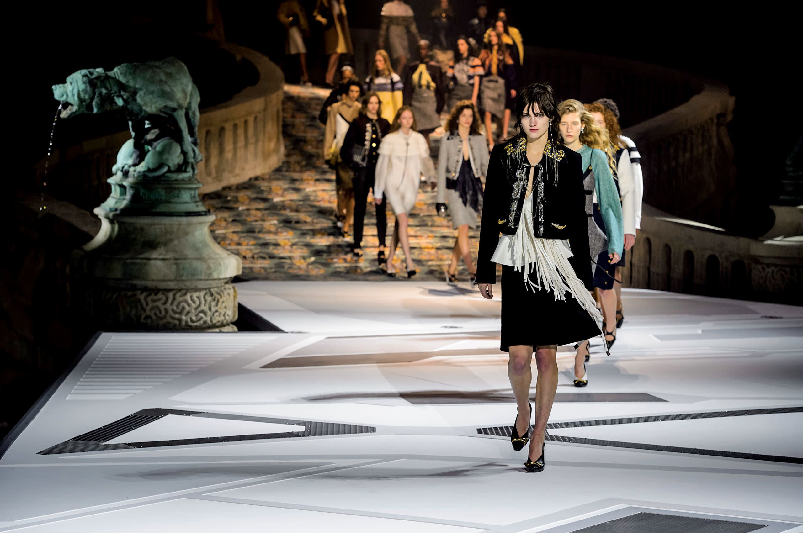

Louis Vuitton AW18 catwalk show
Louis Vuitton AW18 catwalk show
LOUIS VUITTON
Future perfect
To stage the AW18 Louis Vuitton womenswear show, Nicolas Ghesquière meshed space-age futurism and ancient art in the Musée du Louvre’s Cour Lefuel courtyard. A sloped catwalk, simulating the flight deck of a ‘Star Wars’ type spacecraft, ran around bronze Pierre Louis Rouillard sculptures of wolves, dogs and wild boars.
The clothes were a similar hybrid of old and new: models descended the ramp in bourgeois skirts and blazers, carrying circuit-board printed handbags and wearing space-age graphic shoes. “It is a span in time and the dialogue between east and west” said Ghesquière.

BALENCIAGA
Peak performance
For his first collection since unifying mens- and womenswear at Balenciaga, Demna Gvasalia built a mountain. The towering 10-metre high polystyrene edifice was covered in neon graffiti, some of it slogans taken from previous Balenciaga collections. The hillsides read “the power of dreams”, “no borders” and “2-gether”. Its peak was emblazoned with one word: Balenciaga. Of the collection, the most memorable looks were a series of multi-layered coats, featuring hoodies, windbreakers and puffa jackets. Some fused as many as nine different items of outerwear together in huge voluminous silhouettes. The message, like the mountain, was clear: go big or go home.
Thom Browne’s art class


Panniers, portrait painters and padding – Jo Ellison gets a lesson in playful provocation
‘If I could, I would wear a grey suit every single day,” announces Thom Browne from a well-upholstered chair in London’s Claridge’s Hotel. He’s sitting in his customary rig-out of grey flannel shorts, white shirt, grey blazer and waistcoat, and black cotton socks which are pulled to the knee. The US designer who launched his namesake label in 2001, and showed his first womenswear collection in 2003, is famed for his trim, grey suiting, couture-like finishes and tailored urban shorts, and has a perfectionist’s obsession for details. But while his clothes have a certain rigour, his catwalk indulges a different side: the side, perhaps, which wears the knee socks. His shows are a smorgasbord of weird where, from one season to next, you might find inflatable unicorns, moon-faced aliens on stilt-like heels, Alice’s Adventures in Wonderland-style psychotropic, or even, as was the case at his menswear show in June, garden gnomes.
“Everything starts from the collection,” he says of the journey from creative impulse to commercial end point. “I approach the show from a pure design point of view because I really want people to see the fantasy it all starts from. I want you to see things that are provocative or funny or just more interesting than what you would see on the street.”
For his AW18 women’s show, Browne set up an art school in which models painted canvases and the clothes took on strange forms. Grey pannier skirts swelled with padded appendages, while tweed suits were interrupted with body-shaped curves. “The idea came from a project that was proposed to me. I was asked if I were to design a uniform for an artist, who would that artist be? And what would that uniform be?” He chose Elisabeth Vigée Le Brun as his subject but while the project never came to fruition, the idea of using the French portraitist famed for her paintings of Marie Antoinette for the show took hold. “My Vigée Le Brun characters were painting their vision of what they saw themselves wearing in the 21st century,” he says. “So that was the basic premise of the show.”
The combination of court portraiture, flannel fabrications and a performance piece staged to the sound of Madonna’s “Vogue” and Carly Simon’s “Let the River Run”, may not make immediate sense, but Browne insists it’s all quite straightforward. The pannier “was the uniform of the 18th century”; his uniform is the “classic flannel jacket and trouser”. He simply brought the two together. And Carly Simon? “I love the shows to be entertaining. I approach the way that everything is made very seriously. But I love also to throw in something that just makes you smile and throws it off.”
Presumably Browne, whose partner is Andrew Bolton, the head curator of the Metropolitan Museum of Art’s Costume Institute in New York, has no shortage of art references to draw on? And, no surprise, many of his favourite artists are masters of the human form – Antony Gormley, Duilio Barnabè and Alberto Giacometti. “I love strict portraiture,” he says. “John Singer Sargent is one of my favourite painters as well.” Yet he’s cautious of using artworks too literally. “I love to reference things from the past, but then I want to challenge myself to create something ahead of its time. What makes me most excited is to try to do something that people maybe don’t even realise that they need yet or that they want yet.”
Browne knows something about what people might yet want. His early collections, with their shrunken silhouettes, took a while to take hold. “The first three or four years I couldn’t give my collections away,” says the designer who started his career at Ralph Lauren and sold a majority stake in his business to Sandbridge Capital in 2016. “But I stayed true to it because I knew that there was something really interesting about it to me.” He’s since built a $100m business by sticking to his guns. “If I listened to everyone telling me to change it I would probably be out of business now.”

Thom Browne in his customary shorts and waistcoat. Alastair Nicol
Thom Browne in his customary shorts and waistcoat. Alastair Nicol

The Thom Browne AW18 womenswear show
The Thom Browne AW18 womenswear show
Panniers, portrait painters and padding – Jo Ellison gets a lesson in playful provocation
‘If I could, I would wear a grey suit every single day,” announces Thom Browne from a well-upholstered chair in London’s Claridge’s Hotel. He’s sitting in his customary rig-out of grey flannel shorts, white shirt, grey blazer and waistcoat, and black cotton socks which are pulled to the knee. The US designer who launched his namesake label in 2001, and showed his first womenswear collection in 2003, is famed for his trim, grey suiting, couture-like finishes and tailored urban shorts, and has a perfectionist’s obsession for details. But while his clothes have a certain rigour, his catwalk indulges a different side: the side, perhaps, which wears the knee socks. His shows are a smorgasbord of weird where, from one season to next, you might find inflatable unicorns, moon-faced aliens on stilt-like heels, Alice’s Adventures in Wonderland-style psychotropic, or even, as was the case at his menswear show in June, garden gnomes.
“Everything starts from the collection,” he says of the journey from creative impulse to commercial end point. “I approach the show from a pure design point of view because I really want people to see the fantasy it all starts from. I want you to see things that are provocative or funny or just more interesting than what you would see on the street.”
For his AW18 women’s show, Browne set up an art school in which models painted canvases and the clothes took on strange forms. Grey pannier skirts swelled with padded appendages, while tweed suits were interrupted with body-shaped curves. “The idea came from a project that was proposed to me. I was asked if I were to design a uniform for an artist, who would that artist be? And what would that uniform be?” He chose Elisabeth Vigée Le Brun as his subject but while the project never came to fruition, the idea of using the French portraitist famed for her paintings of Marie Antoinette for the show took hold. “My Vigée Le Brun characters were painting their vision of what they saw themselves wearing in the 21st century,” he says. “So that was the basic premise of the show.”
The combination of court portraiture, flannel fabrications and a performance piece staged to the sound of Madonna’s “Vogue” and Carly Simon’s “Let the River Run”, may not make immediate sense, but Browne insists it’s all quite straightforward. The pannier “was the uniform of the 18th century”; his uniform is the “classic flannel jacket and trouser”. He simply brought the two together. And Carly Simon? “I love the shows to be entertaining. I approach the way that everything is made very seriously. But I love also to throw in something that just makes you smile and throws it off.”
Presumably Browne, whose partner is Andrew Bolton, the head curator of the Metropolitan Museum of Art’s Costume Institute in New York, has no shortage of art references to draw on? And, no surprise, many of his favourite artists are masters of the human form – Antony Gormley, Duilio Barnabè and Alberto Giacometti. “I love strict portraiture,” he says. “John Singer Sargent is one of my favourite painters as well.” Yet he’s cautious of using artworks too literally. “I love to reference things from the past, but then I want to challenge myself to create something ahead of its time. What makes me most excited is to try to do something that people maybe don’t even realise that they need yet or that they want yet.”
Browne knows something about what people might yet want. His early collections, with their shrunken silhouettes, took a while to take hold. “The first three or four years I couldn’t give my collections away,” says the designer who started his career at Ralph Lauren and sold a majority stake in his business to Sandbridge Capital in 2016. “But I stayed true to it because I knew that there was something really interesting about it to me.” He’s since built a $100m business by sticking to his guns. “If I listened to everyone telling me to change it I would probably be out of business now.”
Thom Browne in his customary shorts and waistcoat. Alastair Nicol
Thom Browne in his customary shorts and waistcoat. Alastair Nicol
The Thom Browne AW18 womenswear show
The Thom Browne AW18 womenswear show

Elisabeth Vigée Le Brun ‘Self Portrait’ c1782. Universal History Archive/UIG via Getty Images
Elisabeth Vigée Le Brun ‘Self Portrait’ c1782. Universal History Archive/UIG via Getty Images


Margaret Howell AW18
Margaret Howell AW18
Margaret Howell AW18
Margaret Howell AW18

Margaret Howell AW18
Margaret Howell AW18
We all know our G Plan from our Ercol. And it’s largely thanks to this British designer, says Carola Long
One of the first objects that catches my eye in the Margaret Howell shop on London’s Wigmore Street is a book entitled Ornament is Crime. It’s about Modernist architecture but has a certain resonance when it comes to Howell’s clothes. She might not share quite the radical attitude of architect Adolf Loos, who originated a version of the phrase, but her clothes have a pared-down simplicity that perfectly marries form and function.
I meet Howell, now design director of the brand that she founded in 1970, in one of several light-filled, white-walled offices behind the shop, where the design studio is also located. One of fashion’s more down-to-earth personalities, who looks a decade younger than her 71 years, she is dressed in a roomy black-and-white gingham shirt and black trousers, with black Nike trainers, and the kind of black-framed glasses associated with architects.
Howell hasn’t had a formal fashion education, but a hands-on, instinctive attitude to creativity has served her well. She says making things was how “we amused ourselves growing up” and that “if you intuitively know what you want then you can just do it”. Howell and her sister would make their own clothes in the 1960s, and she would seek out French patterns because they had a sharper cut than the English ones, which, she says, would “come out way off beam”.
Helping her sister to silkscreen scarves gave her the idea of making things to sell, and her handmade beads and knitted accessories caught the eye of Vogue. In 1970 she began designing men’s shirts, and in 1973 set up her own studio and workroom. Four years later, the first Margaret Howell menswear shop opened in London in partnership with Joseph Ettedgui, and its popularity with women prompted a men’s and women’s shop in 1980. In the early days she would buy a shirt pattern and alter it according to a “process of trial and error”. She applied what she learned at her art school drawing classes to making clothes, down to “the positioning of a pocket”.
Since around 2002, Howell has stepped back from designing to oversee the collections and areas such as visual merchandising – but the depth of her involvement is clear from the consistency of the brand’s aesthetic, whether in clothes, campaigns or its series of art calendars (2018’s version is devoted to British post-war public art).
She sold a stake in the brand to Japanese company Anglobal in 1990, when turnover was less than £500,000. It now exceeds £100m, but Howell still gives everything her personal seal of approval. “I’ve just done three days of going through the collections where I try everything on,” she says in her soft, thoughtful tone. “It’s important that you find out all the little details and try it yourself. That feeling of fit and casualness that l want has to be there.”
Since Howell opened this shop in 2002, it has offered a window into her world. Of course there are rails of clothes – when I visit the first pieces from AW18, such as a pie-crust collar blouse and pleat-front trousers, are just being introduced – but there are also books and design objects, and the store regularly hosts exhibitions, the most recent of which showed the work of the late textile designer Bernat Klein. Howell says she sees herself as a lifestyle brand, and she was curating her space well before the latest wave of boutiques started mixing up homewares, art and clothes (and before “curation” became one of fashion’s buzzwords).
“Just having a few pots in a shop doesn’t work,” she shrugs, “but here it’s because we want to promote someone who might be of interest. The pots and the ceramics are useful, and we started to import handmade designs which we find when we visit the Japanese side of the business.” Like other quintessentially British brands such as Paul Smith, Margaret Howell is a big deal in Japan: in 1982 the company signed a licence with Washo, Tokyo, to manufacture and sell the designs, and now there are more than 100 outlets selling the collections there.
From artisanal glassware and ceramics, to household supplies such as chopping boards with a pleasing utilitarian chic, everything in the William Russell-designed store is perfectly in tune with the Howell aesthetic, and actually useful. No gold statuettes here. The till area features a bank of books such as Space, Hope and Brutalism, as well as Mid-Century Modern tiles; there are ceramics, including a blue-and-white striped teapot and cups thrown by Kazuma Tamaki in the Kasama pottery region of Japan, Isokon “Penguin Donkey” book stands and a 1957 Robin Day sofa. Then there are the lamps, which Howell has created in collaboration with British company Anglepoise in china blue, eau de Nil and, Howell adds, “a citrusy yellow based on one that I pulled out of a skip”.
Her palette tends towards earthy shades such as moss, charcoal, stone, navy and umber. “Occasionally we do bright colours,” she says, “but they have to be the right brights. There was a red linen which was very vibrant.” She points to a pinkish shirt in an indefinable shade – rose meets peach meets terracotta. “I prefer colours that you can’t really name such as that sort of salmony colour.”
The foraging mentality behind the yellow lamp also triggered one of Howell’s design collaborations. She used to drive past a house-clearance shop which had furniture by Ercol for sale on the pavement, and it occurred to her that when it came to the design objects in her shop, she could focus on British products. “I was known as a British brand and I do have this fondness for some of our heritage in manufacturing and cloth,” she says. “At the time there was a lot of publicity around Eames, and Scandinavian and American design, so I thought, ‘why don’t we put forward some of our British designers?’, like Kenneth Grange [the product designer behind 1958 Venner parking meters and 1972 Adshel bus stop benches] and Robert Welch [whose brushed stainless steel salad servers are on sale in the shop].” Howell approached Ercol in 2002, and together they reissued several chairs and a nest of tables.
“It was at a time when [Ercol’s] style had become quite middle-aged, but we could see that what they did in the 1950s and 1960s looked pretty good,” she says. “I realise we were quite influential in encouraging them to revisit that aesthetic as the Mid-Century obsession was just starting.” Now you can’t go to a hipster coffee bar or new hotel without seeing G Plan, Eames and Arne Jacobsen chairs and sideboards, but Howell was an early adopter.
“Mid-Century seems a little more friendly and domestic with all the wood and ply, rather than, say, leather and chrome,” says Howell. “It’s the pared-down aesthetic that I like: the lightness, timelessness and minimalism.”
Again, she could be talking about her clothes and accessories. There are numerous reasons Howell’s customers are so loyal – the androgynous look, the roomy, nonchalant cuts that suit people of all ages and sizes – but one of the most appealing is their classicism. They are the epitome of investment shopping. Howell’s theory is that “classic clothes – a Barbour is a good example – are often clothes that arise from a need, that are made for a purpose”. With a nostalgic look in her eyes, she says she “aspires to a Burberry mac, it goes back to a mac my dad used to garden in, and a memory of it hanging in the shed. That pale khaki gabardine and the way it wears down.” She loves heritage fabrics and works with Harris Tweed, Irish linen and Mackintosh’s oiled cottons. “If you start with a good linen or cotton it wears in an attractive way, whereas other things just wear out or go dull.”
Howell has taken inspiration from what artists wear, and also from the style of her fellow students when she studied fine art at Goldsmiths in the late 1960s. She describes the look that struck a chord with her as “workwear, leading a life where you are working and active and you can’t be precious about things. A tough pair of cotton trousers can look so good. When I started, I would get inspiration from old photos of workmen, artists like Barbara Hepworth, Giacometti, and students of the Bauhaus.” Look at images from the German art school in the 1920s, and the students could almost be wearing Margaret Howell’s AW18 collection. Think jumpers with a home-knitted look, schoolgirl-like knee-length skirts, neat white blouses, and loose tweedy tailoring and berets for men.
In 2015, Howell worked with Tate to make a capsule collection of clothes inspired by Hepworth, including a duffel coat and pebble-print scarf, to mark a retrospective of the late sculptor’s work. Impressed by Hepworth’s elemental look, she says, “I based a windcheater on a style that she would wear with the sleeves pushed up and a chunky necklace.” Howell was the guest designer for the Tate Edit shop at Tate Modern this spring. Her selection included items by Robert Welch and Ercol, Japanese glassware, and Margaret Howell clothing.
As well as Tate, Howell has a penchant for smaller galleries. At the Dulwich Picture Gallery she discovered under-appreciated British artist Winifred Knights, best known for her apocalyptic 1920 painting The Deluge, and at Pallant House Gallery in Sussex she saw “a lovely painting of a vase of flowers by Evelyn Dunbar”. The Fry Gallery in Saffron Walden, which holds work by Edward Bawden and Tirzah Garwood, is another favourite.
While the brand keeps her too busy for any grand personal art projects, Howell finds incidental ways to express her creativity. When she walks along the beach in Suffolk (where she has a Modernist house by Swiss architect Rudy Mock), she picks up “bits of wood that have washed up in different colours or textures” and has “great fun making a little construction, then placing them in the fireplace against a white wall. I think I could possibly use them in a rug design or a painting.”
Howell fans know that with simple clothes, the smallest details – from the pocket placement on a workwear jacket to the width of a skirt pleat – really matter. There’s no hiding an unflattering cut with elaborate patterns, and her talent is to ensure they are satisfyingly just so. “Certain styles carry on for a long time with tweaks: perhaps I feel that a collar needs enlarging, or the fit needs to be looser,” she says. “Sometimes I think, ‘Oh, I’m getting older’, but there’s still an intuitive recognition of when something looks right.”

As a new exhibition celebrates Anni Albers, we talk to five creatives inspired by the textile artist’s work
When she began her studies at the Bauhaus in 1922, Anni Albers dreamed of becoming a painter. Her hopes were swiftly dashed. For all its progressive principles, the path-breaking art and design school saw its female students rather differently from its male ones, and Albers was encouraged to take up textiles instead. It was a fortuitous twist of fate. Shunted into the weaving workshop – otherwise known as “the women’s workshop” – Albers brought a powerfully modern sensibility to an ancient craft. In the process, she became the greatest textile artist of the 20th century.
Cerebral and uncompromising, Albers spent hours at the loom developing her intricate geometric designs. “The interest for her was the way the piece of cloth is constructed, the way the threads interact and twist around each other,” says Ann Coxon, curator of a show dedicated to the artist that opens this autumn at Tate Modern. “She collected pre-Colombian textiles, Peruvian weaving, and unpicked them to see how they were put together.” Along with her husband – the better-known artist Josef Albers – she was passionately committed to modernity, experimenting with synthetic threads and developing fabrics for mass production. One thing she never designed were textiles for clothing. But asked to name her favourite artist, she answered: “Coco Chanel.” When you consider the cool formality of Albers’ work, paring things down to their essence, it makes a lot of sense. No wonder the fashion world still looks to her for inspiration. Horatia Harrod
‘Anni Albers’ is at Tate Modern, London, from 11 October to 27 January

Mary Katranzou
This season, Mary Katranzou is wearing her influences on her sleeve. For AW18, her cleverly structured coats, dresses and jackets came stamped with the words “work of art” and the name of the Bauhaus. “I want to challenge the boundaries of the imagination,” says Katranzou. “For this collection, we followed the transition from Victorian taste through Pointillism to the pioneering Modernist aesthetics of the Bauhaus.”
It was while researching the movement that Katranzou came across Anni Albers. “She allowed the Bauhaus to extend its influence into the field of textiles,” she says. “Her work combines geometry and texture, and created a dazzling, immersive, multi-dimensional world of forms. It is much more than a simple aesthetic point of view. It is a quest for harmony and beauty through experimentation.”

Mary Katranzou AW18
Mary Katranzou AW18


Wall hanging by Anni Albers, 1926 ©2018 The Josef and Anni Albers Foundation/Artists Rights Society (ARS), New York/DACS, London
Wall hanging by Anni Albers, 1926 ©2018 The Josef and Anni Albers Foundation/Artists Rights Society (ARS), New York/DACS, London
Gabriela Hearst
The Uruguayan designer Gabriela Hearst grew up among weavers. “When my ancestors moved from the south of Brazil to what became Uruguay in the early 1800s, an extra family came with them,” she says. “They were the family knitters. For generations, they would make the blankets and weave the wool for all the different ranches.” When Hearst encountered the work of Anni Albers, she felt an instant kinship. “To me she feels familiar, she feels like home,” says Hearst. “She adopts a language that I understand subconsciously.”
For AW18, Hearst presented skirts and knitwear incorporating Modernist blocks of colour. “I’m always interested in geometric and graphic propositions,” says Hearst. “Albers’ work helps me to think about colour, too. Silhouettes come very quickly to me, but colours don’t – I need to give them a lot of thought.” Yet, for all her fellow-feeling with Albers, Hearst does not claim to be her equal. “At the end of the day, I’m not an artist. You try to elevate the experience to whatever degree your creativity allows, but as a designer you are providing a service.”

Grace Wales Bonner
In her lifetime, Anni Albers was a passionate teacher. She was head of the weaving workshop at the Bauhaus, and when the Nazis forced the closure of the school, she and Josef went to America and taught for more than a decade at the avant-garde Black Mountain College in North Carolina. The work of the Josef and Anni Albers Foundation has allowed that legacy to continue. Two years ago, menswear designer Grace Wales Bonner had a residency at the Foundation’s centre in Tambacounda, Senegal.
“I started to become interested in Anni’s work while researching and preparing for the residency,” says Wales Bonner. “I really recognised a soulful approach to the textiles. I find the works beautiful and emotional, and I was interested in their rhythm and the asymmetry.”
For Wales Bonner, whose AW18 collection is accompanied with a lengthy reading list on Creole aesthetics and French Caribbean philosophy, the time she spent in Senegal allowed her to take a step back from the frantic world of fashion. “The most valuable part of my experience was time to think and develop at a different pace.”

Grace Wales Bonner AW18
Grace Wales Bonner AW18


Anni and Josef Albers, c1935. Courtesy Josef and Anni Albers Foundation
Anni and Josef Albers, c1935. Courtesy Josef and Anni Albers Foundation
Carla Sozzani
What happens when two creative people fall in love? It’s a question that has long fascinated Carla Sozzani, the gallerist and proprietor of 10 Corso Como, the Milanese concept store where clothes and artworks are given equal respect. Sozzani herself is married to an artist – the painter and sculptor Kris Ruhs – and it was her love of the work of Josef Albers that led her to that of his wife. “I’ve always been interested in two people sharing life, love and work,” says Sozzani. “Josef and Anni travelled the world for all their lives. It must have been wonderful.”
Last year, Sozzani put on a show of Anni Albers’ prints at Galleria Carla Sozzani. “She was a pioneer in textiles, territory that at the time was not considered art,” says Sozzani, “but she was always finding different elements, different processes. She was an artisan and an artist.” Walking through the exhibition, Sozzani was struck by a feeling of tranquillity. And when the prints were eventually taken down from the walls, she was “super-sorry. I could have kept her here forever”.
Duro Olowu
When Duro Olowu first saw the work of Anni Albers, something struck a chord. “I found her work mesmerising,” says the Nigerian-born designer. “It was beautiful and poetic but also meticulously executed.” Profoundly modern, it also reminded him of West African traditions – the Aso-Oke textiles of the Yoruba, for instance.
It’s the sort of link that the London-based designer makes easily. He epitomises an aesthetic he describes as “international chic”, one that draws on influences from around the world, investigating rather than appropriating local traditions. He sees the same global outlook and sympathy in Albers’ work. “You know, she and her husband made many trips to Mexico,” he says. “They were very influenced by Mayan techniques, and collected their textiles and objects. That comes through in the work, without it being a sort of imitative, inferior copy. You can tell she respected what they did.”
When he was asked to curate a show at the Camden Arts Centre in London a few years ago, Olowu’s starting point was Anni Albers’ work. “I was thinking about how transient the fashion world is, and how distant people are from what they design,” he says. “But her work reminds us of the need for proximity, the power of making things with your hands.”
In his AW18 ready-to-wear collection, Olowu pays homage to Pauline Black – lead singer of legendary ska band The Selecter – and Dadaist collage artist Hannah Höch. Powerful, creative women make him tick. “Women artists make sacrifices that most male artists don’t, and their work is greater for it,” he says. “Anni Albers suffered from being the wife of a better-known male artist. But her work doesn’t evoke any sense of bitterness. She put down her threads – and they’re still there.”

Duro Olowu AW18. Luis Monteiro, courtesy of Duro Olowu
Duro Olowu AW18. Luis Monteiro, courtesy of Duro Olowu
Editor Jo Ellison (jo.ellison@ft.com) Design Hannah Bishop, Gabriela Izquierdo, Kati Lopez, Kostya Penkov, Harriet Thorne, Paramjit Virdee Contributors Horatia Harrod, Flora Macdonald Johnston, Carola Long, Ruth Metzstein, Charlie Porter
For all advertising enquiries please contact Irene Michaelides: +44 (0)20 7775 6281, irene.michaelides@ft.com
Previous issues of the Art of Fashion