The paradox of China’s containment
The emergence of a new Sars-like coronavirus could not have come at a worse time for China. The country was already 10 days into Chunyun — the Lunar New Year travel season that is also the largest annual human migration on the planet — when government officials finally confirmed human-to-human transmission of the as-yet-unnamed virus on January 20.
The city at the centre of the outbreak, Wuhan in Hubei province, went into lockdown three days later. By then, much of the city’s populace was already on the move across the country to enjoy the festivities with their families, an enormous outflow of people by road, rail and air estimated to total 5m — almost half of Wuhan’s official population — by the city’s mayor.
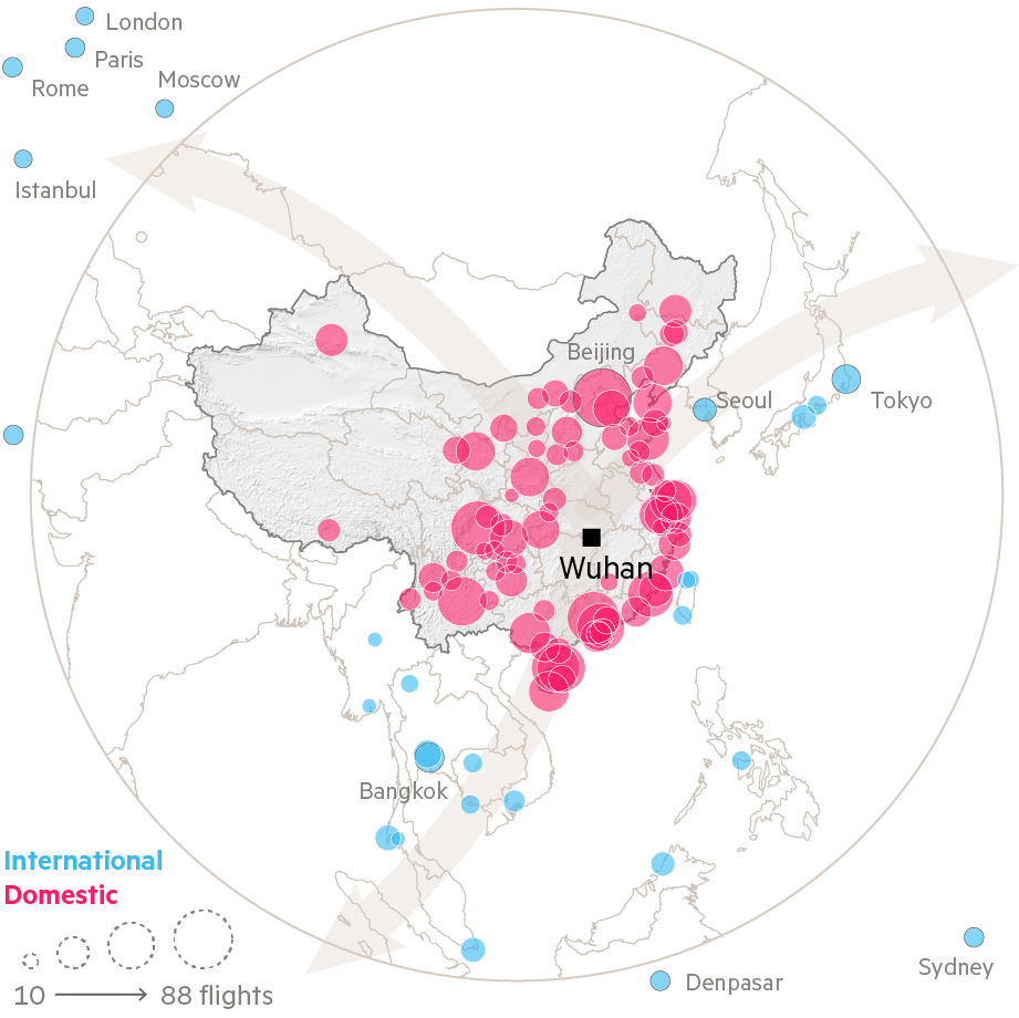
Given the scale of human movement, further spread of the virus across China seemed inevitable. And yet, nine months after the outbreak, province-level cases data reveal China’s remarkable success in containing it to the province of origin.

Although there are valid concerns about the reliability of China’s official figures, its success in containing the virus is largely explained by another factor — intensive contact tracing. But this, too, was subject to a curious paradox of its own: for a nation with a reputation for using cutting-edge technology to spy on its citizens, much of it was achieved with old-school methods such as questionnaires.
While China curbed the outbreak, the transmission of the virus overseas — and the differing responses of other nations to its arrival — meant that the real story of Covid-19 was only just beginning.
Two countries try different escapes from Covid-19
By late February new cases in China were in decline, and attention had shifted to two new areas of concern, one a regional neighbour and the other further afield.
Alarms were raised in South Korea in mid-February after a single super-spreader sparked more than 1,000 cases in the city of Daegu in a matter of days. Between February 17 and 25, the country’s confirmed case count rose from 31 to 1,146 — a 37-fold increase in just eight days, with cases doubling every day and a half.
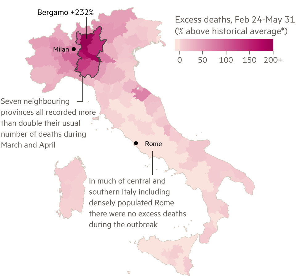
Meanwhile, in Europe, all eyes were on Italy as a cluster of infections began spreading through the northern region of Lombardy.

Both trajectories looked bleak, but the countries’ fortunes quickly diverged.
South Korea acted quickly, taking advantage of legislation passed in response to the 2012 Mers crisis that allows for extensive surveillance of its citizens during an infectious disease outbreak. A comprehensive contact-tracing operation was put in place, partnered with a rapid expansion of testing. On March 20, South Korea was carrying out 100 tests for every positive one that came back, the same day it recorded its 100th death. It took Italy three more months and 34,000 deaths to reach the same testing levels.

Italy was slow to act at the outset, and Lombardy’s outbreak had already become an epidemic by the time the region was placed into lockdown on March 8. Once March and April had passed, 26,000 more people had lost their lives in the region than would typically die in the same months — more than half of Italy’s total toll of “excess deaths”.
Why a Covid-19 death may not be a Covid-19 death
In the weeks that followed the crisis in Lombardy, counting ever-increasing Covid-19 fatalities became a daily task across much of Europe — along with speculation about what the pandemic’s final death toll would be.
Patrick Vallance, the UK’s chief scientific adviser, told the health select committee on March 17 that keeping UK deaths to 20,000 or below would be a “good outcome”.
That figure proved to be overly optimistic — but it’s hard to say by precisely how much: establishing the number of Covid-19 victims has been a problem both in the UK and in other countries around the world.

By whatever measure the pandemic’s grimmest accounting is computed, the UK’s death toll — and particularly England’s — remains among the highest in the world. By its headline figure, 38,524 people in England have died within 28 days of a positive Covid-19 test, but this rises to 42,672 if you extend the cutoff to 60 days, according to the UK’s coronavirus dashboard.
The Office for National Statistics, meanwhile, has tallied 50,642 death certificates mentioning Covid-19 up to October 2, and, if you begin counting on March 6, the day that the 100th positive case was recorded, 56,537 deaths in excess of the average for the same period in the past five years. This figure includes deaths from all causes, including Covid-19.

The UK’s experience demonstrates how seemingly precise tallies of the virus’s victims can vary considerably using alternative definitions and administrative processes. This also explains why national headline death tolls are almost certainly undercounts of the pandemic’s true, but only imprecisely knowable, human cost.
The coronavirus pandemic has killed more than a million people across the globe. But could it have been averted? A unique FT investigation examines what went wrong — and right — as Covid-19 spread across the world
The coronavirus pandemic has killed more than a million people across the globe. But could it have been averted? A unique FT investigation examines what went wrong — and right — as Covid-19 spread across the world. Read more
- Part 1 China and Covid-19: What went wrong in Wuhan
- Part 2 The global crisis — in data
- Part 3 Why coronavirus exposed Europe’s weaknesses
- Part 4 Will coronavirus break the UK?
- Part 5 How New York’s missteps let Covid-19 overwhelm the US
- Part 6 How Africa fought the pandemic — and what coronavirus has taught the world
Most of the US is not like the US
Across the world, public health data are gathered at a very local level before aggregation into regional and national figures. International organisations then collate these to provide the country-level global overview of the pandemic shown in the main chart in this story. While useful as a summary, local distinctions get lost, painting a misleading image of whole countries being affected uniformly.
Nowhere is this more apparent than in the country that has lost more of its residents to Covid-19 than any other. With less than one-twentieth of the world’s population, the US accounts for one in five deaths officially attributed to Covid-19. But almost nowhere in the US looks like the US as a whole.

The US entered the crisis already particularly vulnerable among western nations due to many residents being without health insurance and a lack of paid sick leave in many areas. Moreover, in Donald Trump, it had a president who consistently downplayed the severity of the disease that he would eventually contract.
In the absence of a co-ordinated federal response, state and local governments introduced their own measures to contain the virus. Loosening of restrictions has been similarly fragmented, and in some cases started before evidence suggested local outbreaks were under control.
The complex patchwork of often contradictory state-level measures can be visualised using an index developed by political scientists at Oxford university’s Blavatnik School of Government to summarise the overall stringency of responses to the pandemic.
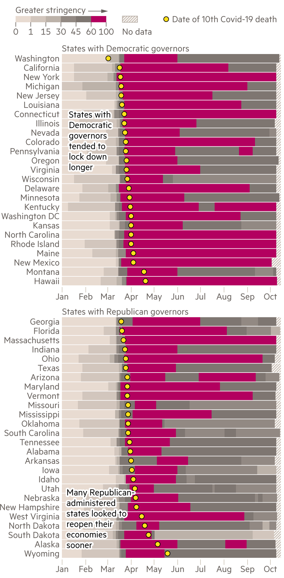
When the virus claimed thousands of victims in the spring, the centre of the crisis was New York City, its suburbs and similar cities in the north-east; vast swaths of the country were largely unaffected. As the year wore on, startlingly different geographical patterns emerged. Once confined to the most densely populated cities, the virus seeped out into small-town and rural America, with places such as Hancock county, Georgia, (population: 8,457) registering among the highest death rates in the country. By early October, the overall death rate was highest in counties classified as the small towns and rural areas — and lowest in large urban counties.
Emerging economies count the cost of coronavirus
Following the playbook of the US president, the leaders of Brazil and Mexico, the two most populous countries in Latin America, also downplayed the risks of the pandemic and delayed preventative action.
They too were rebuked by state governors who stepped in to introduce strict containment rules locally, in defiance of their countries’ leaders’ dismissive attitudes to the disease. But the lack of co-ordinated response and messaging left people confused about the rules and let the virus spread — with disastrous consequences. By May 26 the World Health Organization had declared Central and South America as the new centre of the virus, with Brazil’s daily death rate the highest in the world.

However, European-style lockdowns turned out not to be effective or worth the economic pain to some of the poorer emerging economies on the continent: despite early lockdowns in countries such as Ecuador and Peru, the Andean nations plunged into crisis. Enforcement of proper social distancing proved difficult, as many people are employed in the informal economy, without a safety net that would allow them to apply for Covid-related government handouts. They often depend on daily wages for their evening meal.
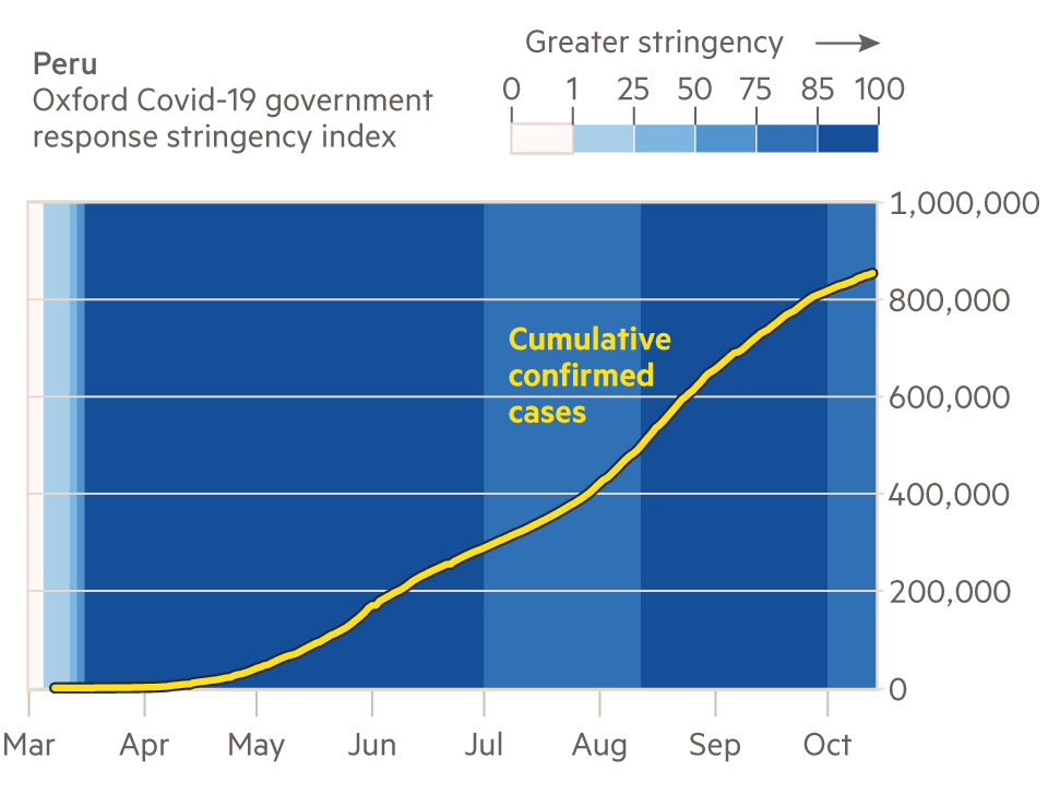
Under-funded infrastructure was stretched beyond its limits, with local authorities, hospitals and funeral homes overwhelmed by the scale of the challenge. By October 5, countries of Central and Latin America accounted for 35 per cent of deaths worldwide, their share ever increasing.

Meanwhile, in India, high levels of urbanisation, coupled with inadequate housing and sanitation, as well as a large informal labour force, formed perfect conditions for the virus to wreak havoc, especially in the country’s mega-cities and slums.
The early national lockdown imposed by the Prime Minister Narendra Modi in March was one of the strictest in the world but it failed to flatten the curve of cases and left millions of people without their daily wages. Suddenly jobless, many people travelled to their home villages to reunite with their families, often taking the virus with them.
Forced to reopen the economy to let people earn again, the central government loosened restrictions in early May, which led to a sharp rise in cases and a splintering of opinions among state leaders on how fast to manage the economic reopening. Some decided to extend the lockdown locally but, inevitably, the uneven easing of restrictions led to a surge in the number of cases. They are now growing faster than anywhere else in the world — by 80,000 a day — and both the economic and human toll remain huge.
The reopening dilemma
As spring became summer, infection rates fell across Europe, and governments began easing restrictions in the hope that normal life could resume with the virus in remission. But early optimism gave way to alarm because, in one country after another, increased socialising was followed by an uptick in cases. Autumn’s second wave has been much more muted than the towering peaks of the spring, but the uptick in cases is nonetheless feeding through into hospital admissions and deaths.

One of the hopes in some quarters had been that herd immunity could provide some protection, with places hard-hit in the spring sheltered from the worst of any resurgence in the virus due to increased antibody levels. Unfortunately, that has proved not to be the case so far, with many of the centres of the outbreak in the spring also suffering the worst in the autumn, both at the country and subnational region level.

Spain, France and the UK were all among the worst-affected countries in Europe in April, and in September things looked no different. Similarly, Paris and Madrid have been badly hit both in the spring and autumn.
Yet for all the patterns that appear in the data, the resurgence also demonstrates the outsized role seemingly played by random chance in the story of Covid-19. When Italy avoided a second wave in the late summer, many pointed to its high levels of mask-wearing as a contributory factor. And indeed, only one country has higher levels of mask-wearing than Italy. That country’s identity? Spain, home to the worst second wave of the continent.
But there is room for hope as the world attempts to stave off a bitter Covid-19 winter. Mortality rates from the virus have fallen over the course of the year as healthcare expertise and technology have improved. In March, somebody aged 70 or above had a 50:50 chance of survival if admitted to hospital with the virus. By August their chances had climbed to 74 per cent.
Endgame?
With more than 1m lives lost, many nations are still struggling to keep the virus under control. In early October, the global death toll continued to increase daily by an average of 5,200, a similar figure to early May.
Leaders have vacillated between reopening to protect the economy and locking back down to protect citizens. Yet recent analysis suggests that this may well be a false trade-off.

Meanwhile, for many, hopes of a return to normality lie with a vaccine — following accelerated development, Phase 3 testing of several candidates is under way.
But perhaps a final paradox is that public trust in vaccines tends to be lower in developed nations, the countries whose citizens have historically benefited most from the elimination of deadly disease. Polling in the US at the end of July, when about 1,000 Americans were dying every day from Covid-19, suggested that a majority could yet decline a vaccine when it becomes available.
A vaccine is, therefore, not necessarily a panacea — and as a result, Covid-19’s death toll is likely to continue to rise significantly for some time to come.
Data analysis, reporting and production by Steven Bernard, John Burn-Murdoch, Tom Hannen, Bob Haslett, Caroline Nevitt, Jane Pong, Ændrew Rininsland, Alan Smith, Martin Stabe, Cale Tilford, Aleksandra Wiśniewska. Series producer Claire Manibog.
Data sources
Global: The aggregated national death tolls used in the main graphic and elsewhere are drawn from the FT Covid-19 database, which is based primarily on data compiled from local sources by the European Centre for Disease Prevention and Control and the Covid Tracking Project. Adjustments and exceptions are detailed on the FT coronavirus trajectory tracker page. All excess mortality data come from the FT excess mortality database, where full details of national-level sources can be found. Figures on daily tests per confirmed case come from Our World in Data. Data on countries’ economic performance in the first half of 2020 come from the OECD and World Bank.
China: Flight data provided by Cirium. Cumulative coronavirus cases data compiled by Statista from regional health commissions in China and DXY.cn.
UK: Deaths in England within 28 and 60 days of a positive test come from the Gov.uk coronavirus dashboard API. Death certificates and excess mortality data come from the Office for National Statistics’ provisional weekly death registrations, last published on October 13 with data up to October 2.
US: The US state-level stringency index comes from the working paper "Variation in US states’ responses to Covid-19" from the Oxford university Blavatnik School of Government. County-level Covid-19 mortality data comes from the time series summary compiled by the Johns Hopkins Center for Systems Science and Engineering. The data have been grouped and adjusted using the urban-rural classification from the National Center for Health Statistics and the US Census Bureau’s 2019 county population estimates.
Latin America: The "stringency index" data come from the Coronavirus Government Response tracker by the Oxford University Blavatnik School of Government.


Join the conversation
How has the pandemic been handled where you live? What has gone right or wrong for you during this time? Do you work in a sector that was hit hard by lockdowns? Or have you managed to adapt your life positively? Share your experiences in the comments below.