

For SS17, fashion designers were pulled in all directions. Inspirations were broad: the joyous dynamism of girls on a beach by photographer Jacques-Henri Lartigue, the red-booted potato diggers of 18th-century Ireland, or the still, silent grandeur of Hans Holbein’s portraits of Henry VIII all featured as reference points. But there were themes also, from the crazy swirls of psychedelia, to lush Tropicalia, to the quiet rigour of Brutalism, which lent the season a certain austerity.
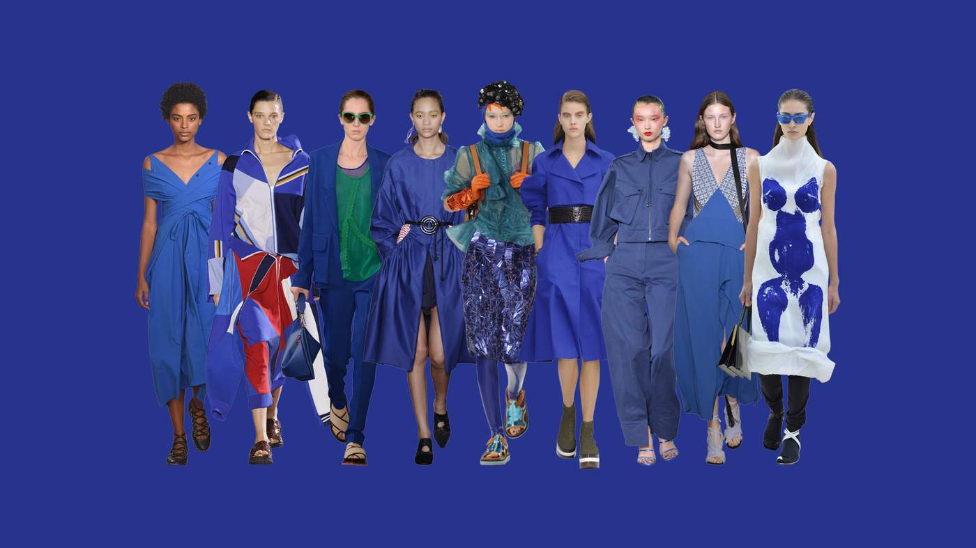
If any colour starred this season it was blue: at Hugo Boss, Jason Wu took the palette of David Hockney’s “A Bigger Splash” to create indigo girls spiked with viridian greens. At Joseph, the blues were abstracted and Matisse-like, while at Céline, Phoebe Philo took Yves Klein’s Anthropometry series to recreate the artist’s body prints on the canvas of a gown. The historian Simon Schama discusses our eternal fascination with this deepest of shades in Into the Blue.

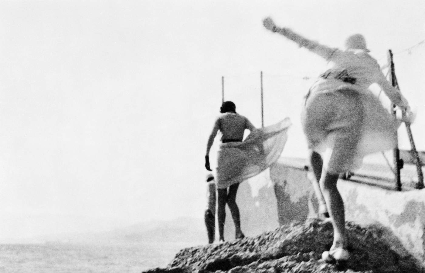
Renée, Biarritz, August, 1930 by Jacques-Henri Lartigue ©Ministère de la Culture, France/AAJHL
The catwalk was also a place of rediscovery. Both Akris and Proenza Schouler referenced the Cuban-born artist Carmen Herrera on their catwalks: the painter and sculptor who received her first solo exhibition at the Whitney last year, aged 101. The New York-based Proenza Schouler designers Jack McCollough and Lazaro Hernandez have long taken art as a lead for their collections: in
‘It’s bad-ass and extreme’ they describe the works that have most inspired them.
The challenge of taking original artwork and making it both authentic in its execution and wearable is no easy one. For designer Nadège Vanhee-Cybulski at Hermès, however, the thousands of square, two-dimensional designs in the house’s scarf archives were too much temptation to leave alone. In Square Roots she describes how the scarfs’ unique geometries have inspired her work since 2014. Fashion’s rules are boundless, she argues, but sometimes the best things are kept within strict borders.
Jo Ellison, Fashion Editor, FT
For SS17, fashion designers were pulled in all directions. Inspirations were broad: the joyous dynamism of girls on a beach by photographer Jacques-Henri Lartigue, the red-booted potato diggers of 18th-century Ireland, or the still, silent grandeur of Hans Holbein’s portraits of Henry VIII all featured as reference points. But there were themes also, from the crazy swirls of psychedelia, to lush Tropicalia, to the quiet rigour of Brutalism, which lent the season a certain austerity.
If any colour starred this season it was blue: at Hugo Boss, Jason Wu took the palette of David Hockney’s “A Bigger Splash” to create indigo girls spiked with viridian greens. At Joseph, the blues were abstracted and Matisse-like, while at Céline, Phoebe Philo took Yves Klein’s Anthropometry series to recreate the artist’s body prints on the canvas of a gown. The historian Simon Schama discusses our eternal fascination with this deepest of shades in Into the Blue.

Renée, Biarritz, August, 1930 by Jacques-Henri Lartigue ©Ministère de la Culture, France/AAJHL
The catwalk was also a place of rediscovery. Both Akris and Proenza Schouler referenced the Cuban-born artist Carmen Herrera on their catwalks: the painter and sculptor who received her first solo exhibition at the Whitney last year, aged 101. The New York-based Proenza Schouler designers Jack McCollough and Lazaro Hernandez have long taken art as a lead for their collections: in
‘It’s bad-ass and extreme’, they describe the works that have most inspired them.
The challenge of taking original artwork and making it both authentic in its execution and wearable is no easy one. For designer Nadège Vanhee-Cybulski at Hermès, however, the thousands of square, two-dimensional designs in the house’s scarf archives were too much temptation to leave alone. In Square Roots she describes how the scarfs’ unique geometries have inspired her work since 2014. Fashion’s rules are boundless, she argues, but sometimes the best things are kept within strict borders.
Jo Ellison, Fashion Editor, FT
Into the blue

Into the blue
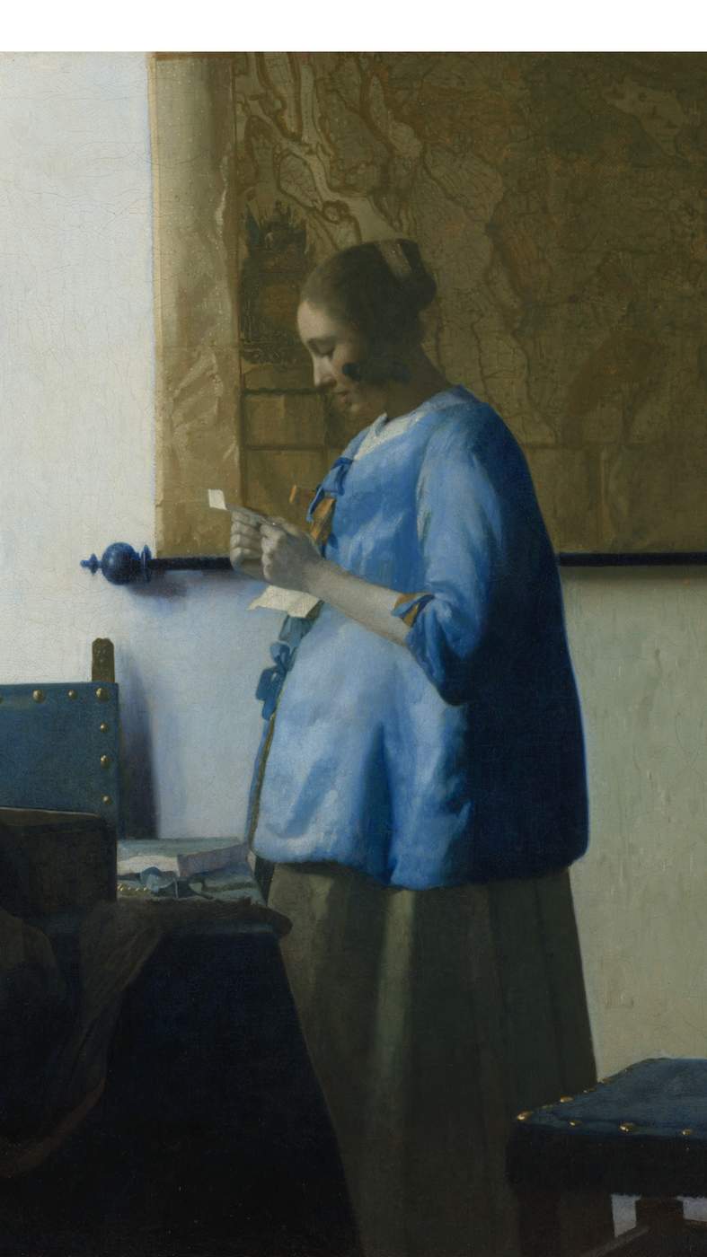
Woman Reading a Letter by Johannes Vermeer, c1663. Collection Rijksmuseum
Simon Schama celebrates the colour that captivates on canvas and the catwalk alike
Except for the perverse poet Mallarmé who called on ashy fog to obscure the aggravatingly impassive azure, we all like a little cerulean in our lives: the sky above, the gentler kind of ocean below, limpid and warm. But do we want to wear it? I have a pair of sky-blue brogues, three words that don’t really belong in the same sentence, but they make walking like treading on air. I also have an Alexander McQueen boxy sky-blue jacket which may have been a mistake and a whole suit in the same colour from the crazy-great Boston store Alan Bilzerian. But if you want heavenly blue (which is what cerulean means, more or less) you’ll need to go to Amsterdam, to the Rijksmuseum, to the beddejak bed-jacket worn by the girl in Vermeer’s “Woman Reading a Letter”.

Woman Reading a Letter by Johannes Vermeer, c1663. Collection Rijksmuseum
One of the most sublime things the hand of man has made, Vermeer’s painting is bathed in a crystalline serenity which even screeds of literal-minded articles pondering whether the profile curve is a pregnancy or not, can’t spoil, not so long as you gaze at the radiant blue at the centre of the picture. Vermeer was prodigal with his ultramarine, the most expensive of all pigments. Most Dutch painters resorted to the much cheaper smalt, made from cobalt oxide. Over time smalt blue goes fugitive, fading to green, but it was all that artists like Jan van Goyen, dependent on high volume for his livelihood, could afford. But Vermeer was the opposite of a production line, painstakingly producing just 36 paintings over his career. The best of them concentrated maximum intensity of light and colour, and nothing delivered saturated radiance like ultramarine.
The pigment was costly because the lapis lazuli that was its base was originally obtainable only from Badakshan in what is now Afghanistan. In 1271 Marco Polo saw the mountain from which lapis was mined and marvelled at its beauty. The very term coined for the colour – “ultramarine” – beyond the seas – carried with it a charge of the magical-mythical so precious that it could only be used sparingly for sacred painting, in particular for the dress of the Virgin. The central panel of Duccio’s c1315 triptych in the National Gallery in London is a communion of the two sacred colours: ultramarine and gold. Fra Angelico applied it in economic patches. An apocryphal story had Michelangelo leaving his “The Entombment” unfinished for want of the expensive pigment. Conversely, slathering on the ultramarine was a coded boast: done exuberantly by Titian in the drapery of the wine god in “Bacchus and Ariadne”; excessively by the prolific 17th-century Roman painter Sassoferrato in Virgin after Virgin. It was a sign of Sassoferrato’s confidence that a self-portrait sets off his ostensibly modest black and white attire against a ground of spectacular cerulean.
‘Vermeer was prodigal with his ultramarine, the most expensive of all pigments’
The genius of Vermeer, in a culture which had removed religious images from its Protestant churches, was to transfer sacred luminosity to what were ostensibly domestic scenes – the pouring of milk; the reading of a letter – so that they became an intimate epiphany. Given the piety of Vermeer’s faith, it’s hard not to see the Dutch letter reader as a disguised Annunciation with the immaculate conception euphemised into the reception of the letter. Looking into the heart of the blue we are dwelling simultaneously in an earthy and a heavenly world.
This optical transport was scientifically planned. During a recent restoration the Rijksmuseum conservators discovered an undercoat of copper green above the primer and beneath the ultramarine, and it may be that extra layer which accounts for the sustained intensity of the colour. But the whole picture is a diffused rhapsody in blue: the leather backs of the chairs are blue (in all probability they would have been green); the rods holding the map of Holland and West Friesland (those parchment and flesh tones work optically with the blue as foil much like Duccio’s gold) are, in another departure from realism, a dark glowing blue. More important than any of these details is the filtered light itself which Vermeer has made into an ethereal veil of the utmost, pearly delicacy, so that the shadows of the chair backs and the ball-ends of the map rods fall in dark blue hues against the blonde wall.
Simon Schama celebrates the colour that captivates on canvas and the catwalk alike
Except for the perverse poet Mallarmé who called on ashy fog to obscure the aggravatingly impassive azure, we all like a little cerulean in our lives: the sky above, the gentler kind of ocean below, limpid and warm. But do we want to wear it? I have a pair of sky-blue brogues, three words that don’t really belong in the same sentence, but they make walking like treading on air. I also have an Alexander McQueen boxy sky-blue jacket which may have been a mistake and a whole suit in the same colour from the crazy-great Boston store Alan Bilzerian. But if you want heavenly blue (which is what cerulean means, more or less) you’ll need to go to Amsterdam, to the Rijksmuseum, to the beddejak bed-jacket worn by the girl in Vermeer’s “Woman Reading a Letter”.
One of the most sublime things the hand of man has made, Vermeer’s painting is bathed in a crystalline serenity which even screeds of literal-minded articles pondering whether the profile curve is a pregnancy or not, can’t spoil, not so long as you gaze at the radiant blue at the centre of the picture. Vermeer was prodigal with his ultramarine, the most expensive of all pigments. Most Dutch painters resorted to the much cheaper smalt, made from cobalt oxide. Over time smalt blue goes fugitive, fading to green, but it was all that artists like Jan van Goyen, dependent on high volume for his livelihood, could afford. But Vermeer was the opposite of a production line, painstakingly producing just 36 paintings over his career. The best of them concentrated maximum intensity of light and colour, and nothing delivered saturated radiance like ultramarine.
The pigment was costly because the lapis lazuli that was its base was originally obtainable only from Badakshan in what is now Afghanistan. In 1271 Marco Polo saw the mountain from which lapis was mined and marvelled at its beauty. The very term coined for the colour – “ultramarine” – beyond the seas – carried with it a charge of the magical-mythical so precious that it could only be used sparingly for sacred painting, in particular for the dress of the Virgin. The central panel of Duccio’s c1315 triptych in the National Gallery in London is a communion of the two sacred colours: ultramarine and gold. Fra Angelico applied it in economic patches. An apocryphal story had Michelangelo leaving his “The Entombment” unfinished for want of the expensive pigment. Conversely, slathering on the ultramarine was a coded boast: done exuberantly by Titian in the drapery of the wine god in “Bacchus and Ariadne”; excessively by the prolific 17th-century Roman painter Sassoferrato in Virgin after Virgin. It was a sign of Sassoferrato’s confidence that a self-portrait sets off his ostensibly modest black and white attire against a ground of spectacular cerulean.
‘Vermeer was prodigal with his ultramarine, the most expensive of all pigments’
The genius of Vermeer, in a culture which had removed religious images from its Protestant churches, was to transfer sacred luminosity to what were ostensibly domestic scenes – the pouring of milk; the reading of a letter – so that they became an intimate epiphany. Given the piety of Vermeer’s faith, it’s hard not to see the Dutch letter reader as a disguised Annunciation with the immaculate conception euphemised into the reception of the letter. Looking into the heart of the blue we are dwelling simultaneously in an earthy and a heavenly world.
This optical transport was scientifically planned. During a recent restoration the Rijksmuseum conservators discovered an undercoat of copper green above the primer and beneath the ultramarine, and it may be that extra layer which accounts for the sustained intensity of the colour. But the whole picture is a diffused rhapsody in blue: the leather backs of the chairs are blue (in all probability they would have been green); the rods holding the map of Holland and West Friesland (those parchment and flesh tones work optically with the blue as foil much like Duccio’s gold) are, in another departure from realism, a dark glowing blue. More important than any of these details is the filtered light itself which Vermeer has made into an ethereal veil of the utmost, pearly delicacy, so that the shadows of the chair backs and the ball-ends of the map rods fall in dark blue hues against the blonde wall.
From left: Pringle of Scotland, Joseph, Boss, Sportmax, Maison Margiela, Salvatore Ferragamo, Kenzo, Roland Mouret, Céline. Catwalking.com
There’s only one other being which manages the same degree of celestial-blue radiance, and that’s the Morpho butterfly. It has the same colour contrast of pale brown and brilliant cerulean as the Vermeer but deployed more functionally. The creamy-brown underside of the Morpho’s wings work as protective camouflage as it flits through the South American rainforest, feeding and mating. It has just 115 days to get this done but the odds of successful reproduction may actually be enhanced by the startling fact, discovered by Nipam Patel at UC Berkeley that many Morphos are gynandromorphs, with both male and female cell tissue present in their wings. But those wings are, by butterfly standards, enormous: 12cm wide; and when fully displayed by the male, are the flashiest bolt of colour in the forest.
 by Pablo Picasso, 1902. Artwork: ©Succession Picasso\/DACS, London 2017. Photo: Bridgeman Images")
Two Women at a Bar (oil on canvas) by Pablo Picasso, 1902. Artwork: ©Succession Picasso/DACS, London 2017. Photo: Bridgeman Images
After the invention of synthetic chemical pigments, starting in 1826 for ultramarine, but industrially produced later in the 19th century, blue-struck artists – Cézanne, Renoir, Picasso and, especially, Matisse could use variations of ultra and aquamarine lavishly. Cézanne could chill his blues, almost cruelly where, as costume or background they make the portraits of his wife inanimate. (It was not a happy marriage.) Or as in the Provençal skies over the Mont Sainte-Victoire he could make them tumid with heat.
 by Henri Matisse, 1952. Musée National d’Art Moderne, Centre Pompidou, Paris, France ©Succession H Matisse\/DACS 2017")
Blue Nude III (gouache on paper) by Henri Matisse, 1952. Musée National d’Art Moderne, Centre Pompidou, Paris, France ©Succession H Matisse/DACS 2017
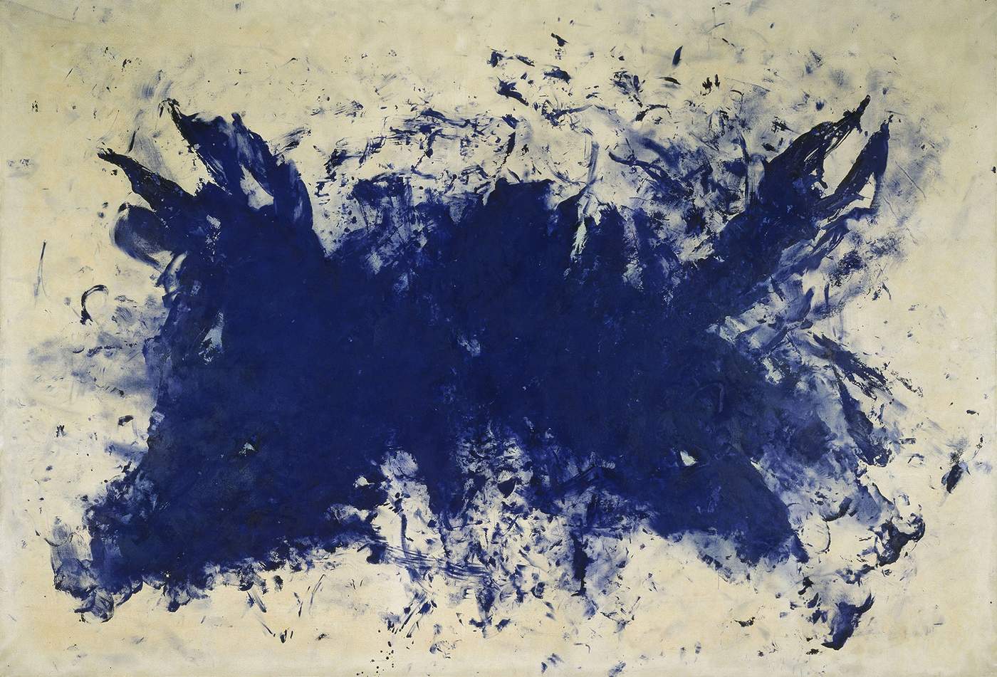
But the Morpho of modernism was Yves Klein for whom the perfect ultramarine came to serve as the be all and the end all of his work. For Klein (much taken with Zen) that peerlessly rich blue was the visualisation of impassive infinity, the colour which liquidated line, edge, space. In quantities that would have made Duccio and Vermeer faint, Klein produced work that were nothing but blocks of blue. There was a totalising madness about his quest for a hue that would exclude the slightest trace of the mineral impurities found in lapis lazuli. Klein bound the pigment in a synthetic resin he had specially commissioned and which he believed would retain the saturation of the colour in purer concentration than if it were suspended in any oil emulsion. When he had nailed it he patented the colour as International Klein Blue (IKB). In 1958 his fetishism extended to a controversial attempt to drown the obelisk on the Place de la Concorde in blue light; to creating IKB versions of Louvre icons like “The Winged Victory of Samothrace”; and to exhibiting the saturated (he liked to say impregnated) sponges as sculptures in their own right. The obsession made him a poster-boy for minimalist contempt for any kind of gestural art as well as figuration, the liberator of colour free from the presumptuous intervention of an artist’s hand.
‘For Yves Klein, that peerless blue was the visualisation of infinity’
However tediously monomaniacal the serial Blues seem on the pages of catalogues and monographs, when you are in the actual presence of the work Klein made in the last few years before his fatal heart-attack at the age of 34 in 1962, the intensity of the paintings does deliver the retinal punch of its sensory force-field. Few of the paintings are, in fact, perfectly flat. Many of them are textured, pitted, studded and in some cases incorporate those sponges. The paintings that raised most eyebrows were done with what Klein called the “living paintbrushes” of naked female bodies, daubed in that same blue and then rolled over sheets of white paper. The best of them are actually very beautiful, flowing with a kind of balletic, exuberant vitality.
 in his studio at 14, rue Campagne-Première with his model Michèle, 1960, Paris. Artwork: ©Yves Klein, ADAGP, Paris and DACS, London 2017. Photograph: Shunk-Kender ©J. Paul Getty Trust. Getty Research Institute, Los Angeles (2014.R.20)")
Yves Klein realizing an Anthropometry (ANT 15) in his studio at 14, rue Campagne-Première with his model Michèle, 1960, Paris. Artwork: ©Yves Klein, ADAGP, Paris and DACS, London 2017. Photograph: Shunk-Kender ©J. Paul Getty Trust. Getty Research Institute, Los Angeles (2014.R.20)

Celine SS17
Blue can calm but, turning cold, blue can also kill. The calming hue can turn into the herald of mortality as blue stains appear on rosy flesh. It’s a bad sign when your lips go blue. And the colour is of course dense with sadness; the spectrum’s equivalent of the long sigh. As an expression of melancholy, “the blues” apparently came from the “blue devils” which, in 17th-century English, were said to possess those suffering from alcohol withdrawal.
But when the Blues are sung with that paradoxical union of joyful mournfulness – by Bessie Smith or Muddy Waters – they somehow make us happy. But if you want the all-time moody howl, there’s only one performance to have in your head while you’re hunting for blue suede shoes. That would be “Blue Moon”, sung, to the soft clip-clop of a cowboy’s horse, by Elvis: the only version of the song which drops Lorenz Hart’s unpersuasively golden ending.
The exhibition ‘Yves Klein’ is at Tate Liverpool until 5 March
There’s only one other being which manages the same degree of celestial-blue radiance, and that’s the Morpho butterfly. It has the same colour contrast of pale brown and brilliant cerulean as the Vermeer but deployed more functionally. The creamy-brown underside of the Morpho’s wings work as protective camouflage as it flits through the South American rainforest, feeding and mating. It has just 115 days to get this done but the odds of successful reproduction may actually be enhanced by the startling fact, discovered by Nipam Patel at UC Berkeley that many Morphos are gynandromorphs, with both male and female cell tissue present in their wings. But those wings are, by butterfly standards, enormous: 12cm wide; and when fully displayed by the male, are the flashiest bolt of colour in the forest.
 by Pablo Picasso, 1902. Artwork: ©Succession Picasso\/DACS, London 2017. Photo: Bridgeman Images")
Two Women at a Bar (oil on canvas) by Pablo Picasso, 1902. Artwork: ©Succession Picasso/DACS, London 2017. Photo: Bridgeman Images
After the invention of synthetic chemical pigments, starting in 1826 for ultramarine, but industrially produced later in the 19th century, blue-struck artists – Cézanne, Renoir, Picasso and, especially, Matisse could use variations of ultra and aquamarine lavishly. Cézanne could chill his blues, almost cruelly where, as costume or background they make the portraits of his wife inanimate. (It was not a happy marriage.) Or as in the Provençal skies over the Mont Sainte-Victoire he could make them tumid with heat.
 by Henri Matisse, 1952. Musée National d’Art Moderne, Centre Pompidou, Paris, France ©Succession H Matisse\/DACS 2017")
Blue Nude III (gouache on paper) by Henri Matisse, 1952. Musée National d’Art Moderne, Centre Pompidou, Paris, France ©Succession H Matisse/DACS 2017
But the Morpho of modernism was Yves Klein for whom the perfect ultramarine came to serve as the be all and the end all of his work. For Klein (much taken with Zen) that peerlessly rich blue was the visualisation of impassive infinity, the colour which liquidated line, edge, space. In quantities that would have made Duccio and Vermeer faint, Klein produced work that were nothing but blocks of blue. There was a totalising madness about his quest for a hue that would exclude the slightest trace of the mineral impurities found in lapis lazuli. Klein bound the pigment in a synthetic resin he had specially commissioned and which he believed would retain the saturation of the colour in purer concentration than if it were suspended in any oil emulsion. When he had nailed it he patented the colour as International Klein Blue (IKB). In 1958 his fetishism extended to a controversial attempt to drown the obelisk on the Place de la Concorde in blue light; to creating IKB versions of Louvre icons like “The Winged Victory of Samothrace”; and to exhibiting the saturated (he liked to say impregnated) sponges as sculptures in their own right. The obsession made him a poster-boy for minimalist contempt for any kind of gestural art as well as figuration, the liberator of colour free from the presumptuous intervention of an artist’s hand.
‘For Yves Klein, that peerless blue was the visualisation of infinity’
However tediously monomaniacal the serial Blues seem on the pages of catalogues and monographs, when you are in the actual presence of the work Klein made in the last few years before his fatal heart-attack at the age of 34 in 1962, the intensity of the paintings does deliver the retinal punch of its sensory force-field. Few of the paintings are, in fact, perfectly flat. Many of them are textured, pitted, studded and in some cases incorporate those sponges. The paintings that raised most eyebrows were done with what Klein called the “living paintbrushes” of naked female bodies, daubed in that same blue and then rolled over sheets of white paper. The best of them are actually very beautiful, flowing with a kind of balletic, exuberant vitality.
 1960 by Yves Klein. ©Yves Klein, ADAGP, Paris \/ DACS, London, 2017")
Untitled Anthropometry, (ANT 76) 1960 by Yves Klein. ©Yves Klein, ADAGP, Paris / DACS, London, 2017
Blue can calm but, turning cold, blue can also kill. The calming hue can turn into the herald of mortality as blue stains appear on rosy flesh. It’s a bad sign when your lips go blue. And the colour is of course dense with sadness; the spectrum’s equivalent of the long sigh. As an expression of melancholy, “the blues” apparently came from the “blue devils” which, in 17th-century English, were said to possess those suffering from alcohol withdrawal.
 in his studio at 14, rue Campagne-Première with his model Michèle, 1960, Paris. Artwork: ©Yves Klein, ADAGP, Paris and DACS, London 2017. Photograph: Shunk-Kender ©J. Paul Getty Trust. Getty Research Institute, Los Angeles (2014.R.20)")
Yves Klein realizing an Anthropometry (ANT 15) in his studio at 14, rue Campagne-Première with his model Michèle, 1960, Paris. Artwork: ©Yves Klein, ADAGP, Paris and DACS, London 2017. Photograph: Shunk-Kender ©J. Paul Getty Trust. Getty Research Institute, Los Angeles (2014.R.20)

Celine SS17
But when the Blues are sung with that paradoxical union of joyful mournfulness – by Bessie Smith or Muddy Waters – they somehow make us happy. But if you want the all-time moody howl, there’s only one performance to have in your head while you’re hunting for blue suede shoes. That would be “Blue Moon”, sung, to the soft clip-clop of a cowboy’s horse, by Elvis: the only version of the song which drops Lorenz Hart’s unpersuasively golden ending.
The exhibition ‘Yves Klein’ is at Tate Liverpool until 5 March
Untitled Anthropometry, (ANT 76) 1960 by Yves Klein. ©Yves Klein, ADAGP, Paris / DACS, London 2017
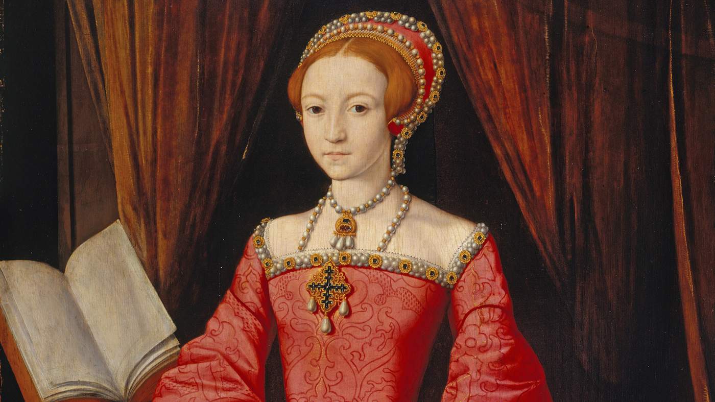
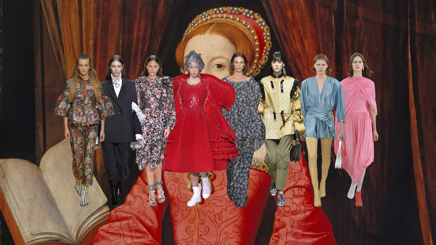
Tudor
Elizabeth I when a Princess by William Scrots, c1546. Royal Collection Trust ©Her Majesty Queen Elizabeth II, 2016/Bridgeman Images
Power sleeves and steely stares, the collections had commanding presence
From left: Marques’Almeida, Ellery, Isabel Marant, Comme des Garçons, Sonia Rykiel, JW Anderson, Balenciaga, Celine. Catwalking.com
No surprise the 400th anniversary of Shakespeare’s birth lead many designers to re-examine that era’s dress codes. At JW Anderson, Hans Holbein’s famed depictions of that most alpha of English monarchs, Henry VIII, had inspired a wardrobe of leg-of-mutton sleeves, burlap day dresses and quilted corsetry. Described as “urban armour” for the modern working wardrobe, Jonathan Anderson wanted to work with “relics of aggressive masculinity”, and yet reinterpret them in a gentler, raw-edged way.

Victorian engraving of Henry VIII based on Hans Holbein’s 1537 portrait. ©Alamy
There were more Tudor moments at Marques’Almeida where elaborate ruffles and rich, colourful brocades recalled Elizabethan silks yet remained 21st century in sensibility. The sculptural bodices, bell-shaped sleeves and ankle-skimming breeches and boots also had a princeling charm. There were thigh-high boots at Balenciaga too, where designer Demna Gvasalia added a sheen of opulence to his spandex looks with archive jewelled embellishment and jersey silks. A bold Tudor shoulder featured frequently, ruffled, billowed and caped at Ellery, Simone Rocha and Céline. But nowhere was it quite so dramatic as at Comme des Garçons, where designer Rei Kawakubo’s study of “invisible clothing” found one model swathed in layers of ruffled red velvet. As wide as she was tall, she commanded attention, her presence as powerful as any Renaissance king. Jo Ellison

Nonsuch Palace from the South by Joris Hoefnagel, 1568 ©Victoria & Albert Museum, London
Brutalism
©Tom Gowanlock/Alamy
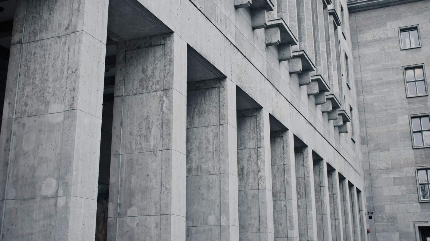
No frills: designers make a feature of fashion’s raw materials
From left: Mulberry, Salvatore Ferragamo, Stella McCartney, Chalayan, Prada, Jasper Conran, Hermès, Louis Vuitton, Loewe, Isabel Marant, Sandro, Marni. Catwalking.com
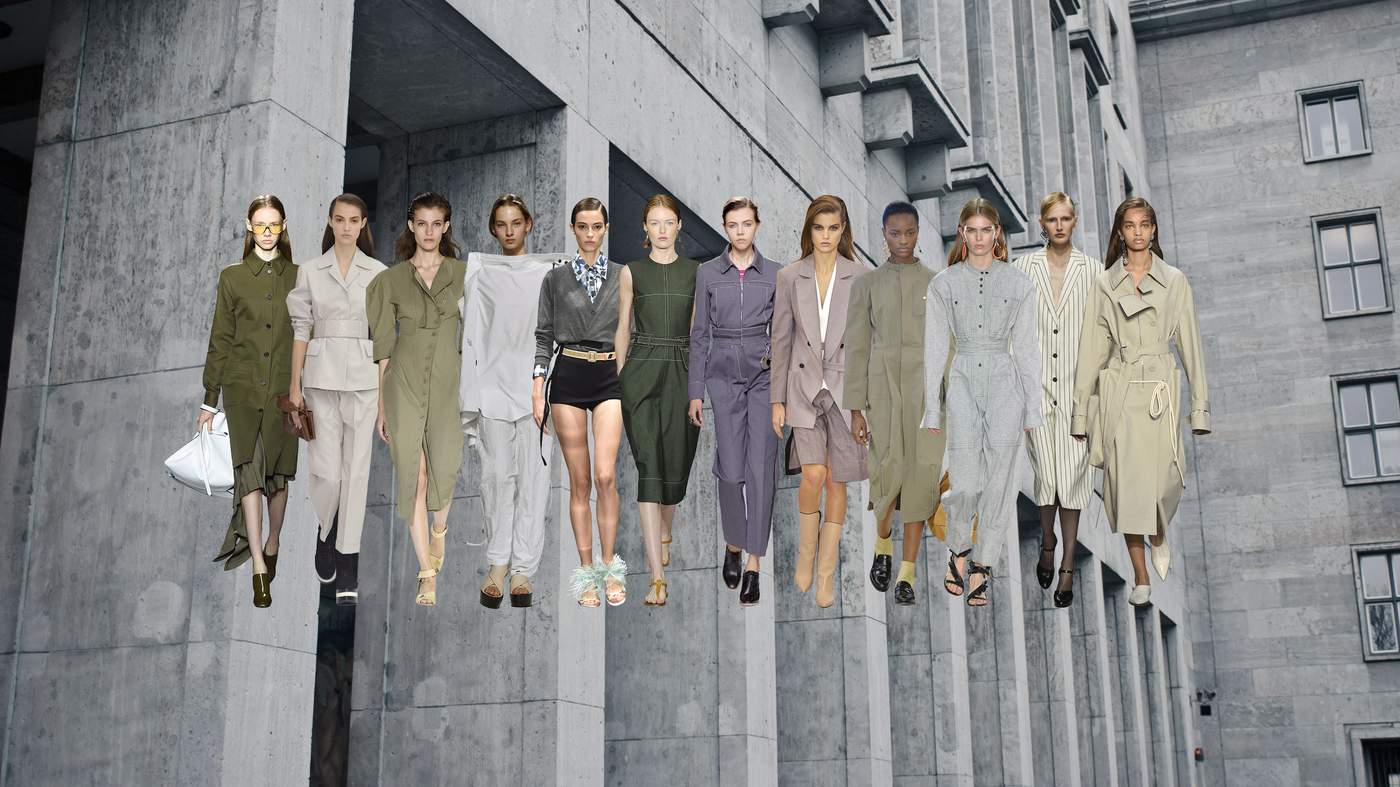
Simple, clean tailoring with outsize features and, yes, lots of grey were a regular feature of the spring shows, where looks were reduced to an essential functionality on many of the catwalks. Presented almost in opposition to the sprauncier florals and patterns which appeared alongside, these were the pieces that added grit to so much girlie glamour. There were utilitarian separates at Hermès and Mulberry, where Johnny Coca used khaki work jackets and liquid leathers to punch up school-boy pinstripes, while practical all-in-ones tempered the more bohemian rhapsody at Isabel Marant.

Boston City Hall by Kallmann, McKinnell & Knowles, 1969. Photo: Ezra Stoller ©Esto, all rights reserved.
Designers eschewed accessories in favour of an outsize detail or silhouettes. The shoulder made a statement at Stella McCartney, while Marni’s cool separates were worn with pannier-style pocket bags. As with the architects whose raw design gained prominence in the 1950s, these designers took a similar interest in showing a garment’s construction; overstitching, button details and pockets took centre stage. There was volume too: shoulders were heightened or rounded to create a new architecture, while sleeves were pushed up to the elbow to convey a workmanlike attitude, or long and knuckle-sweeping with outsize cuffs. The mood was businesslike, no nonsense and tough. JE
The Brutalist Playground is at the Vitra Design Museum, Weil am Rhein, Germany, until 16 April
In the frame
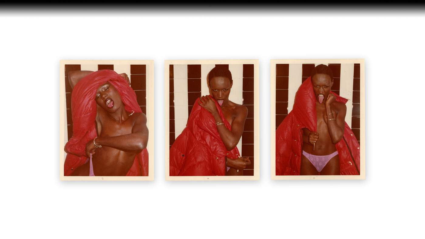
Red Coat Series: Grace Jones, Paris, 1974 ©The Estate of Antonio Lopez & Juan Ramos
How did a shipwrecked dress, a disco diva and a potato digger inspire the SS17 collections? Aimee Farrell finds out
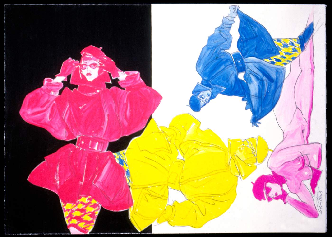
Sportmax Coats, pencil & watercolor, Milan, 1983 ©The Estate of Antonio Lopez & Juan Ramos
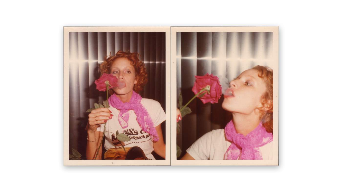
Donna Jordan, NYC, 1974 ©The Estate of Antonio Lopez & Juan Ramos
Kenzo
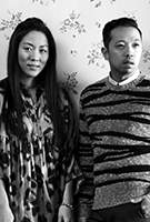
Designers Carol Lim and Humberto Leon have been creative directors of the LVMH-owned French fashion house since 2011. In November, they collaborated with H&M

Kenzo SS17
The euphoric output of fashion illustrator Antonio Lopez was writ large on the Kenzo catwalk of designers Carol Lim and Humberto Leon. The Harlem-based, Puerto Rican artist who turned up the dial on the New York fashion scene with work that spanned the 1960s until his death from an Aids related illness in 1987, has long been admired by the self-described “fashion nerd” Leon. “His style is so distinctive and powerful,” says the Kenzo designer. “Lopez made women look super strong – but was also really good at making men seem sexy and romantic.” It is this gender fluidity – still prescient today – that really appeals, Leon continues: “It was modern to me then, and it’s modern to me now.”

Blue Water Series: Patti D’Arbanville, Paris, 1974 ©The Estate of Antonio Lopez & Juan Ramos
The synergy between the artist and the house runs deep. Not only did Lopez immortalise many Kenzo looks in his drawings, he was a friend of the brand’s founder Kenzo Takada. “They ran in the same circles,” explains Leon of the pair who shared an enthusiasm for having fun. This celebratory collection pays tribute to that shiny, happy era, and Studio 54, where Takada memorably hosted his 1977 show featuring Grace Jones (who, legend has it, was discovered on the subway by Lopez) and a young Jerry Hall. “It’s quite a personal story we’re telling,” says Leon. “Back then, the fashion world was smaller, there were fewer brands. Grace and Jerry would walk into the studio from the street in Kenzo clothing and they would shoot it. People were capturing the moment. There was less of a preconceived notion of everything than there is now.”
The appeal of Lopez’s work – and Leon and Lim’s own vivacious spirit – comes through in the collection: from the party-ready lamé looks to the giant sequins and T-shirts printed with portraits of Pat Cleveland and Donna Jordan. The real find however was made in the Lopez archive where the pair uncovered a working photo-book. “When he lent out a Polaroid to a magazine or newspaper, he would make a sketch over the image to remind himself what was missing,” says Leon who turned the sketches into monochrome prints on white poplin dresses – a fashion memorandum to photos that were never returned.

Antonio Lopez at work on drawings for Italian Vogue by Bill Cunningham, Paris, 1970.
Film stills taken from Antonio Lopez 1970: Sex Fashion & Disco a film by James Crump, releasing spring 2017.
Simone Rocha

The 30-year-old designer was born in Dublin. She launched her label soon after graduating from Central Saint Martins in 2010. At the 2016 Fashion Awards, she was named British Womenswear Designer of the Year

Simone Rocha SS17
A Christmas in Ireland proved unseasonably productive for Simone Rocha: “I went to an exhibition at the National Gallery,” she explains. “It’s such a beautiful gallery, full of very special works.” The show, entitled “Uniform: a collaboration with Jackie Nickerson” juxtaposed the American photographer’s “Terrain” series of large-scale colour portraits of African farm workers, with works selected by Nickerson from the gallery’s own collection. Rocha knew immediately she had struck upon the artistic genesis of her SS17 show.
“The contrast of the permanent works, which I’ve known since I was a child, with Nickerson’s photographs of Africa really stayed with me,” she says. “I loved the balance between each painting and photo. It immediately started a narrative in my head.” Rocha’s already potent personal connection to paintings, such as Paul Henry’s “Potato Diggers”, was enriched by its new context alongside a simple shot of “Marie, 2012” wearing remarkably similar garb. For Rocha, Nickerson’s contemporary portraits – which are part abstraction, part social documentary – have the beauty of paintings.“They balance portraiture and landscape while capturing real environments in a strong and sensitive and honest way,” she says.

The Potato Diggers by Paul Henry, 1912. National Gallery of Ireland Collection, ©National Gallery of Ireland/DACS 2017
Many of the images made their way on to Rocha’s mood-board, informing the “cross-pollination” that was so central to the catwalk show. It’s plain to see the influence of William John Leech’s “A Convent Garden, Brittany” – which shows a gathering of sisters dressed in their white habits – in the pure white dresses Rocha paired with dainty little gloves. Nickerson’s work was there throughout in the tones, textures and silhouettes, while Henry’s potato diggers are to be found in the bright red perspex-heeled wellington boots.
Erdem
Erdem Moralioglu is a British-based designer who launched his eponymous label in 2005. His romantic, poetic dresses have been worn by the Duchess of Cambridge, Keira Knightley and Alexa Chung

Erdem SS17
You wouldn’t know it from the seamless parade of looks, but there are two opposing art moments at work in the SS17 collection of Erdem Moralioglu. This season, the designer looked both to photographer Jacques-Henri Lartigue’s carefree snapshots of Deauville, the Normandy holiday spot that was a favourite of Jean Cocteau and Pablo Picasso, and the regal portraiture of Anthony van Dyck, the Flemish court painter to Charles I.
If the link isn’t immediately clear, that’s because the aesthetic exercise was largely anchored in Moralioglu’s imagination. It was sparked when he read an article about the discovery of a 17th-century embroidered silk dress in the depths of the Wadden Sea, where it had been preserved in seabed silt. “It piqued my interest that this dress had belonged to Jean Kerr, a lady-in-waiting to the queen of Charles I, Henrietta Maria,” explains Moralioglu of the find, shipwrecked during a 1642 voyage to deliver the king’s 11-year-old daughter to marry William II, Prince of Orange. “There’s a theory that Maria was conspiring to sell the crown jewels to raise funds for the Royalist army.”
 by Anthony van Dyck. ©Bridgeman Images")
Henrietta-Maria of France (1609-69) by Anthony van Dyck. ©Bridgeman Images
Shipwrecks? Child brides? Royalist rebellions? Moralioglu admits that his source material is less about historical accuracy than forging his own narrative. It certainly proved potent, evoking an image of a heroic Kerr, part-siren, part-spy. “I love the idea this woman so close to the king was plotting,” he says. “I could imagine an army of women washed up on the shore, stomping along the beaches of Deauville to realise her failed mission hundreds of years later.”
He drew the ideas together by observing that 1930s Deauville and 1650s England were each on the cusp of war: “These worlds were both about to change monumentally,” he says of the thematic symmetry. Key to his nautical vision was the majestic paintings of Anthony van Dyck, whose portraits of Henrietta Maria are marked by their forensic fashion detail; austere necklines reworked into dishevelled dresses and jackets, some tied at the front with grosgrain bows. They have much in common with the doublets Moralioglu inspected at Fashion Museum in Bath, and then promptly deconstructed. “A cropped jacket with the simplest design was the starting point,” he explains of the show’s opening look. “But then I added in these jaunty little trousers and a sunhat and turned it into something more Deauville-y.”

Detail of 17th-century embroidered silk dress recovered from the Wadden Sea. ©Emmy de Groot / Kaap Skil Museum. The recovered gown is now held by the Kaap Skil Museum on the Dutch island of Texel
Central to the Deauville strand is one particularly intimate image by Lartigue. Shot in 1929, “Bibi, Arlette and Irene” is a black-and-white portrait of three women with their backs to the camera, caught in a storm. “That shot is so evocative,” says Moralioglu. “It makes me think about that moment of arriving. Lartigue’s photographs are informal observations that came to define this decadent and interesting time right before World War Two.” Of his historical mash up, the designer continues: “I found it fascinating to mix together this Van Dyck-y nipped-in repression with the freedom of Deauville. There was something so controlled and buttoned-up about the Stuart era with all those stomachers and corsets.” A case in point are the towering Ottoman platforms, melded with a simple Deauville sandal; and the deliberately unfinished jacquards, crafted by the centuries-old Vanners Silk Weavers in Suffolk. “The art references are clues and catalysts to create the collection,” qualifies Moralioglu. “There’s not a literalness to it. It’s lots of different, random-seeming things that form a story in my head.”
Bibi, Arlette and Irène. Storm in Cannes. Cannes, May 1929 by Jacques-Henri Lartigue ©Ministère de la Culture, France / AAJHL
Psychedelia
Blues Pills’ 2014 debut album cover. ©Marijke Koger/Nuclear Blast
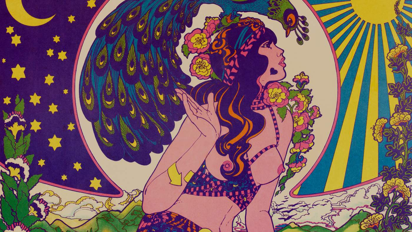
Fashion gets groovy with whirling prints and acid-like abstractions
From left: Roberto Cavalli, Marc Jacobs, Temperley, Mary Katrantzou, Proenza Schouler, Chanel, Pucci, Louis Vuitton, Versace, Valentino, Givenchy, Sacai, Olympia Le-Tan. Catwalking.com
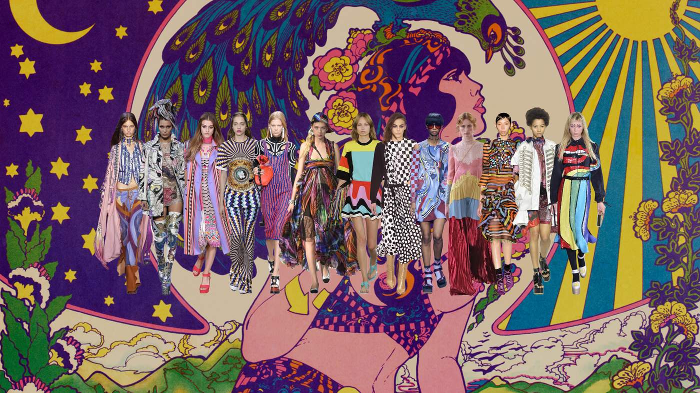
Maximalists rejoice! The rainbow colours and groovy attitude of psychedelia are back. And this season it’s part of a mash-up of influences that takes the 1960s and 1970s movement into new territory. Mary Katrantzou took ancient Greek motifs and patterns and “fused them with psychedelic art”; trippy optical squares on flared trousers, tunic dresses and skirts with peplums that mirrored the shape of ancient vases. At Louis Vuitton, Nicolas Ghesquière also offered an optical arrangement of chequered black and white which evoked the monochrome paintings of Bridget Riley. Flowing shapes, eclectic prints and hippy-style embroidery at Roberto Cavalli conjured up Woodstock so strongly you could almost smell the joss sticks.

Cream’s Disraeli Gears album cover, 1967 ©Alamy
Fringing, skinny scarves and flares also owed a lot to psychedelic rock star Jimi Hendrix, while the palette echoed the clashing block colourways of that era’s poster art. Hendrix was also a major influence on designer Chitose Abe, creative director at Sacai, who summoned Hendrix’s personal style as one of her “game changers”. Youth culture was at play too at Marc Jacobs, whose club-kid models were inspired by raves, acid house, anime, Harajuku girls, Boy George (hence those controversial colourful dreadlocks) and 1980s London. Stomping down the catwalk to rave classic “Born Slippy”, models wore jackets and towering platform boots decorated with hallucinatory illustrations by artist Julie Verhoeven. Taps, cacti, rainbows, snakeskin, mouths, lemons and ovens all mingled together in her kooky cartoonish designs. Far out. Carola Long

Poster for 1967 Fillmore auditorium concert ©Lebrecht Music and Arts Photo Library / Alamy
‘It’s bad-ass and extreme’
Proenza Schouler’s Jack McCollough and Lazaro Hernandez
For Proenza Schouler’s Jack McCollough and Lazaro Hernandez art is essential to their work. They talk about the people whose palette, passion and creative process inspire them
How do you use art in design?
Jack McCollough It changes every season. Sometimes it’s texture, sometimes it’s palette. Sometimes it’s just the artist’s process and how they work that inspires us. We never like it to feel like a direct reference. Fashion can feel a bit recycled, so we try to look beyond that and get different ideas from all over the place.
Why does art inform so much of your work?
Lazaro Hernandez We started our company right out of school, we don’t have the 100 years of fashion to pull from our archives. Proenza Schouler isn’t this heritage brand. We’re just pulling ideas and images from our lives and making it up from scratch. JM American modernism is something we’re really drawn to. I guess we’re in a fashion dialogue at any moment. What’s happening. What’s our stance on this thing that’s happening right now? Are we going to go in that direction or not? And sometimes we reject what’s happening and we go the opposite direction.
What are you drawn to currently?
JM I think aesthetically, we’re in a new phase. We used to sketch the collections at the very beginning of the season, and our sketches were exactly how the show would look. Now the show will be completely different. LH I think we’re more confident and therefore we’re freer and looser with things. We’re not being too rigid. The SS17 show was a good example: we used a bunch of different references and approached it more as a curatorial project than as a fashion collection. Mixing all these references into one big pot and seeing what came out. The whole thing had movement and more life and energy to it.
Have you ever bought the art you work with?
LH We definitely try to collect what we can, and where we can afford it. The Robert Rymans and the Cy Twomblys are a little… expensive for us.
Do you think fashion is art?
JM We think fashion is design. I think art has a spiritual quality. Art has the quality of just being an object and a thing that exists that fashion doesn’t have. I think good fashion has to work on many levels, but at the end of the day it’s a product. It has to be bought and sold and produced. And it has to have a function. It’s not enough to create clothing just to sit on a mannequin in a museum. We like to think the clothing we make has to have a life after we present it on the runway. It’s for women to use and wear and own. I think that functional aspect makes it not art. It can be art-like but we would never say that we’re artists in any way. We have too much respect for real artists to say that.
SS11 / Sterling Ruby
JM When we first learnt of the work of Sterling Ruby, we were most inspired by his palette and the mix of textures and that broken-down quality of his work. There was this beautiful drippy sculpture that he does – it’s like the cross-hatch sort of idea. It almost feels like lace in a way, in these neon bright colours…
LH We were looking at the industrial elements of Sterling Ruby’s work. How a lot of things he uses are found objects recontextualised. So we went to Canal Street in New York and we took this iridescent flooring material and had it sent to India to be cut up into sequins. That top (left) is all sequins made out of plastic – we wanted to translate that materiality into a more feminine thing.

SS11

Kiss Trap Kismet by Sterling Ruby, 2008 ©Camera Press/Tristan Gregory
SS13 / Gerhard Richter
JM For this show, we were specifically interested in a body of work that Richter did called Overpainted Photographs, where he was taking different imagery and painting on top of it, kind of distorting the images. This dress, for example, is photo printed and we then start taking all these studs and eyelets and distorting the images to become a bit more abstracted. We used totally random images we’d found on Tumblr. It was similar to Instagram culture – a modern collage mixing references and ideas and visuals and different points of views and aesthetics. LH We loved the randomness of the imagery, and how that imagery becomes obsolete because of the texture and the surface treatment on top of it. JM What was interesting to us about the Richters was that hand quality – that mix of something really digital and high tech with something very hand-made and human. That became the central theme of the collection, this mix of hand and machine.

SS13
")
Overpainted photograph 17. Nov. 99 by Gerhard Richter ©Gerhard Richter 2017 (1305)
SS14 / Robert Ryman
LH Ryman’s entire career has been about applying white paint, and applying white onto a surface in whatever way… It’s about the act of painting. I cannot believe a human being has dedicated 60 years of his life to applying white paint onto different materials. It’s so obsessive and bad-ass and extreme. There’s no one like Ryman. We’ve been obsessed with him forever. JM That’s how we landed on those pieces. We asked: how can we apply white paint to pieces and still have them as something you’d want to wear? And how could we apply it in different ways? We’d sew the garments up kind of half-assed, without creating the shoulder seams, so you can lay the whole piece flat, and then apply a kind of pigment print onto the screen so it would cover the coat entirely. The thing is the coat was already seamed, so you’d have the fat little lips from the seam allowance and where the hem is turned up and the pocket flaps, the lapels, and all these really beautiful nuances and little discrepancies of colour.

SS14
, 2002 by Robert Ryman ©Collection of Pennsylvania Academy of the Fine Arts, Philadelphia. Alexander Harrison Fund 2005.")
Philadelphia Prototype (installation detail), 2002 by Robert Ryman ©Collection of Pennsylvania Academy of the Fine Arts, Philadelphia. Alexander Harrison Fund 2005.
AW14 / Ron Nagle
LH We had never heard of the American artist Ron Nagle before we went to the Venice Biennale and his work was in this vitrine in the middle of the Central Pavilion. It’s just got that pop-py quite fun sensibility, and yet what I like about it is that you have no idea what it is you’re looking at. JM The ceramics are tiny – four inches tall – and they’re like underwater creatures or really fancy desserts. But it was these insane textures and super sophisticated colour combinations that were inspiring. Most of all we were attracted to that palette. It was unlike anything we had ever seen before.

AW14

Untitled by Ron Nagle ©Ron Nagle 1981, courtesy the Matthew Marks Gallery
AW15 / Robert Morris
JM This is one of the collections where the art informed the process of how we work and how we got to the final result. It wasn’t just about Robert Morris, it was also about Helen Frankenthaler, the artist who would throw paint on a canvas and let it fall and do its thing. Similarly Morris was slashing into these felt pieces, letting them hang, nailing them up on walls and slashing into them again. It was a really interesting way of doing fittings. We started with a grey coat. We took some old military pieces and cheap little vintage pieces and started slashing them. LH Morris used gravity as a compositional element. There’s material, there’s colour and then there’s gravity. Gravity is just as important a device as colour and texture. When you slash clothes or cut things a certain way and they do a certain thing, gravity forces it to do something. JM Prior to this season we had been fixated, as I think many other designers have been, on the internet image. So many people digest fashion now online, and a lot of people don’t go to the shows, so it’s about being able to control that image as best as possible by doing heavier clothes or more constructed clothes that will stay in place. And I think it was that fall show we were kind of like: who cares? Let’s get some more freedom in these clothes and some more movement and not be so fixated on what the final image is going to look like. Let’s bring more of a sense of freedom into these pieces. The hardest point was knowing when it was done. How about one more slash? Then you do one more slash and it’s like, no, one slash too many. That was the hard part. Knowing when something was finished.

AW15
, 1967 by Robert Morris (b.1931).
Artwork: ©Robert Morris \/ Artists Rights Society (ARS), New York \/ DACS, London 2017. Photo: Bridgeman Images")
Untitled (Felt Tangle), 1967 by Robert Morris (b.1931).
Artwork: ©Robert Morris / Artists Rights Society (ARS), New York / DACS, London 2017. Photo: Bridgeman Images
SS16 / Cy Twombly
LH The SS16 show started off in a very fashion place. We’d never done a ruffle – it’s like the most hideous thing. We hated the idea of a ruffle, and so therefore we said, “Let’s try to make it cool and interesting.” Then we started looking at some Spanish clothes and the idea of circles and dots and roses… Roses can be so cheesy and tacky. And then we remembered the Cy Twombly roses, he had taken this twee idea and made it really cool. So we were inspired by them. The process is very much like that. One thing leads into that, that leads us into the next and that leads into something after that. Somehow, along the line, Twombly became a visual element that we played with.

SS16

Cy + Relics, Rome, 1952 by Robert Rauschenberg. Gelatin silver print ©Robert Rauschenberg Foundation / DACS, London / VAGA, New York 2017
AW16 / Donald Judd
LH This was a landscape thing: we had gone on a road trip out West and ended up in Marfa, Texas, and seen the Donald Judd sculptures. It’s so magical out there. And we were inspired how artists in the 1960s had decided to use that landscape as a gallery space and created these artificial, synthetic sculptures and, in Judd’s case, an entire city in the American West, the most natural, beautiful, mystical setting in the world. It was the mix of the natural and the completely man-made and the conversation between the two that we wanted to explore as a theme for a collection. JM So we mixed natural organic and synthetic materials: a black faux leather, super synthetic, with this really rough shearling collar. The earrings were these geodes and stones. There were steel toes on the boots – organic meets artificial.

AW16

Untitled Cubes by Donald Judd, 1980-84. These box-like minimal structures, sometimes called Judd cubes, by Minimalist artist Donald Judd are in the grounds of the Chinati Foundation, or La Fundacion Chinati. Artwork: © Judd Foundation / ARS, NY and DACS, London 2017. Photo: Getty Images / Carol M. Highsmith
SS17 / John Currin and others
JM Here we were on a whole new vibe from what we’ve been doing for the past couple of years – a new chapter for us. The John Currin came about because we were out to dinner with John and his wife Rachel Feinstein and he’s talking about what he’s up to and that piece “Heartless” was on his phone. And he gave us his blessing to use it. A heart means so many things. And that this was an empty heart is… there’s something twisted about that. LH We’ve used so many references this season. Anything we were feeling or looking at in the moment we just tried to throw into the mix and not be so precious about the theme of the collection. There’s Bernini sculptures, there’s primitive stuff, Carmen Herrera. We had never heard of this 100-year-old Cuban lady who’s doing the same kind of work as Ellsworth Kelly. She became successful at age 95. How cool is that?

SS17

Heartless by John Currin, 1997. Oil on canvas ©John Currin, Courtesy Gagosian
Tropicalia
©Maryna Stryzhak/Alamy
The catwalks bloomed with lush florals and a Latin American beat
From left: Roksanda Ilincic, Prada, Chanel, Marni, Missoni, Victoria Beckham, Miu Miu, MaxMara, Lacoste. Catwalking.com
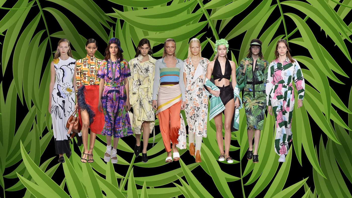
The rhythms of Rio continue to reverberate far beyond the stadiums of last summer’s Olympic games, and the SS17 catwalks were awash with colour and vibrant design. At Maxmara, centre stage was the architect and designer Lina Bo Bardi, one of the key exponents of Tropicalia – the movement which infused Brazil’s cultural landscape in the 1960s and included musicians like Gilberto Gil and the poet Torquato Neto among its number. The show was lush with big, bold palm prints, athletic jersey separates and sport-tech coats. There were similarly splashy florals at Victoria Beckham, Roksanda Ilincic and Lacoste, where Felipe Oliveira Baptista had been inspired by Brazil’s Bahia coast for his soft washed prints. Miu Miu’s pin-up prints and floral swimming hats conjured the spirit of Carmen Miranda.

Gilberto Gil, 1985 ©Jan Persson/Redferns/Getty; US Carmen Miranda postage stamp ©Neftali/Alamy
Other designers looked further north: to Cuba. Albert Kriemler, the Akris designer had, like Proenza Schouler, alighted upon the minimal works of Carmen Herrera to find the key to his SS17 collection. The 101-year-old artist, who was born in Cuba, has just enjoyed a solo show at the Whitney, New York, the city in which she has lived since 1954, and the fashion world has been quick to adopt her for their own. Kriemler’s collections featured punchy geometric prints taken from the Herrera archive. JE

Green Garden, 1950 by Carmen Herrera. Acrylic on canvas ©Carmen Herrera; courtesy Lisson Gallery

Akris SS17
Carmen Herrera: Lines of Sight is on at the Wexner Center in Columbus, Ohio until 16 April
Type
Open your eyes, A Love Letter For You by Steve Powers ©Steve Powers, photo by Adam Wallacavage
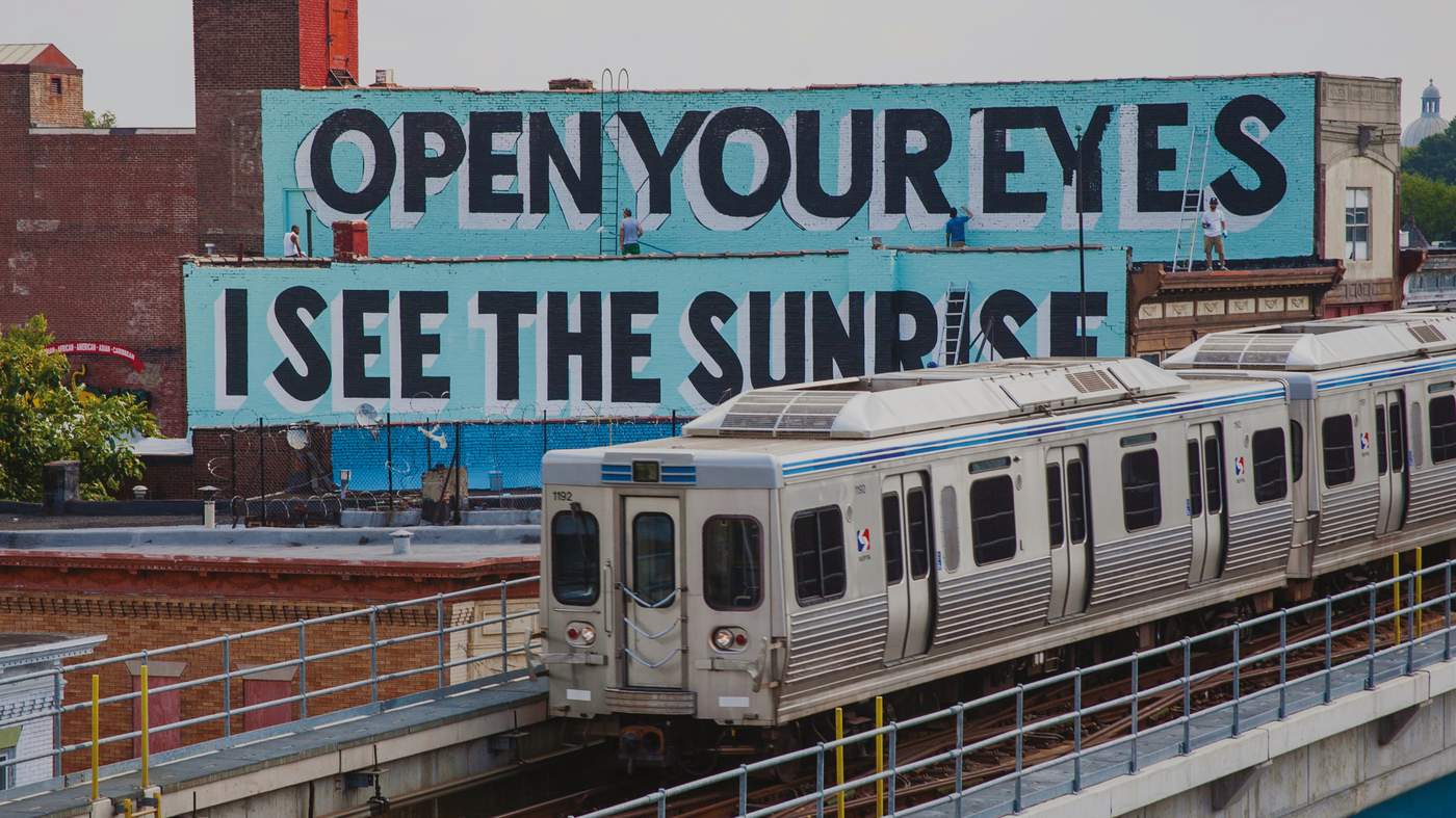
Feminism! Love! Futuresex! For SS17, designers said it with a slogan
From left: Paco Rabanne, Dior, Moschino, Ashley Williams, Stella McCartney, Junya Watanabe, Maison Margiela, Dolce & Gabbana, Vivienne Westwood. Catwalking.com
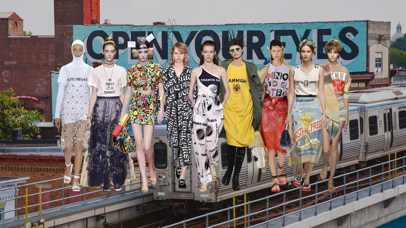
Sometimes designers are content to convey their messages subtly, to intimate them through the romance of tulle or the toughness of zips and chains. This season, however, many want to spell out their thoughts, using an array of fonts, slogans and graphics.
Maria Grazia Chiuri employed slogans to express a manifesto of sorts for her new tenure at Dior, where she is the house’s first female artistic director. T-shirts were emblazoned with capital letters (in a similar style to those used by Ed Ruscha) declaring “Dio(R)evolution”, and “We should all be feminists” referring to the Ted talk by Chimamanda Ngozi Adichie. Chiuri told the FT before her show, “Fashion is about revolution. And I think that revolutionary is a woman. I’m a little bit feminist because I’m a woman at Dior and so I wanted to speak about the women in a different way.” Her use of words made explicit the spirit in which the collection was to be taken; a mix of fencing-inspired jerkins, ballerina skirts and sharp tailoring was a reflection of the multifarious nature of modern womanhood. “Women don’t want to be only one way,” she explained. “In the morning you might want to be very basic, tonight princess, another time to be a little bit sexy.”

Gucci SS17
Traditionally, the primary use of words in art was for the artist’s signature; in fashion the name of the luxury label is the seal of authorship. It was in the early 20th-century that art increasingly began to feature words and symbols, just as marketing and advertising occupied a more prominent place in popular culture. Picasso’s “Bottle of Vieux Marc, Glass, Guitar and Newspaper” (1913), with its cutting from Le Figaro, Kurt Schwitters’ “Mz 299” and Francis Picabia’s “The Fig-Leaf”, from 1921 and 1922 respectively, are key early examples.
, 1985 by Barbara Kruger (b.1945). Private Collection, ©Barbara Kruger. Courtesy of Mary Boone Gallery, New York. Photo: Bridgeman Images")
Untitled (Money Can Buy you Love), 1985 by Barbara Kruger (b.1945). Private Collection, ©Barbara Kruger. Courtesy of Mary Boone Gallery, New York. Photo: Bridgeman Images
Slogans cropped up all over the SS17 catwalks, from the matter of fact Futuresex at Paco Rabanne, to Sacai, where Chitose Abe reversed a Joe Strummer quote to read “Fashion is a Passion”. Designers Domenico Dolce and Stefano Gabbana showed “fake” T-shirts featuring mis-spelled or joke versions of the Dolce & Gabbana logo inspired by the imitations they have encountered on their jet-setting, from Drunk & Gorgeous to Dolce & Gabbaba [sic]. And as part of their ongoing homage to Italian culture, which spans everything from Catholic crosses to grocery packaging, the pair had also designed sack-cloth skirts and dresses printed with tinned tomatoes and pasta packets. Andy Warhol might have got there first with his Campbell’s Soup prints in 1962, but this Italian spin on Pop Art was fun and evocative of the mouthwatering delights of an Italian delicatessen.
 ©Morgan Art Foundation Ltd. \/ Artists Rights Society (ARS), New York, DACS, London 2017. Photo: Bridgeman Images")
India Tulip, from ‘The Garden of Love’ by Robert Indiana (b.1928) ©Morgan Art Foundation Ltd. / Artists Rights Society (ARS), New York, DACS, London 2017. Photo: Bridgeman Images
At Stella McCartney, T-shirt dresses and leotard tops were emblazoned with graphic prints: the words – “Thanks Girls”, “No Leather, And No Fur”, “Love” – a direct expression of gratitude to her customers for supporting her ecological and animal cruelty -free ethos. There were echoes of Robert Indiana’s 1965 “LOVE” print also. The word appeared in bold capitals at Michael Kors, in kooky squiggly felt-tip scrawls at Moschino and on a T-shirt declaring “Love & Devotion” at Ashish. Gucci wrote the words “Blind for Love” on a fur coat, in different languages and scripts.
Sometimes the medium was the message. Asked why he’d used Cyrillic lettering and varsity fonts on his T-shirts, the Japanese designer Junya Watanabe’s spokesman told the FT: “He just liked the graphic quality of the way they looked.” This season, at least, designers played to type. CL
Barbara Kruger’s ‘Untitled (Blind Idealism Is…)’ is on display on the High Line, New York City, until March

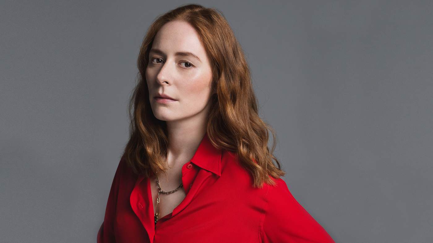
At Hermès, designer Nadège Vanhee-Cybulski has taken the house scarf to new dimensions. By Jo Ellison
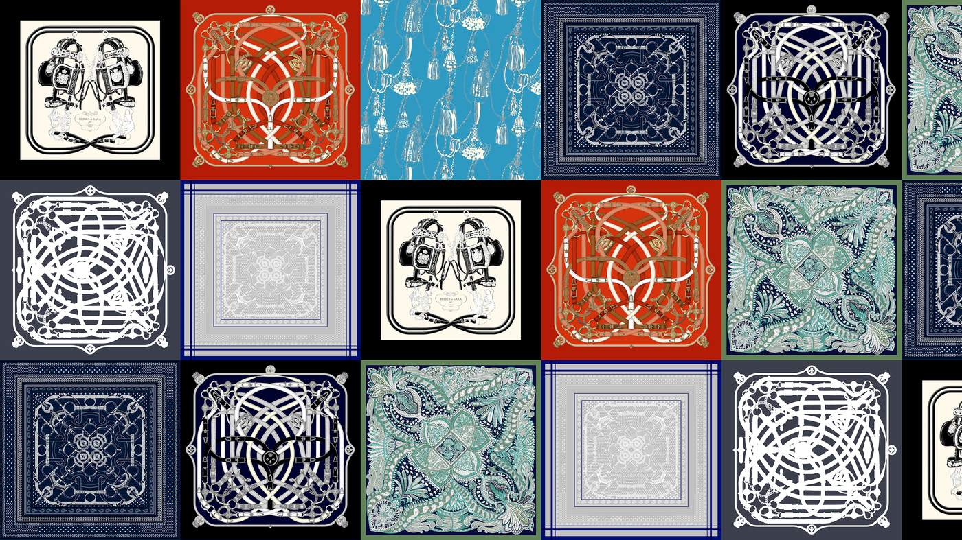
A big square, typically measuring 90cm-by-90cm, and designed in infinite variety, the carrè (or scarf) has become as powerful an emblem of Hermès as the saddlery on which the French luxury house was founded in 1837 – and far, far prettier to behold. Serving as a canvas for infinite interpretations, the first scarf design was a simple block-print conceived in 1937 by Robert Dumas, one of the Hermès-family heirs. Today the house boasts an archive of more then 2,000 scarf designs, to which a stable of some 50 freelancers contribute further designs each year.
For the house’s current womenswear designer, Nadège Vanhee-Cybulski, the scarf has become an intrinsic part of her design. Since taking the creative reigns in 2014, the French-born designer has used the scarf in myriad ways, incorporating prints into her ready-to-wear collections and pushing the technical capabilities of the studio in her quest to reinvent it.
“There’s a very strong heritage feeling with the scarf,” she explains from her design studio in Paris. “It’s about the equestrian world. It’s about travelling. It’s about the dream. It’s about so many different things. When I arrived at Hermès, I was fascinated by what could be revealed when you work on the colours of a classic scarf, but also how you could show things you might not see when you wrap it around your neck. I wanted to push it to another level.”
Vanhee-Cybulski’s fascination plays out in many ways. “I like to play with the different proportions and cuts,” she says. As well as creating separates tailored from the scarf’s precise proportions, she has spliced it to create knife-edged pleats, and punched its designs into leather. She loves the scarf because, while tailoring requires a strict adherence to “the architecture of a garment’s construction”, a scarf, “you just drape, so it’s much more pure”.
One thing she won’t do, however, is cheat. “I always use the exact dimensions of the scarf, whether it’s the 70cm, 90cm or giant 140cm squares. I try to stay purist because we work with screenprint factories and a specific frame. And if you have a perimeter that you can’t overcome, it’s interesting… within that perimeter, you find your freedom of creativity.” But does she have favourites? Of course she does…
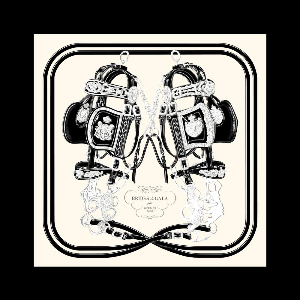
Brides de Gala by Hugo Grygkar, 1957
One of the house’s most distinctive scarfs, by the designer of the first Hermès carrè, Hugo Grygkar, with input from Robert Dumas, the “Brides” has adorned the heads of both Queen Elizabeth II and Sophia Loren. “It’s a very interesting scarf because it represents two things for me: an extreme minimalism, and a deep femininity,” says Vanhee-Cybulski who has returned to it several times in her studio. “I wanted to liberate it for a contemporary woman. And I love the idea of taking something that belongs more to a certain type of pop culture and mixing it with a very intricate drawing of the saddle.” The scarf also offers a specific challenge. “Because an illustration is one dimensional, I have to erect a volume and a dimension for it to be worn on the body so the colours and the composition are really important. That’s always interesting.”
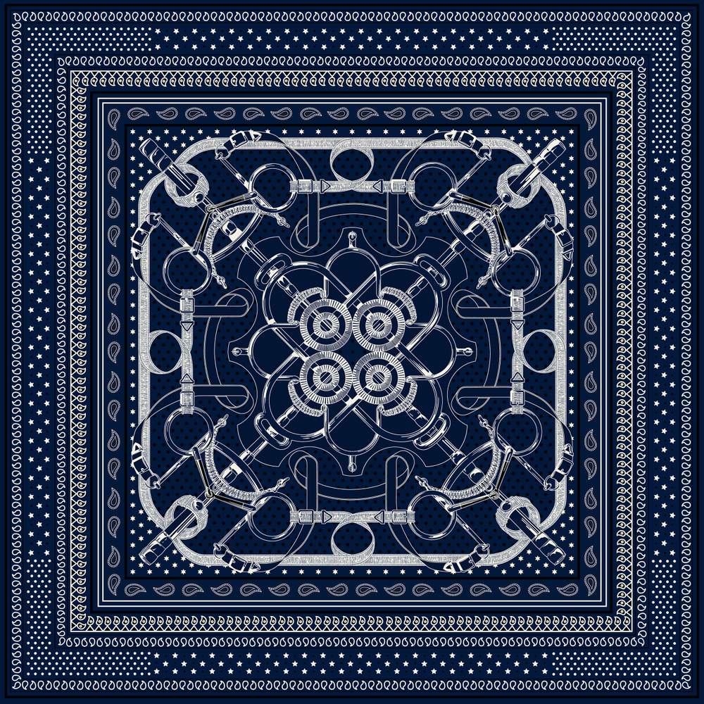
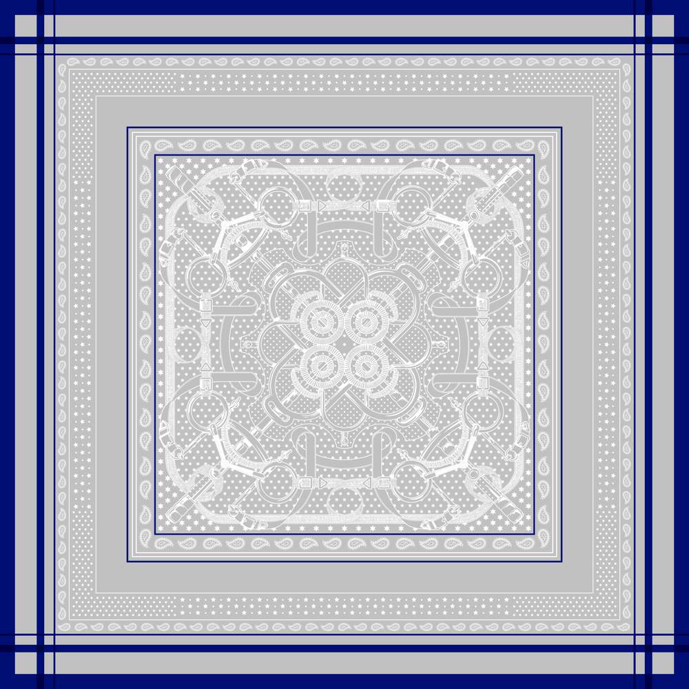
Eperon d’Or by Henri d’Origny, 1974
Conceived by Henri d’Origny, one of the most illustrious of the Hermès scarf designers who has spent 55 years working with the Maison des Carrès, this bandana scarf has been a key code of Vanhee-Cybulski’s collections. She is especially drawn to its kaleidoscopic quality. “I always fall back on d’Origny’s scarves as a source of ideas and inspirations,” she says. “He’s an extraordinary illustrator, but this idea of symmetry is innate in him: he can really draw within a square which is not an easy thing to do.” Despite their vintage, the Eperon, like the Brides de Gala suggests a certain modernity to the designer also. “I’m a big fan of the artists Josef Albers and Dan Flavin,” she continues “and when I see the Henri d’Origny I feel that same sense of composition. It’s unique. Within that square he manages to create all these intricacies and designs and twist them into something dynamic. Then, when you drape or tailor it, it allows you to unknot another dimension. He’s a great mental gymnast.”

Indigo Eperon d’Or bandana silk twill print man’s shirt and skirt with inverted pleats, Hermès AW15
For her debut collection, AW15, Vanhee-Cybulski used the scarf to create a bold print shirt and panelled skirt constructed from perfectly proportioned pieces. “I wanted to look at a new androgyny,” she says of the sporty day collection which also featured leather overalls and quilted equestrian jackets. “This was a confident men’s shirt made in twilled silk. I liked the tension, and that this look was a dialogue between something masculine and something extremely feminine. I think also, it was about injecting my story into the house, to study the scarf or motifs that are the DNA of Hermès and see how I could translate them in a more specific way.”
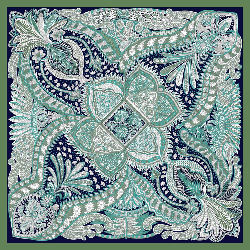
Le Jardin de la Maharani by Anna Faivre, 2016
“I love the idea of paisley,” says Vanhee-Cybulski. “It come from a very classic tradition and it was something I really wanted to translate into a garment.” Developed and used for a small capsule collection last year, Vanhee-Cybulski took the Maharani and its paisley design and used it in every way. She found its most delicate expression, however, in a pastel paisley perforated leather. The technical specificity of the task was painstaking. “You have to work on perspective, so we chose to translate the drawing with three different diameters – small holes, medium holes, bigger ones. It was a very long project. Also, we placed the pattern as though draped, like you would a silk scarf; everything had to be absolutely calibrated so that it could be framed within the little leather pieces because, how do you translate a 90cm-square into leather skins which are a bit smaller?” With immense patience, it transpires.
Passementerie by Françoise Heron, 1960
Anyone can submit a scarf design to Hermès. The house currently works with around 50 freelancers worldwide, including Kermit Oliver, a former postman who lives in Waco, Texas, who has designed 16 carrès. Françoise Heron, whose Passementerie scarf inspired the house’s latest resort collection, is known for richly feminine designs but always leaving her scarfs unsigned. “The Studio Dessin is an amazing database because we work with so many different illustrators,” says Vanhee-Cybulski. “We have our classics and then sometimes we make a discovery, so it’s very dynamic.” Moreover, it’s constantly evolving. “It’s extending the know-how and the sensibility of the house but also the sensibility of the illustrators,” says the designer. “It’s a great place of dialogue.”

Dress, in silk marocain crêpe, flat screen-printed with a design inspired by the Passementerie scarf, and sneakers, in woven silk with Cavalcadour print, Hermès Resort 2017
Eperon d’Or by Henri d’Origny, 1974
Vanhee-Cybulski used the Eperon d’Or in the SS16 collection, this time making a feature of its bold blue trim. This was a “contemplative” design, says Vanhee-Cybulski. “The more you look at the scarf, the more you understand the different shades and perspectives, and the more you observe, the more you connect the dots. The blue lines frame the square. They’re very loud; they’re really shouting out to help you understand the outlines of the garment, but when you look inside, you just see all these different weaves that give you an idea of different volumes and shades.”

Sailor dress in the ivory white Eperon d’Or silk jacquard, Hermès SS16
Vanhee-Cybulski enjoys the rigour of a scarf’s geometry. “Whether you are a fashion designer or a car designer, there are rules or certain ways of doing things. I think it’s interesting to understand how it works so that you can choose to go along with it, or not. It’s always a statement of choice.”
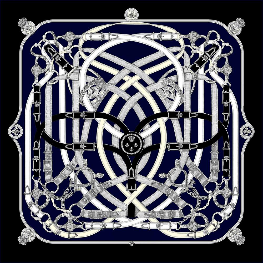
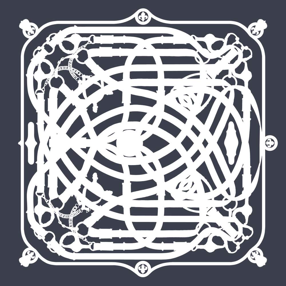
Cavalcadour by Henri d’Origny, 1982
For SS17, Vanhee-Cybulski took a classic scarf design of belts and horse bits by d’Origny and used its distinctive lines on prints and embroideries. The art was in the subtlety of its use. “If you look closely, the Cavalcadour was everywhere,” she says. It was there on the skirts, folded into knife-edge pleats interspersed with the “Fantôme” version (below) of the Cavalcadour that rendered it in simple monochrome. It was used also as the subtlest of embroideries on crisp white cotton shirts and khaki shirt dresses, “where all the stitches were representative of the scarf’s design” says the designer. And it was printed, like a ghost pattern, on acid yellow silk. Like the most beguiling of optical illusions, the Cavalcadour only revealed itself to those who were searching for it. Says Vanhee-Cybulski: “I just wanted to give the scarf a whole new dimension.”

Silk and polyester pleated knit wraparound skirt printed with the Cavalcadour Fantôme motif, Hermès SS17
Editor Jo Ellison (jo.ellison@ft.com) Design Hannah Bishop, Gabriela Izquierdo, Anna Kaminska, Alexander Kozlowski, Kati Lopez, Kostya Penkov, Harriet Thorne Contributors Grace Cook, Aimee Farrell, Carola Long, Ruth Metzstein, Simon Schama Commercial Chris Nardi, Jo Thompson, Alexis Williams
For all advertising enquiries please contact Alexis Williams: +44 (0)20 7873 4216, alexis.williams@ft.com
The Art of Fashion issue 1