For the fifth issue of The Art of Fashion we offer an overview of the men’s and women’s SS18 collections and the art trends and creatives which inspired them. Fashion illustration is becoming an ever more urgent trend in luxury. Until recently the illustrator was a front-row curiosity, a character representing a past era of design. All that has changed: new technologies and the rise of street art have encouraged us to reappraise the power of the pencil, and original artworks are increasingly appearing on clothes, campaigns and customisations. Flora Macdonald Johnston meets three artists redrawing the luxury space in totally different styles.

Ignasi Monreal’s artwork for Gucci’s SS18 campaign. Courtesy Delfino Sisto Legnani & Marco Cappelletti
On the home front, interior design informed many of this season’s collections, as fashion found inspiration in domestic spaces. The bold, block graphics of textile designers David Hicks, Marimekko, William Morris and Alexander Girard were among some of the standout sources. Aimee Farrell investigates the appeal of the interior and why wallpaper is so hot right now.
Collaborations are fashion’s greatest currency. This season Stuart Vevers, artistic director of Coach, worked with the Keith Haring Foundation to find the playful, pop-y spirit of his SS18 show. He explains why the late New York artist’s cheeky line drawings of alien crafts, dancing men and barking dogs were such a good fit for the brand. Meanwhile, Grace Wales Bonner describes the friendships and cultural ties that have shaped the mood of the menswear line she started in 2014.
All this and Louis Vuitton’s Nicolas Ghesquière, on why an 18th-century male status symbol, the frock coat, became the star of his womenswear show. And a few Warhols…
Jo Ellison, Fashion Editor, FT

Louis Vuitton’s Nicolas Ghesquière on how an 18th-century male status symbol inspired his latest women’s show
‘It began with a visit to the Costume Institute at the Met Museum in New York,” says Nicolas Ghesquière, the artistic director of womenswear at Louis Vuitton, of the stimulus for his SS18 show: the frock coat. “I was inspired by the notion of perennial style while looking at 18th-century aristocratic garments. Looking at these extraordinarily ornate pieces lead me to wonder how I could re-appropriate them in a modern-day context.”
One of the most flamboyant and extravagant expressions of male status, the frock coat (or, more precisely, the justacorps that preceded it) first rose to prominence in the mid-17th century. A knee-length garment with cut-away tails, fabricated in heavy brocades and silks and embellished with ornate embroideries, the frock coat became sartorial shorthand for wealth, privilege and power, and was an essential feature in the portraiture of 18th- and 19th-century aristocratic life. Such a totem of machismo was an unexpected motif for a designer recognised for his more futuristic visions. Yet Ghesquière made the coat core to his SS18 collection.

The Blue Boy, c1770 (oil on canvas) by Thomas Gainsborough, Huntington Library and Art Gallery, CA, USA ©The Huntington Library, Art Collections & Botanical Gardens
“The construction is very interesting as, on the one hand, the garment is incredibly military in its cut and function. It’s a piece cut in movement, it swings as you walk and carries its weight in the back, which makes it modern. But on the other hand, it’s very embellished. The redingote [an early version] was originally a menswear piece. It was essentially a uniform. Dressed up or down, it took men from the woods to the palace. What makes the piece so interesting is its versatility. The frock coat transcends utility and gender.”
In Ghesquière’s hands, the coat became a more fluid, feminine garment — though no less grandiose. “The sheer construction of these garments structures one’s silhouette,” he explains of the coat’s ability to confer status on its wearer. “Shoulders are highlighted, waists are defined, the silhouette is elongated. Though it was traditionally a masculine piece, women did in fact adopt the frock coat,” he continues. “They used it as a political statement in their fight for female liberation — the epitome of the Louis Vuitton woman, who is strong, adventurous and free.”
On the Louis Vuitton catwalk, in the medieval foundations of the Louvre museum in Paris, the frock coat received a new athletic spin. The models wore their flowing silks with sneakers and running shorts. Just as Thomas Gainsborough’s “The Blue Boy” depicts its young subject as a figure in the world, so too was Ghesquière’s muse a woman of action. “The sporty elements were natural,” he says. “These coats are in movement in their cut and silhouette. The model is in movement. I was also inspired by the film L’esquive by Abdellatif Kechiche, where aristocratic, theatrical pieces are transported to the inner-city, where real people mix these decorative dresses with their own wardrobe of denim jackets and trainers.” JE

Louis Vuitton SS18
Louis Vuitton’s Nicolas Ghesquière on how an 18th-century male status symbol inspired his latest women’s show
‘It began with a visit to the Costume Institute at the Met Museum in New York,” says Nicolas Ghesquière, the artistic director of womenswear at Louis Vuitton, of the stimulus for his SS18 show: the frock coat. “I was inspired by the notion of perennial style while looking at 18th-century aristocratic garments. Looking at these extraordinarily ornate pieces lead me to wonder how I could re-appropriate them in a modern-day context.”
One of the most flamboyant and extravagant expressions of male status, the frock coat (or, more precisely, the justacorps that preceded it) first rose to prominence in the mid-17th century. A knee-length garment with cut-away tails, fabricated in heavy brocades and silks and embellished with ornate embroideries, the frock coat became sartorial shorthand for wealth, privilege and power, and was an essential feature in the portraiture of 18th- and 19th-century aristocratic life. Such a totem of machismo was an unexpected motif for a designer recognised for his more futuristic visions. Yet Ghesquière made the coat core to his SS18 collection.

Louis Vuitton SS18
“The construction is very interesting as, on the one hand, the garment is incredibly military in its cut and function. It’s a piece cut in movement, it swings as you walk and carries its weight in the back, which makes it modern. But on the other hand, it’s very embellished. The redingote [an early version] was originally a menswear piece. It was essentially a uniform. Dressed up or down, it took men from the woods to the palace. What makes the piece so interesting is its versatility. The frock coat transcends utility and gender.”
In Ghesquière’s hands, the coat became a more fluid, feminine garment — though no less grandiose. “The sheer construction of these garments structures one’s silhouette,” he explains of the coat’s ability to confer status on its wearer. “Shoulders are highlighted, waists are defined, the silhouette is elongated. Though it was traditionally a masculine piece, women did in fact adopt the frock coat,” he continues. “They used it as a political statement in their fight for female liberation — the epitome of the Louis Vuitton woman, who is strong, adventurous and free.”
On the Louis Vuitton catwalk, in the medieval foundations of the Louvre museum in Paris, the frock coat received a new athletic spin. The models wore their flowing silks with sneakers and running shorts. Just as Thomas Gainsborough’s “The Blue Boy” depicts its young subject as a figure in the world, so too was Ghesquière’s muse a woman of action. “The sporty elements were natural,” he says. “These coats are in movement in their cut and silhouette. The model is in movement. I was also inspired by the film L’esquive by Abdellatif Kechiche, where aristocratic, theatrical pieces are transported to the inner-city, where real people mix these decorative dresses with their own wardrobe of denim jackets and trainers.” JE

Louis Vuitton SS18
Flora Macdonald Johnston meets three fashion illustrators reworking the look of luxury

Ignasi Monreal is a 27-year-old Spanish artist and illustrator whose digital painting and moving imagery has been used by Gucci, JW Anderson and Louboutin
Imagine a world in which robots fight fish monsters with laser beams, a fluffy-coated Santa Claus hoists sacks of JW Anderson handbags over his shoulder, and “Ophelia” floats on water dressed in head-to-toe Gucci. This is the realm illustrator and artist Ignasi Monreal inhabits. At 27, the London-based Spaniard had amassed an impressive portfolio of work for luxury brands such as Louis Vuitton, Louboutin and JW Anderson. But it is his recent work for Gucci that has captured imaginations on a global scale. His distinct style, combining cyber and surrealist touches, has even been given a label: “Monrealism”.
“I come from comics; I’m a bit of a geek,” says Monreal in his thick Spanish accent. His love for fantasy developed at an early age. “When I was a child, my mother told me myths instead of fairy tales – that’s what drew me into that fantastical world. I grew up listening to the stories and I mean, they’re bonkers! As a kid, you don’t get the metaphors, you’re just like, ‘What? He turns into a bull?!’”
This myth influence is most apparent in a series of images he created for Gucci’s Gift campaign in 2017, for which Monreal was given full creative reign by creative director Alessandro Michele. He says: “They were like, ‘We don’t want to give you any brief, we don’t want to influence’, so there was no input there.” His starting point was the Italian Renaissance and the works included a three-headed dog holding a pair of men’s horsebit sliders, and good and evil furry kittens, perched on the shoulders of a man in a white “mystic cat” baseball cap.

Gucci’s SS18 campaign, detail. Courtesy Delfino Sisto Legnani & Marco Cappelletti
Monreal has produced about 150 art works for Gucci in the past eight months. “Maybe more. I lost count.” How does he produce so many, so quickly? “It’s all digital, all on my computer and a few tablets,” he says. “I use Photoshop. I have a custom set of brushes and I just sit there all day in front of the computer painting. I was working 14-hour days in order to get them finished on time, and each piece takes around two days to create.”
Monreal used an unexpected resource to hone his digital techniques: “I just learnt it from YouTube, it’s full of tutorials. I also learnt graphic design there. I wouldn’t necessarily call myself a photographer but I wanted to learn how to use a camera and watched videos until I could use one… You have to have a lot of patience, but if you have, it’s a free education. It’s not very curated but if you really want to learn something, you can.”
Monreal lights up when discussing the place of illustration in fashion right now. “There is something so beautiful in this current Gucci collaboration, as they have put faith and trust in illustration,” he says. “Until now, illustration has been a secondary thing, used to fill in the gaps. But the Gucci experience is amazing because it’s giving this art form a place. That’s the beauty of painting and illustration: you create things that you cannot recreate with real life. And that’s what we try to do with these Gucci projects, create something beyond reality. There is a craft behind it. It has taken me 27 years to learn to paint like that, and it’s a lot of work.”
Despite his out-there creations, the artist has a surprisingly simple vision for his ideal future: “I’d like to buy a house in the country, with a small garden, get a dog and just paint my stuff. Find the beauty in the small things, you know?”

Danny Sangra’s artwork for Burberry
Danny Sangra, 37, has created eye-catching black felt-tip illustrations for Burberry, Nike, Balenciaga and Louis Vuitton among many others. He is also a film-maker
‘I’m lazy. In my opinion, I’m the laziest person I’ve ever met. I mean, listen to my voice. It sounds so lethargic.” It is hard to believe the words of London-based artist, illustrator and director Danny Sangra, when his client list contains names such as Miu Miu, Vogue, A$AP Rocky, Metallica and Sony. His works range from large and loud black-and-white illustrations, usually drawn in thick black pen, to films and music videos that have a soft quality and finish, created using hand-held cameras and tonnes of personality. “Actually, I haven’t updated my site for ages,” says Sangra of his burgeoning client list.
Dressed in a plaid wool lumberjack shirt, Burberry cashmere scarf and Burberry trench, he certainly looks relaxed. But Sangra’s nonchalant demeanour belies his keen ambition. He studied graphic design and graduated from Central Saint Martins in 2003 with a game plan. “At the time I knew I needed to make a living for myself, and to get a career it’s almost like you need to have had one before. So I created this brand name – ‘A Minute Silence’ – and made all of these posters and images, and I would go to interviews and I would just lie. Unfortunately, the brand’s now folded, but we did all of this cool stuff and then, when I actually started to get given jobs, I would tell them that in order to get my previous jobs, I had lied.” He pauses. “People actually preferred that story. So it really just started off as a whole fake thing.”

Danny Sangra at the Burberry store in New York
Now 37, Sangra has just finished a major collaboration with Burberry: “The best project I’ve ever worked on,” he says. According to Sangra, Burberry designer Christopher Bailey had long admired his unapologetic style and had been thinking of a way to collaborate, but even Sangra’s friends were wary when he was first approached by the brand. “I have a few friends that work at Burberry,” says Sangra. “They were convinced I would have to water down my work and that I’d get into an argument. But actually it was fun.”
Sangra’s first project was to use Burberry archive images and give them a new lease of life. Sangra scribbled, wrote, collaged, cut and pasted imagery together to create a series of works that were colourful, humorous and visually entertaining. “I thought I would do one or two pictures,” he says, “they would post it on social media and that would be it. I ended up doing 15 pictures and the images clogged up their entire Instagram feed.”
Sangra went on to document the Burberry show in September, doing a Snapchat takeover, again drawing over the images of models walking the runway, using filters and injecting a sense of fun into the social platform.
He then worked on the brand’s first augmented reality experience, an app feature in which Sangra “doodles” illustrations on the user’s environment. “They put me in this virtual reality headset and I painted these three worlds,” says Sangra of the project. “You kind of live in these worlds and you can walk around them. It was weird because my phone was actually too old to use; Burberry bought me a phone so I could see.”
Sangra is now back from his world tour with Burberry, for which he created a range of bespoke “doodle” tote bags during a series of live consultation sessions, and created 30 different prints which now feature in different Burberry territories around the globe. “I have never worked so hard, and I mean that in the best way possible,” he says.
His favourite part of the tour? “Seoul, I’ve never been to South Korea, but their style there is just so good. They will buy expensive brands, mix it with random stuff and then customise everything they are wearing — it’s great!”
So what now for one of the most sought-after artists of the moment? “I thought during January that I would try and chill, but I keep being asked to do interviews.” Despite the sentiment of the statement, there’s a cheeky glint in his eye.
Sabrina Percy is a 28-year-old artist and model who creates colourful paintings, pencil sketches and digital drawing, and is a favourite of Dolce and Gabbana
Hopping off the back of her boyfriend’s moped, model and illustrator Sabrina Percy makes a very cool entrance. Dressed in a large navy duvet-style coat, leather trousers and an oversized knitted Dolce & Gabbana jumper emblazoned with the sparkly word “queen”, she works the relaxed-chic look.
The 28-year-old orders an Americano and starts talking. Fast. “I like to draw but I don’t think I have an artist’s soul,” she says from across the table. Her route to becoming a fashion illustrator has had its hiccups. Graduating from the London College of Fashion with a BA in fashion illustration in 2014, she started doing an eclectic mix of commissions for family, friends and brands. Colourful watercolours of models and fashion imagery, ink still-life drawings and delicate pencil work of animals. But her career stalled, and in 2016 Percy decided to take a break from the art world. She says: “I got to 27 and I said to myself: ‘I don’t know if I’m actually meant to be doing this.’ So I said, ‘Guys, I’m going to give up drawing, I’m going to resign, I’m going to work in an office, I’ll become an estate agent.’ So I applied for a job, got it in February last year, made it past my three-month probation, negotiated a pay rise after six months — and then the whole Dolce & Gabbana thing happened.”
The Dolce & Gabbana thing she is referring to is her walking in multiple runway shows over the past six months and appearing in their new SS18 campaign, shot by the Morelli Brothers. “I still can’t work out if it’s all real or not, it all feels so surreal. They contacted me through my art Instagram and the message simply said: ‘Mr Dolce and Mr Gabbana saw you in the pages of Tatler and would like you to walk in their show this Sunday.’ I had to call their head office as I was convinced it was a scam”.
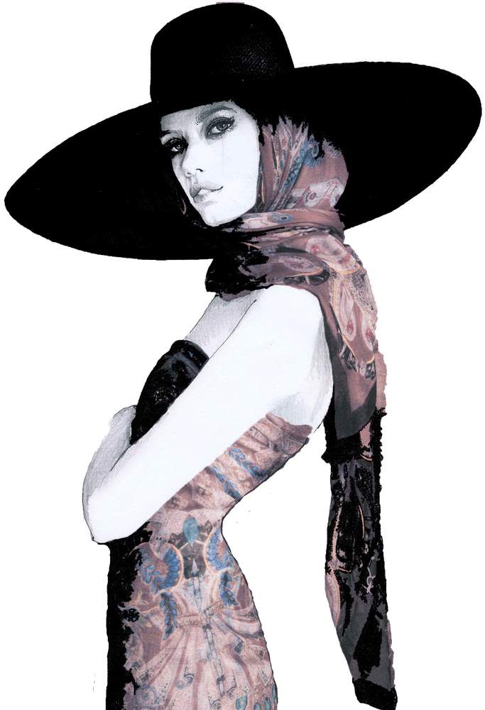
One of Sabrina’s fashion illustrations
Since her runway debut, Percy has “returned to the art world in full force”, leaving her career as an estate agent firmly behind her. Her eclectic portfolio now includes brands such as Aruna Seth and Rolls-Royce, the underwear label Cheekfrills and Canadian sportswear giant Lululemon. The latter were opening a store in London’s King’s Road and wanted local artists to create work for them that reflected the area.
It was the perfect brief for Percy, who “loves” research. Her piece was inspired by designs produced by the now-closed Chelsea Porcelain Factory. The finished painting, in acrylic, features a black Labrador lifting weights, two stags in a scrum with a rugby ball, a pheasant practising yoga, and foxes playing golf. Measuring 1.5m by 3m, it’s both beautiful and comical — much like Percy herself. “It was ironic, really, the canvas was so large I had to practically learn yoga positions in order to paint it,” she says.
But it’s the digital realm that really gets Percy excited: “I recently got into the iPad and the stylus and this app called Procreate. There are laws with physical painting you cannot break, whereas you can do things that aren’t possible in nature when digitally drawing.”
Is this the direction in which art production is heading? “I don’t know, but it’s a greener process,” says Percy. “To quote my favourite fashion illustrator David Downton, he said: ‘I’m a famous tree-killer.’ I find the production before a finished work so wasteful.”
Percy doesn’t want her future career to follow a typical path. She says: “You can give yourself permission to be something that doesn’t really exist. Even for me as an artist, I don’t even have a style of art. I’ve had to learn to not judge myself on not fitting into a type. Maybe that will be my thing: not finding a style at all.”
Furniture and interiors have never been so fashionable. Aimee Farrell investigates why designers are staying close to home
The Arts and Crafts pioneer William Morris believed that you should have “nothing in your house that you do not know to be useful, or believe to be beautiful”. This season, Morris’s approach applies just as readily to our wardrobes, as designers seek solace in the decorative beauty of homes and gardens.
“The decorative arts have always spoken to one another,” says the interior decorator Fran Hickman, who has been responsible for creating fashion retail spaces for everyone from Moda Operandi and Emilia Wickstead to the Chinese designer Huishan Zhang. So why are so many designers finding their inspiration so close to home right now? “At the moment, the world stage is unstable, so it’s entirely natural that fashion designers are looking at smaller, joyful spaces, ordered to bring about lasting comfort for inspiration.”
The world of interiors has long been a source of fascination for Jonathan Anderson. “Everyone who works in design tends to have a love of interiors,” says the Loewe creative director, whose recent capsule line (in stores now) took Morris’s most recognisable printed textiles and wallpapers – Strawberry Thief, Acanthus, Forest and Honeysuckle – and injected them with a punk sensibility on parkas, jeans and Puzzle bags. Anderson is a long-time fan of Morris, the Victorian polymath who championed handmade production in much the same way as the designer does today. And the collection has an appropriately crafted feel: there are embroidered knits, tapestry embellished T-shirts and biker jackets hand-painted with Morris’s Forest Fox.

Loewe pre-fall SS18 tapestry bag
The Spanish fashion house has had designs on our homes since Anderson joined some five years ago. Loewe will make its fourth outing at Salone del Mobile, Milan’s annual furniture fair, in April, with a collection of 50 tapestries and blankets that encompasses an array of global craft techniques, from African tapestry to Indian ribbon embroidery and Japanese Boro textiles. The project, which has taken more than a year to realise, began with the SS18 show at the Maison de l’Unesco in Paris, where Anderson commissioned a series of large-scale tapestries to adorn an otherwise minimalist runway; it was there, too, in the Andean tote carried by one of the models. The focus on the decorative arts is all part of Anderson’s effort to create context for the clothes he conceives by landing his woman in a world.

Mother and Child, 1961 ©2018 Girard Studio, LLC. All rights reserved. Alexander Girard
At Akris, Albert Kriemler landed his woman in an entirely different kind of domestic landscape. The Swiss creative director mined the archive of the postwar American architect and designer Alexander Girard. A lesser-known contemporary of Charles and Ray Eames, Girard made his name with his Op Art flecked fabric designs and interior schemes, which he called “atmospheres”. Kriemler became captivated by Girard’s bold yet subtle use of colour and geometric canvases while touring the Vitra Design Museum in Germany, home to Girard’s extensive fabric collection and the contents of his studio. Kriemler applied the fabrics to a series of graphic evening gowns.

Akris SS18
He also used Girard’s work to adorn the set. A huge Folk Art fan, Girard created a series of wooden figurines for his Santa Fe home in 1952, and a gang of these giant totems towered over the Akris runway. Their curvilinear forms, which radiate positivity, also decorated a procession of chiffon sheath dresses – often-times stitched in the house’s signature St Gallen embroidery.
The domestic mood was more nostalgic at Anya Hindmarch. Staged in the shadow of a specially constructed suburban two-up, two-down, the designer borrowed from the home decor of her grandparents for her SS18 show.

Anya Hindmarch SS18
Hindmarch found “solace and joy” in the interiors of the 1960s and 1970s to deliver housecoats (that pinnacle of household drudgery) in brocades modelled after Anaglypta wallpapers. Anaglypta, the British brand forever associated with mid-century suburbia, and whose name is Greek for “raised cameo”, has been selling its embossed painted designs since 1887. Hindmarch’s set was clad in an iteration of their relief decorations, which are surely ripe for a revival. “Suburbia is a funny thing,” says Hindmarch, who also created a textural leather pillow clutch, complete with upholstery studs, modelled after a 1970s bolster cushion, “you want to escape from it but it is also very comforting.”
For many designers, that same comfort was predicated on a metaphorical escape into the garden. Sarah Burton at Alexander McQueen and Junya Watanabe both cited a retreat into nature as part of their personal pursuit for SS18. Watanabe opened his Paris show with a succession of monochromatic prints pulled from the archive of the Finnish home-furnishing brand Marimekko. It’s poignant he chose interior textiles typically used on placemats, tea towels and curtains to form high-fashion looks in voluminous silhouettes.
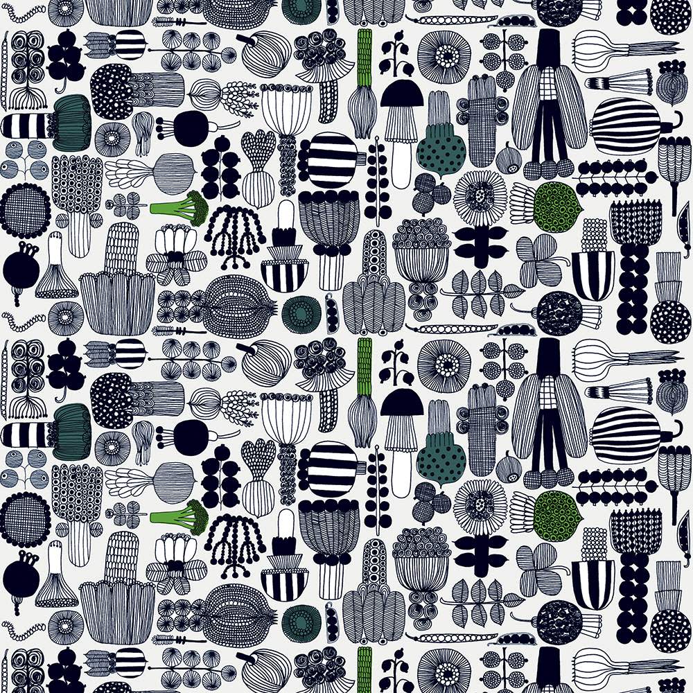
Puutarhurin parhaat by Maija Louekari, Marimekko ©Marimekko
The simplicity of the nine Marimekko designs was powerful: Kivet (meaning “stones”) was designed in 1956 by Maija Isola to depict the pebbles found around her studio; Kaivo (meaning “well”) emulates the circular rings that form on the surface of water; and Puutarhurin parhaat illustrates the fruits and flora harvested from a Scandinavian kitchen garden. For Watanabe, the Marimekko textiles brought “another dimension” to a collection he called “an homage to curious natural forms of nature”. Deeper observations were not forthcoming. “I just like nature,” he shrugged.

Junya Watanabe SS18
Meanwhile, Sarah Burton went on a horticultural trip to what is arguably the quintessential English house and garden, Great Dixter, for her SS18 show. The garden’s creator, the late Christopher Lloyd, known affectionately as “Christo”, pioneered meadow gardening, filling the six-acre plot in East Sussex with native flowers and grasses and exuberant painterly planting.
Burton turned the runway into a bricked garden path, with pergolas decked with gauzy canopies and embroidered with trailing flowers. “Some of the women are almost like flowers themselves,” she said of the profusion of petal-like organza ruffles. Everything pointed to the abundance of nature: there were rose tapestries to mirror the textural planting of Lloyd’s borders, and the models wore rain-saturated hair and buckled boots with Lucite heels that housed tiny flowers and pearls.

The Long Border, Great Dixter ©Great Dixter Charitable Trust
Though Burton cited “the healing power of nature” as her inspirational source, there was something else at play. What she called the “weather-beaten” quality of the clothes came from a visit to the House Style exhibition, which explored the wardrobes of five centuries of Chatsworth chatelaines.

Alexander McQueen SS18
“Fashion borrowing from interiors is not really new,” admits the interior designer Ashley Hicks. “Think about Versace’s Roman collection or Biba and Aubrey Beardsley and William Morris.” For SS18, Hicks collaborated with Tory Burch on a collection that paid tribute to the geometric schemes of his late father, David Hicks. The starting point for the joyful and celebratory clothes that followed was Hicks’s scrapbooks. Throughout his 40-year career as a decorator to everyone from Helena Rubinstein to Prince Charles, Hicks fastidiously compiled press cuttings, swatches, sketches and souvenirs into volumes that were recently published by his son with Idea Books.

David Hicks designed guest bedroom at Easton Grey House, Wiltshire, for Peter Saunders, 1966, with ‘Navajo’ design on green linen ©The Estate of David Hicks
“Hicks’s attention to detail was staggering,” says Burch. His influence on her is pervasive: growing up, her mother had all nine of his books, which are full of edicts on good taste and living with style. “They’re required reading,” she says. “When we were designing our first store over a decade ago, I kept coming back to the rooms he created – colourful, graphic, bold.”
Hicks’s most iconic 1960s and 1970s prints seamlessly fit into modern women’s wardrobes: Burch edged clothes with his graphic border designs, buttons featured his distinctive H logo (which Burch says was the original inspired for her own) and silk separates were decorated in collage prints pulled straight from his scrapbooks.

Tory Burch SS18
Burch was not just inspired by Hicks’s patterned decor, but his great love of gardens, too. In his twilight years, he designed and wrote numerous books on the subject, seeing gardens as “open-air rooms” with flower-beds and urns and specimen trees, “the equivalent of furniture, sculpture, pictures and carpets”. She packed the collection with vibrant floral prints and corsage-style pendants, staging it in the well-tended grounds of the Smithsonian Design Museum in New York.
Ashley Hicks, though, is not sure how his father would have received it: “He had a very 1950s sensibility when it came to clothes,” he says. “He’d probably have hated seeing his designs as fashion. But I spend my life deliberately doing things he wouldn’t approve of.”


Barbara Hepworth, Pierced Hemisphere, 1937. White marble. The Hepworth Wakefield (Wakefield Permanent Art Collection) ©Bowness, Hepworth Estate Photo ©Norman Taylor
Carola Long looks at the season’s taste for sculptural shoes
When it comes to heels, it’s time to think beyond the spike, the kitten and the block. How about the ovoid contours of a blue-speckled egg, as seen on chocolate brown mules at Loewe? Or perhaps something more dramatically abstract, such as Alexander McQueen’s boots, with their gold wedge featuring cut-out circle shapes that pay homage to Barbara Hepworth?

Alexander Mcqueen, £940
Hepworth’s work has inspired several of this season’s most intriguing designs. British-based designer Rejina Pyo says her heels, which evoke cones, pebble and architectural curves, were inspired by her love of sculpture, in particular “Barbara Hepworth’s and the Japanese-American sculptor Isamu Noguchi’s works”, she says. She also looked to “memories of visiting my favourite spot in Paris, the Brancusi Atelier at the Pompidou. His sculptures are beautiful organic shapes in clay, wood and metal.”

Loewe, £625 and Neous, £455
Some of the season’s cutest, quirkiest shapes come from up-and-coming shoe brand Neous, designed by fashion stylist Vanissa Antonious and designer Alan Buanne. The pair say they often find themselves “inspired by the fluidity of a sculpture or design; the work of Barbara Hepworth and Jean (Hans) Arp come to mind. Our gold disc heel is a bold statement, we loved this because your eye is drawn to the negative space in the design, not the heel itself.”

Gucci, £805 and Rejina Pyo, £495
Lisa Aiken, retail fashion director at Net-a-Porter, reports that “this season, sculptural heels on minimalist shapes have had a huge impact on our customers globally”. From Ferragamo’s ribbed gold Art Deco heel to Gabriela Hearst’s boot with what look like freshly mined crystals attached to the back, most of these designs balance simple shoes with more characterful support. Rejina Pyo says: “I love that the shoes pair elegant silhouettes with a sculptural heel, creating a beautiful balance of functional and experimental.”

Celine, £610 and JW Anderson, £685

Barbara Hepworth, Pierced Hemisphere, 1937. White marble. The Hepworth Wakefield (Wakefield Permanent Art Collection) ©Bowness, Hepworth Estate Photo ©Norman Taylor
Carola Long looks at the season’s taste for sculptural shoes
When it comes to heels, it’s time to think beyond the spike, the kitten and the block. How about the ovoid contours of a blue-speckled egg, as seen on chocolate brown mules at Loewe? Or perhaps something more dramatically abstract, such as Alexander McQueen’s boots, with their gold wedge featuring cut-out circle shapes that pay homage to Barbara Hepworth?
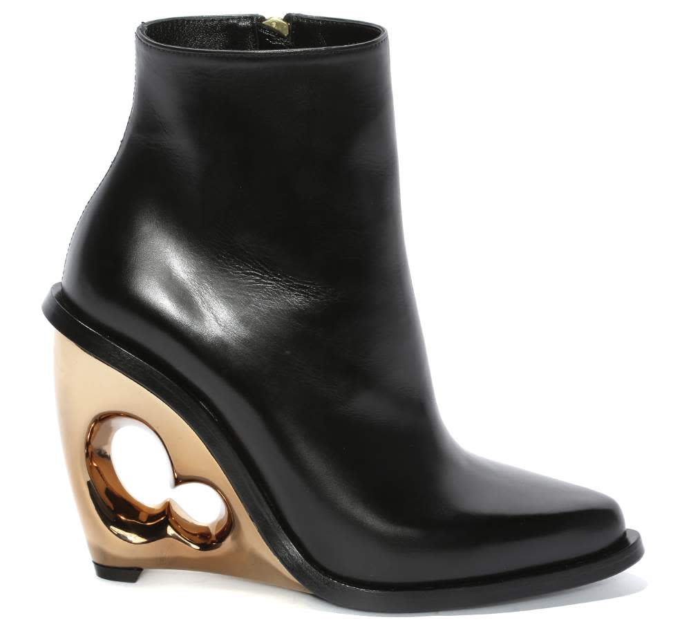
Alexander Mcqueen, £940
Hepworth’s work has inspired several of this season’s most intriguing designs. British-based designer Rejina Pyo says her heels, which evoke cones, pebble and architectural curves, were inspired by her love of sculpture, in particular “Barbara Hepworth’s and the Japanese-American sculptor Isamu Noguchi’s works”, she says. She also looked to “memories of visiting my favourite spot in Paris, the Brancusi Atelier at the Pompidou. His sculptures are beautiful organic shapes in clay, wood and metal.”

Neous, £455
Some of the season’s cutest, quirkiest shapes come from up-and-coming shoe brand Neous, designed by fashion stylist Vanissa Antonious and designer Alan Buanne. The pair say they often find themselves “inspired by the fluidity of a sculpture or design; the work of Barbara Hepworth and Jean (Hans) Arp come to mind. Our gold disc heel is a bold statement, we loved this because your eye is drawn to the negative space in the design, not the heel itself.”
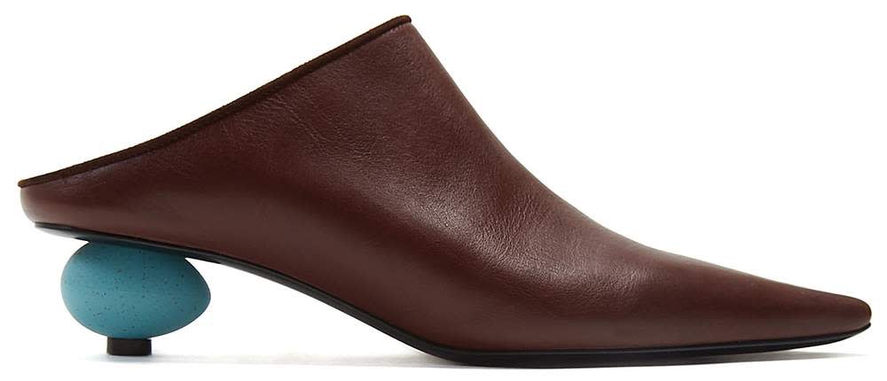
Loewe, £625
Lisa Aiken, retail fashion director at Net-a-Porter, reports that “this season, sculptural heels on minimalist shapes have had a huge impact on our customers globally”. From Ferragamo’s ribbed gold Art Deco heel to Gabriela Hearst’s boot with what look like freshly mined crystals attached to the back, most of these designs balance simple shoes with more characterful support. Rejina Pyo says: “I love that the shoes pair elegant silhouettes with a sculptural heel, creating a beautiful balance of functional and experimental.”

Rejina Pyo, £495


Versace SS18

Versace SS18
Keith Haring was just one cult artist whose works were worn on the SS18 catwalk. By Carola Long
‘I used the John Kacere images because it felt in line with my collection,” says Christopher Kane of the risqué photorealist paintings that appear on his T-shirt dresses. “I was completely struck with Kacere’s obsession and continuous study of the same part of the female body for his entire career,” he adds. “There is an honesty about how he paints; he is so open about his love of the female form and never stops evolving his style. They remind me of the Tennent’s Lager cans featuring page three girls. I grew up in the 1980s, so this was the style I was exposed to.” While Kacere’s paintings are highly sexual, other art prints in the SS18 shows are bold and confrontational in other ways. This is a trend that demands attention. At Calvin Klein, Raf Simons used Andy Warhol photos as part of a collaboration with the Andy Warhol Foundation. The photos and screen prints underlined the streak of darkness running through the show: sinister stills from Warhol’s series “Death and Disasters” were emblazoned on denim jackets and gowns. At Versace there were further references to Warhol, this time to Gianni Versace’s SS91 Pop collection, which featured the artist’s more uplifting images of Marilyn Monroe and James Dean collaged on dresses and catsuits. There was an overt political, feminist message behind the cartoon-inspired designs on Miuccia Prada’s collection. Rockabilly clothing featured drawings of punky, streetwise comic-book heroines by female graphic artists, as well as an homage to the “Sister: you are welcome in this house” poster by Trina Robbins, which depicts activist Angela Davis. These multilayered clothes were anything but a blank canvas.

SS18 looks at Christopher Kane, Prada, Calvin Klein and Undercover


Grace Wales Bonner ©Greg Funnell for the FT

Grace Wales Bonner ©Greg Funnell for the FT
Charlie Porter talks to the young menswear designer about the artists, musicians and photographers who have shaped her point of view
By nature, Grace Wales Bonner is a collaborator. The 26-year-old founded her label straight after graduating from the BA course at Central Saint Martins, and has surrounded herself with artists, musicians and thinkers since. Her dependence on collaboration was something she discovered on a month-long residency with the Albers Foundation in Senegal. “In the end, I realised the conditions I need to create are other people.”
For many fashion brands, collaborations are a quick route to novelty product. Often it goes no deeper than a designer printing an artist’s image on a bag or T-shirt. For Wales Bonner, it is more about the creative process. None of the collaborations she discusses here have ever resulted in a commercial product.
“Collaborations are really important,” she says. “I like to spend time with artists, and give myself time to create work with people. To me, collaboration is an entry point to having a conversation around something, to a journey where you can go further than you could ever imagine. It’s where those people take you that I find interesting. It’s exciting to have people guiding the path for me.”
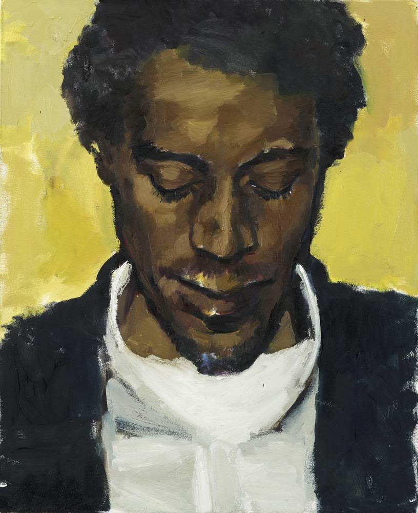
Lynette Yiadom-Boakye, Citrine by the Ounce, 2014, oil on canvas LYB14-12 ©The artist, Corvi-Mora, London and Jack Shainman Gallery, New York
Lynette Yiadom-Boakye artist
One of the most important painters of her generation, Lynette Yiadom-Boakye has become firm friends with Wales Bonner. “We were introduced by Hans-Ulrich Obrist at the Serpentine,” says the designer. “I loved her work. If I look back, I surprise myself that I had the confidence to have a conversation with someone I so admire.” Both share a love of narrative. Yiadom-Boakye paints her predominantly male figures entirely from imagination, with no model present. She finishes them in one day, so that the paint is always fresh. The result is portraits that have both familiarity and also mystery. “Lynette’s paintings transport me somewhere,” says Wales Bonner. “The characters have an effortless elegance, purity, beauty and dignity that I am drawn to and aspire to reflect in the boys I work with.” Yiadom-Boakye is also an accomplished writer and poet. For her AW17 show, Wales Bonner asked her to write a work to coincide with the collection, which was printed in the show notes. “I gave her references,” says Wales Bonner, “and talked about the idea of street preachers. The way she was able to articulate this character, to push the narrative, it made it such a broad experience. The poem took things to another level.”

Lynette Yiadom-Boakye, Amber in the Ether, 2015, oil on canvas LYB15-47 ©The artist, Corvi-Mora, London and Jack Shainman Gallery, New York
Eric Mack artist
The New York-based artist Eric Mack, known for his work with textiles, spent four days last month creating fabric works with Wales Bonner to drape across the catwalk of her AW18 show. “His artworks naturally developed in the space, and it was interesting to see the forms grow alongside the collection,” says Wales Bonner. “That’s the ideal way of working for me, as so much comes together and evolves in the last few days before a show.” The pair first met in 2016. “We were both in Duro Olowu’s show Making & Unmaking at the Camden Arts Centre,” says Wales Bonner. “I met with him in New York, and we’ve wanted to work together for a while. Now felt like a good opportunity. There’s something very immediate about his work, and an intellectual curiosity that I find interesting. It also feels very new.” Wales Bonner sees the show as the beginning of a long collaboration. “We’re still having conversations about what we can do,” she says. “I think we might do something very specific together, because working with clothing is part of his practice.”
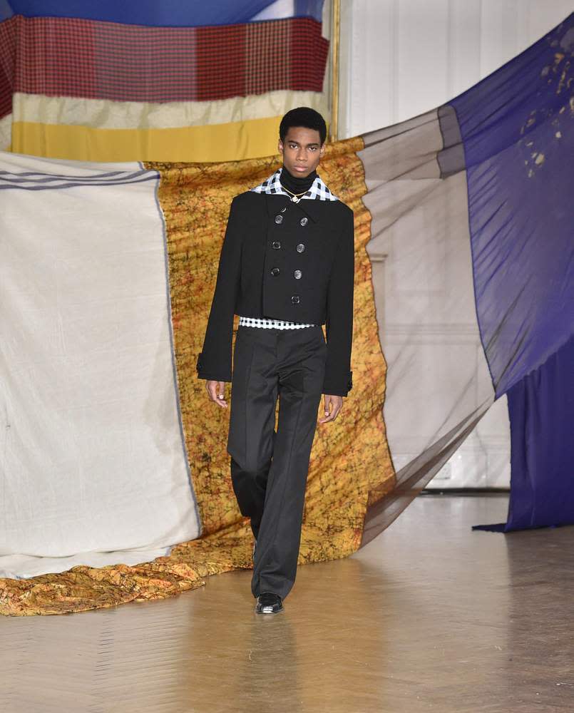
Eric Mack’s fabric works for Wales Bonner’s most recent AW18 show
Harley Weir photographer
“We’ve been working together since I graduated in 2014,” says Wales Bonner of Harley Weir, a fashion photographer who has become one of the industry’s most-watched names. “We only knew each other through Instagram. We sent each other random images, and then I sent her a picture of Lac Rose, the pink lake near Dakar, and she was like, let’s go.” The pair travelled to Senegal with her AW15 collection to make a film using the clothes, but leaving much to chance. “It was really innocent,” says Wales Bonner. “We set up a situation where we would be introduced to people, and the characters that we met would take us on a journey.” The film offered Wales Bonner a new way to think about her clothing. “I think my work is in some way about exploring fantasy and reality,” she says. “It’s exciting to see how these characters take my ideas and fit them into reality.” The pair now collaborate twice a year, after every show. “I find the research process then really informs the next collection,” she says. “I create with a very specific idea in mind, but it’s about placing that world into something real.”

©Harley Weir/Art Partner
Elysia Crampton musician
“The music was like something I had never heard,” says Wales Bonner of Elysia Crampton, the electronic musician who created a soundtrack and then walked in her AW17 show. “I was aware of her music for a long time, from when she worked under the name E+E. I remember the first I saw of her work was an incredible video called ‘Fire Gut’, with slowed-down monster trucks crashing into each other in a sea of glittery sparks. Some collaborations are a back-and-forth conversation, but she got it straight away,” says Wales Bonner of the music Crampton created. “She has a very academic approach to creating work. She responded really well to visuals and we exchanged literature. And she interpreted my ideas for the show in a very different way.”
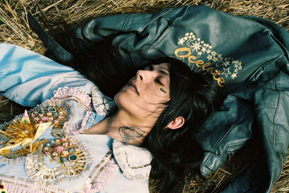
Elysia Crampton ©Boychild. Crampton’s new album, ‘Elysia Crampton – Elysia Crampton’, is out on 30 March on Break World Records
Sampha musician
Wales Bonner met musician Sampha through friends while he was working on his debut album Process, which went on to win the 2017 Mercury prize. “I met him in the studio and he played me some tracks,” says Wales Bonner. It started a conversation – and when Sampha provided music for her AW17 show, she says, “it was a dream for me”. The collaboration continued. “It was only natural that the collaboration would extend the other way. I did some research for him initially, and then we talked about creating a physical document for Process.” It led to Shy Light, a 36-page fanzine, with collages, lyrics and photography by Jalan and Jibril Durimel. “Print feels like quite a natural medium for me,” says Wales Bonner, who also produced publications to coincide with her first presentations. “It feels more immediate and it was really rewarding to work in a different way. Plus, it was amazing to work with him before he had released the album, before everyone knew how incredible it was.”

Sampha, the experimental British pop singer and electronic producer, in New York last year. ©Andre D Wagner/The New York Times/Redux/Eyevine

Kesewa Aboah wears Coach SS18. Philip Sinden

Kesewa Aboah wears Coach SS18. Philip Sinden
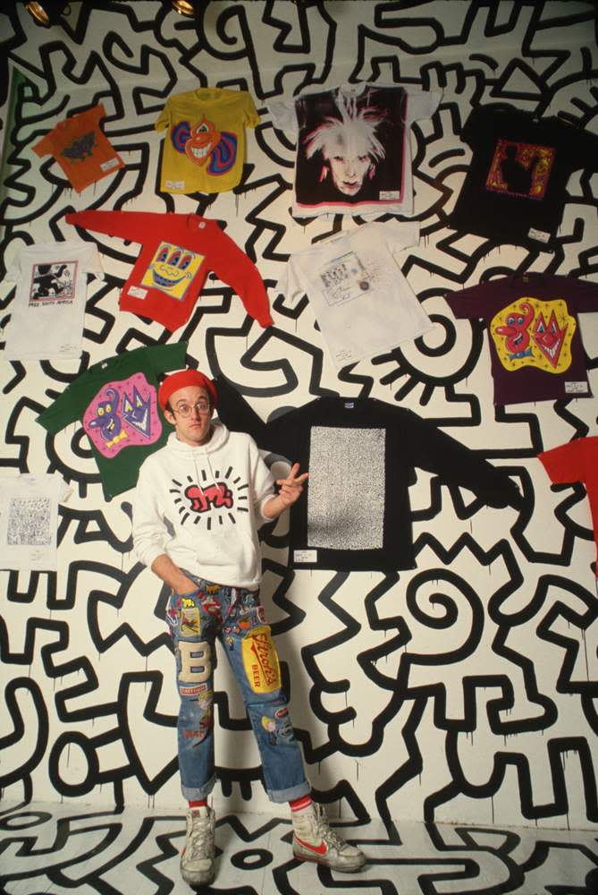
His line figures helped drag drab 1980s New York out of the doldrums. Now they’re popping up all over Coach. Stuart Vevers, the brand’s creative director, tells Jo Ellison why he’s crazy for Keith Haring


The sharp stripes of graphic art find their parallel on the catwalk
Is there any pattern more arresting than the stripe? Bold, dynamic and punchy, there’s a reason that thick black-and-white lines are designed to stop traffic. Both designers and artists are attuned to the power of the repetitive line, and this season houses including Céline, Haider Ackermann and Isabel Marant used stripes and angular patterns that recalled work by such 20th-century artists as Daniel Buren, Dan Flavin and Alexander Calder. Buren is as synonymous with graphic lines as Yayoi Kusama is with spots, and his 8.7cm-wide stripes have appeared on everything from buildings to tulips in a demonstration of the pattern’s versatility. Whether it’s Gabriela Hearst’s horizontal lines inspired by David Hockney’s rugby shirts or Haider Ackermann’s slightly Beetlejuice twist on the pinstripe, graphic lines are once again evoking confidence and modernity. CL


